This documentation is available as Markdown for AI agents and LLMs. See the full Markdown index or append .md to any documentation URL.
Expo UI
A set of components that allow you to build UIs directly with Jetpack Compose and SwiftUI from React.
@expo/ui is a set of native input components that allows you to build fully native interfaces with Jetpack Compose and SwiftUI. It aims to provide the commonly used features and components that a typical app will need.
Features
- Native primitives: Expo UI is not another UI library. It brings Jetpack Compose and SwiftUI primitives to React Native.
- 1-to-1 mapping: Components map one to one to their native counterparts. To browse a catalog of Jetpack Compose and SwiftUI components, see Available components below.
- Full-app support: Expo UI integrates at the component level. You can write an entire app with it, or adopt it one screen at a time. You can also mix React Native components, DOM components, and 2D components drawn with
react-native-skia.
Available platforms
Components are available for the following platforms:
- Jetpack Compose: Build native Android interfaces with Jetpack Compose components
- SwiftUI: Build native iOS interfaces with SwiftUI components
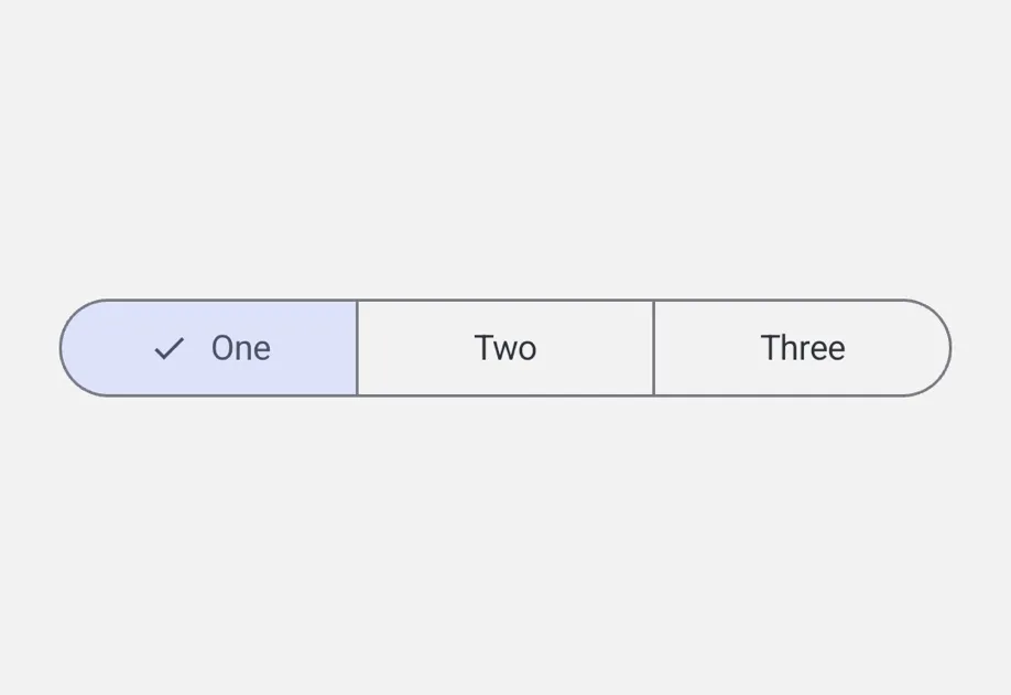
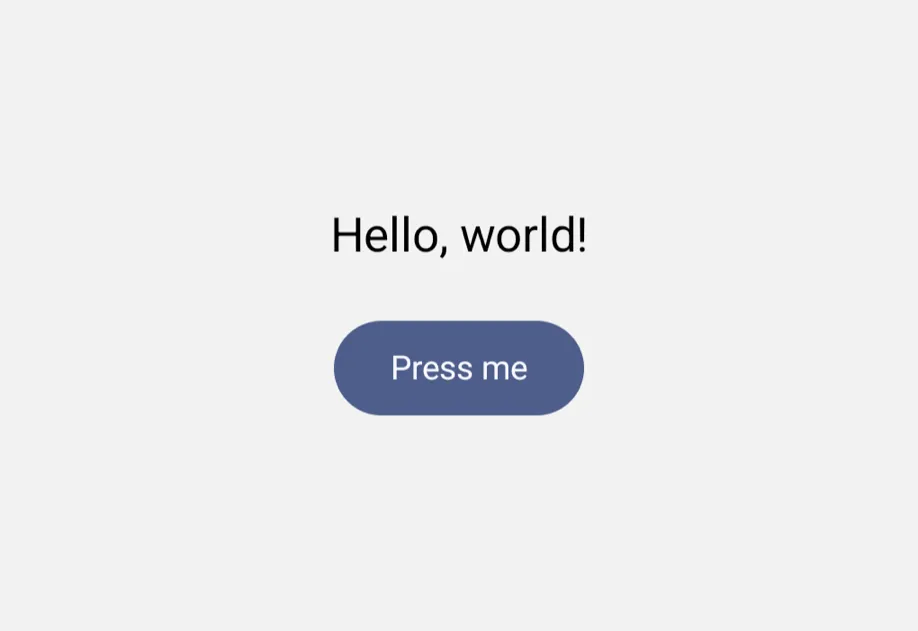
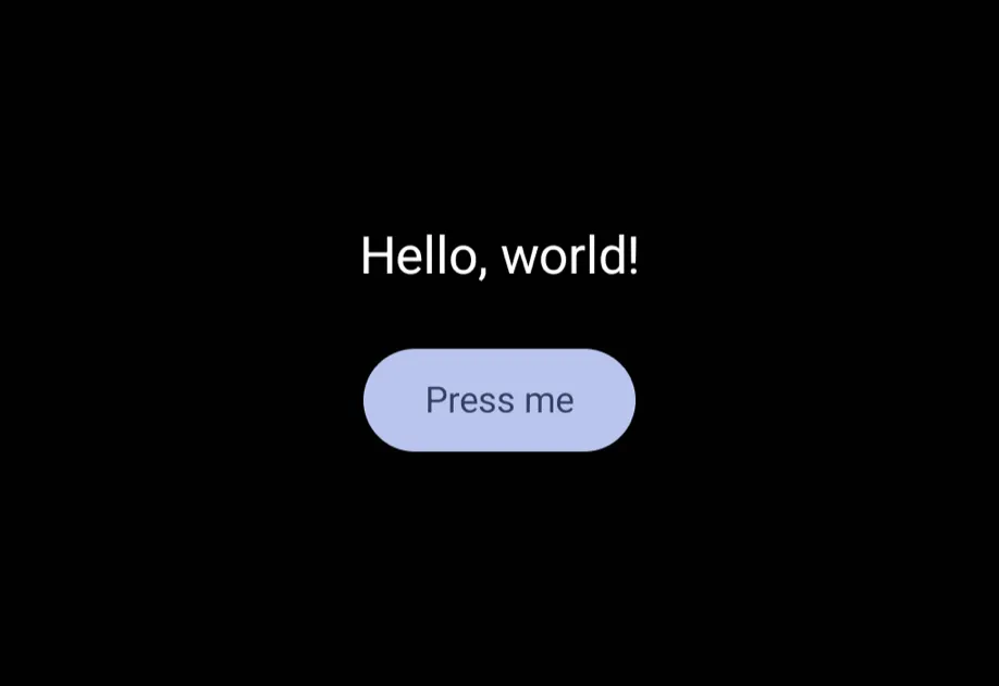
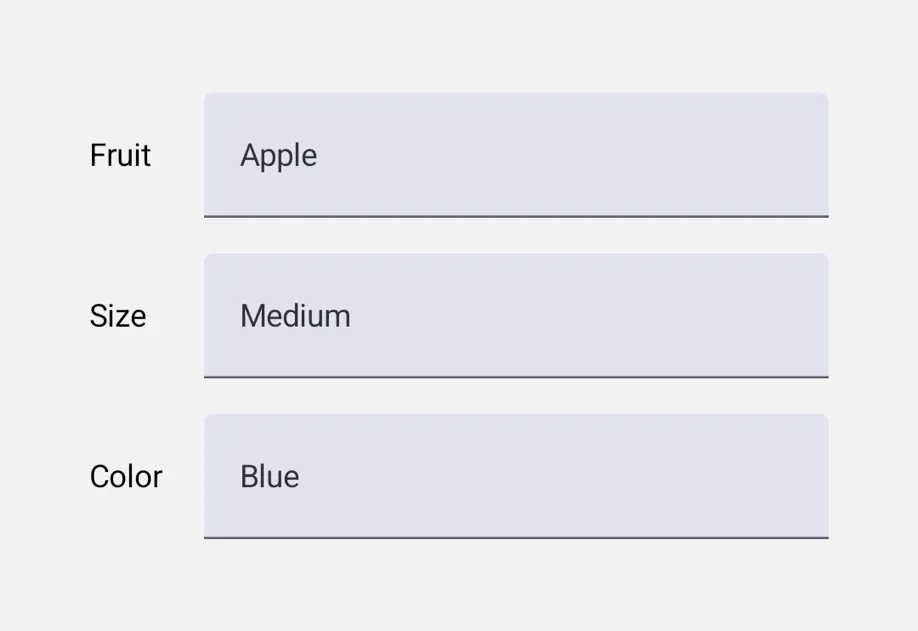
- Universal: Cross-platform components that run on Android, iOS, and web from a single source
Start with Universal when you want one component tree that runs unmodified on Android, iOS, and web. Reach for Jetpack Compose or SwiftUI directly when you need platform-specific controls, modifiers, or behavior that the universal API doesn't cover.
Drop-in replacements
See Drop-in replacements for API-compatible replacements for popular React Native community libraries.
Expo Skills for AI agents
If you use an AI agent, install Expo Skills to teach it how to build native-feeling screens:
Build native UI with the @expo/ui package: real SwiftUI on iOS and Jetpack Compose on Android.
Build beautiful, native-feeling Expo screens.
Available components
Jetpack Compose









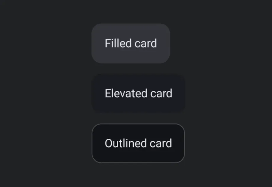




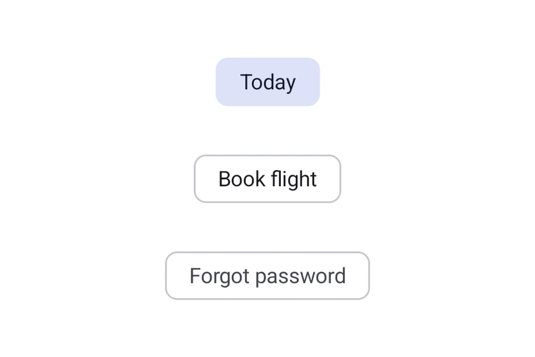




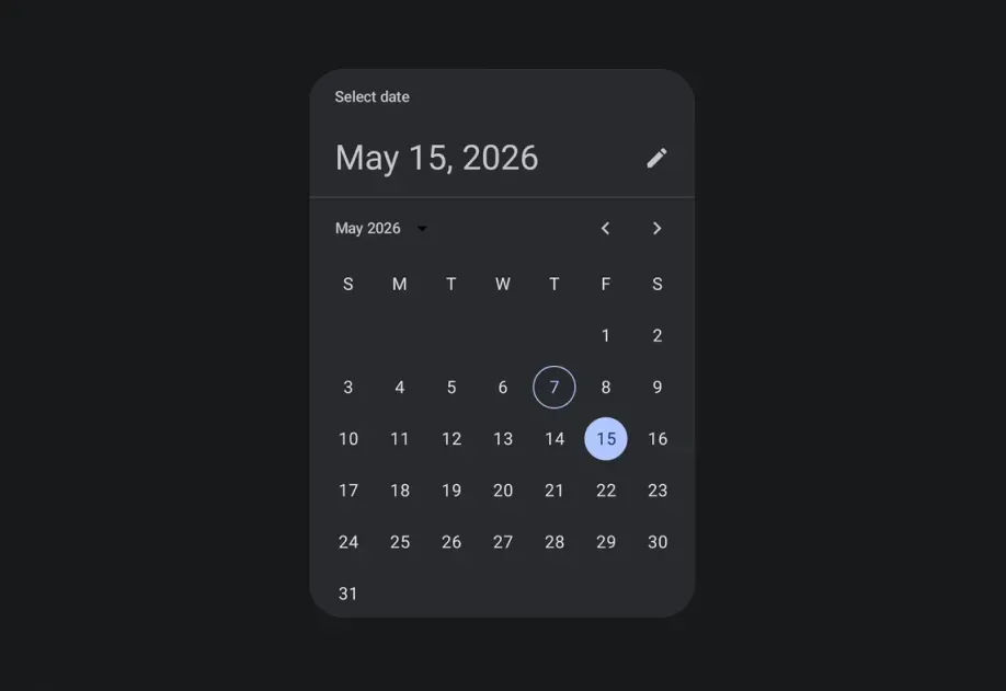




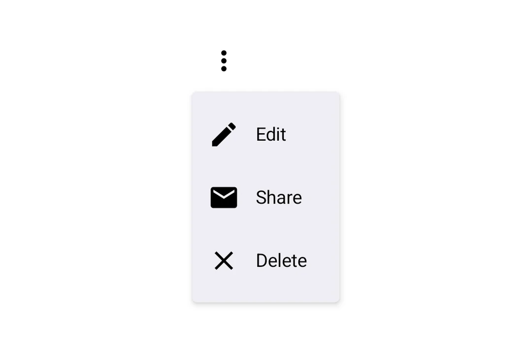



















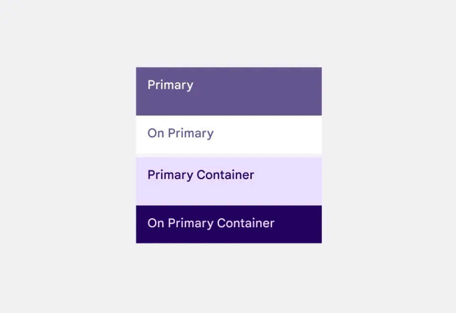
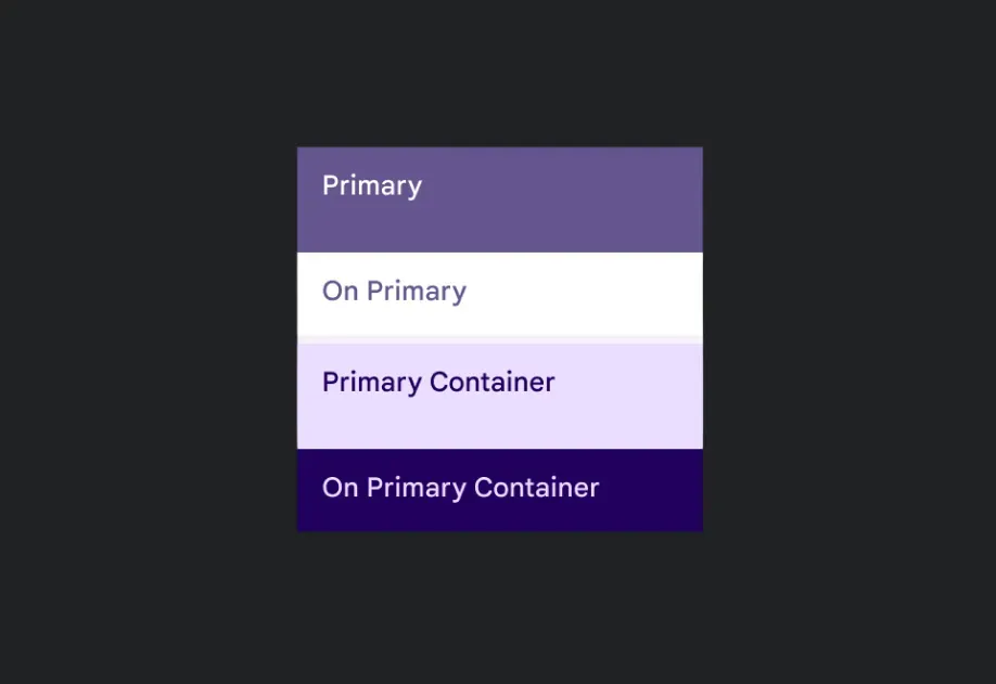














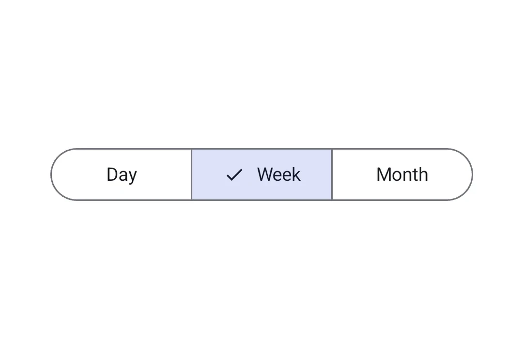















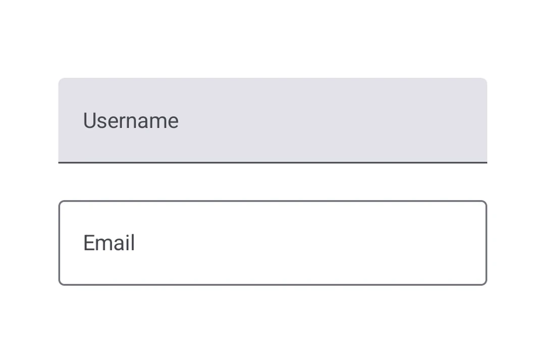
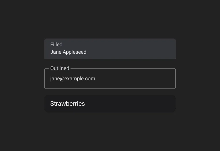




SwiftUI


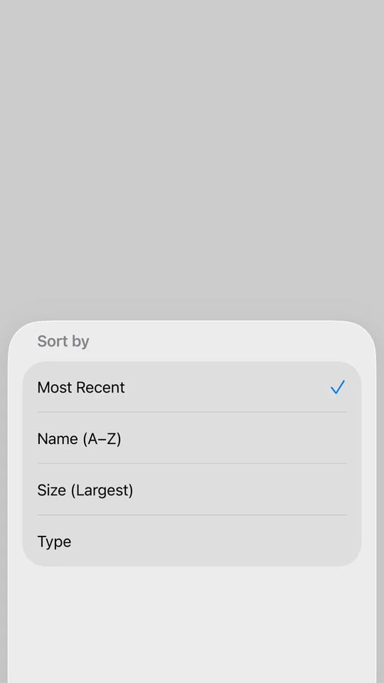
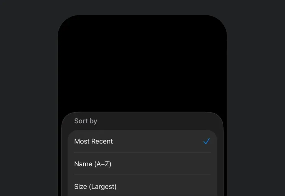
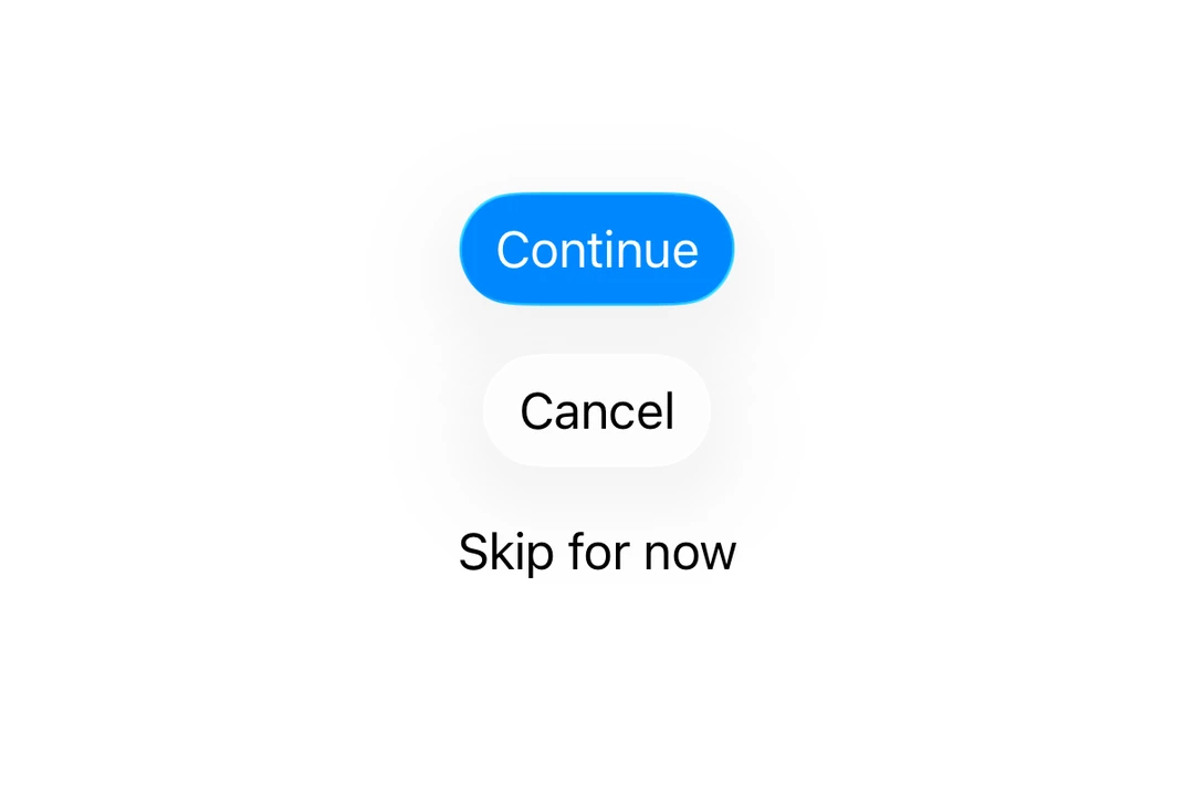
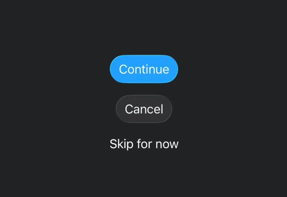
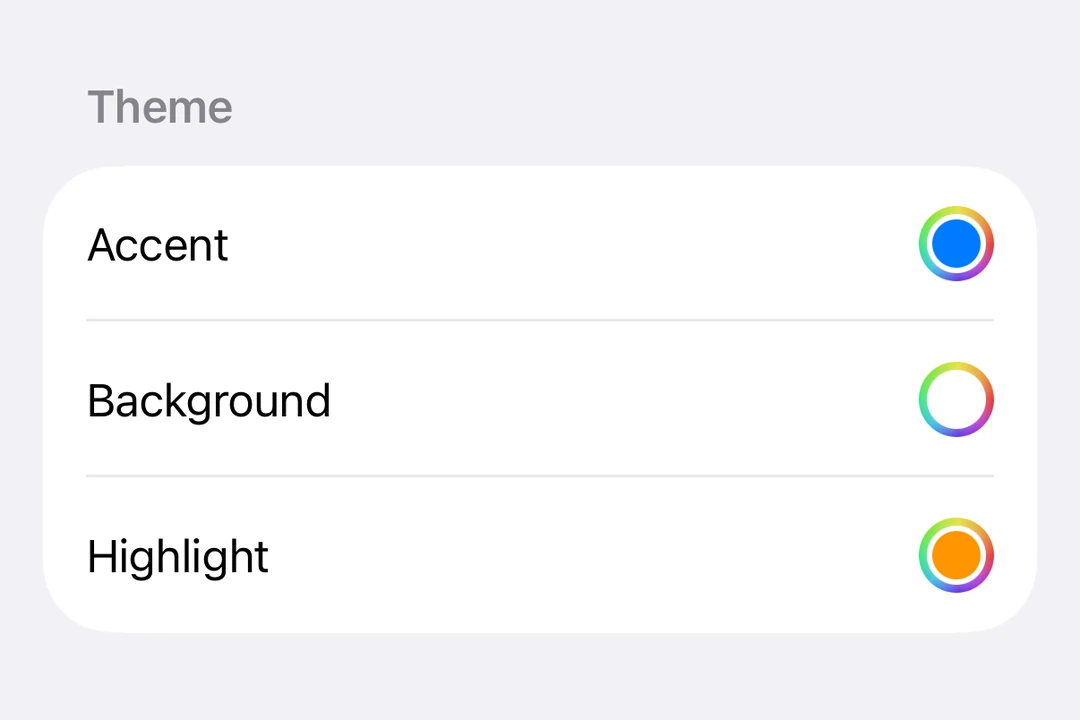
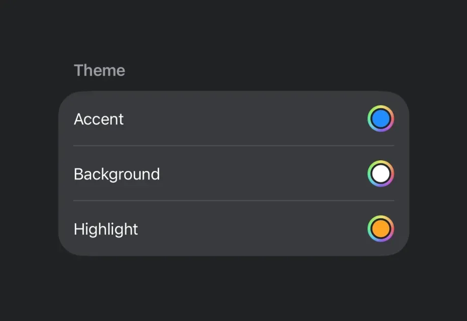



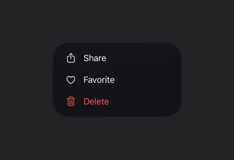


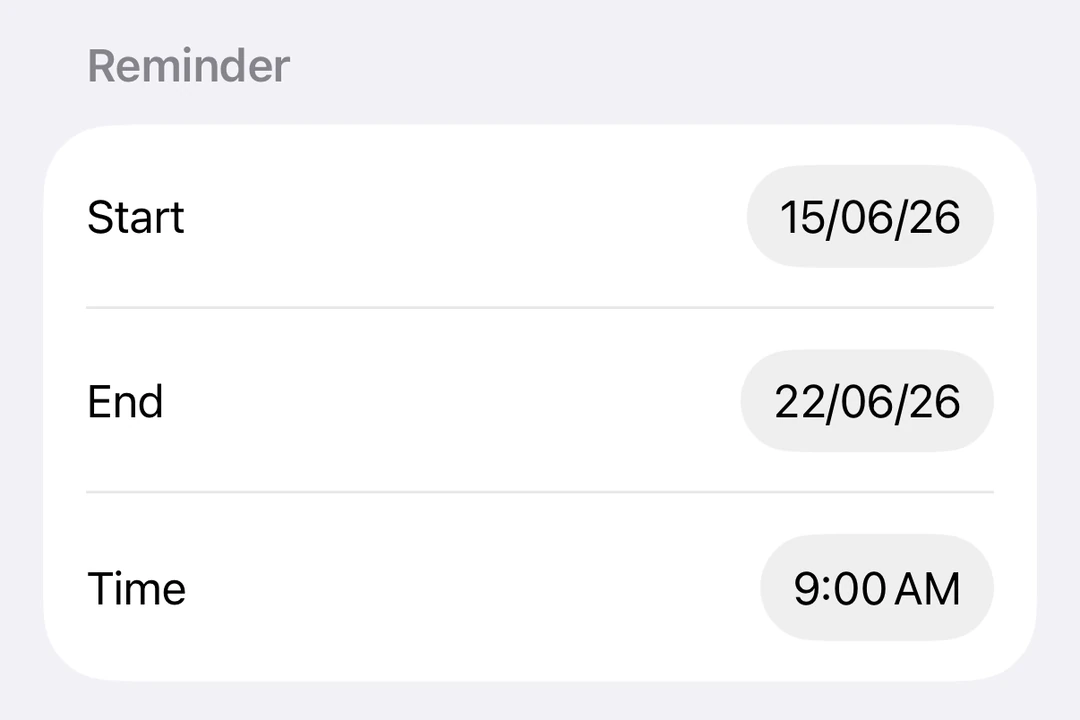
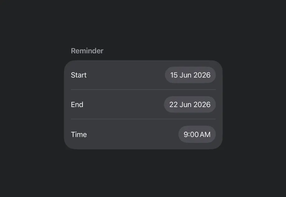
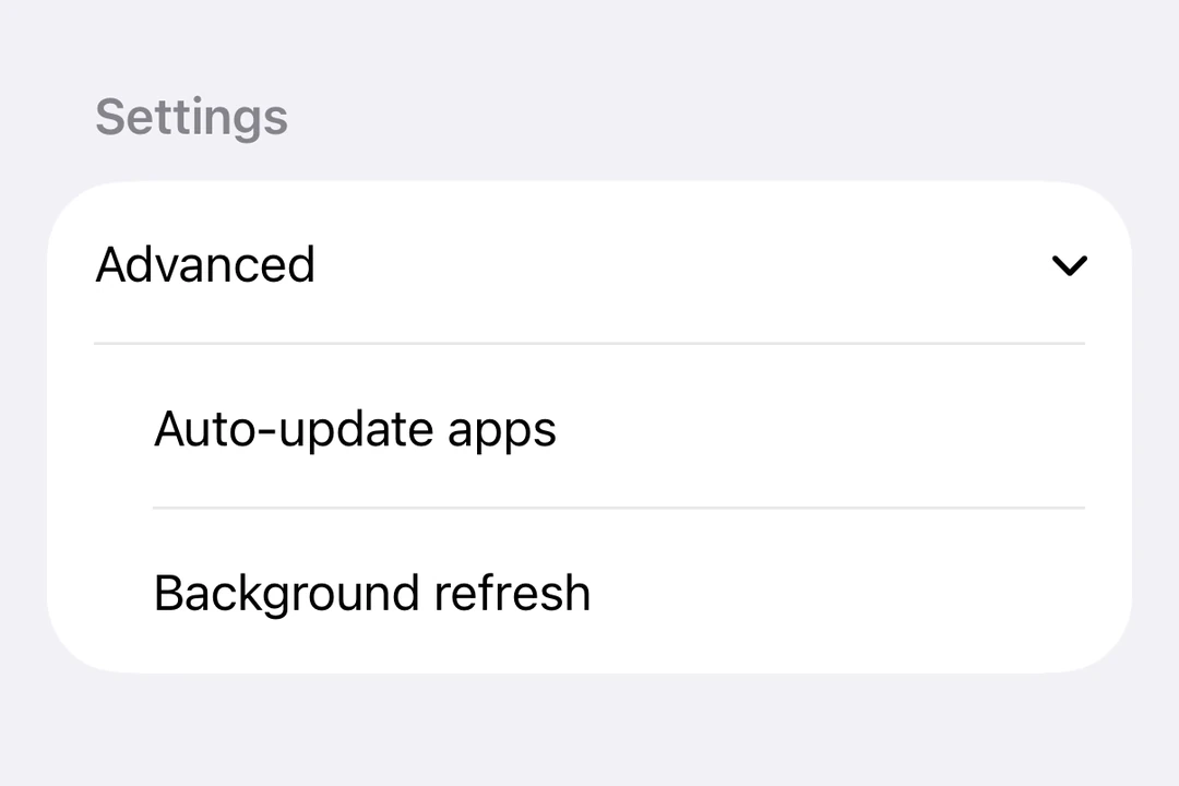
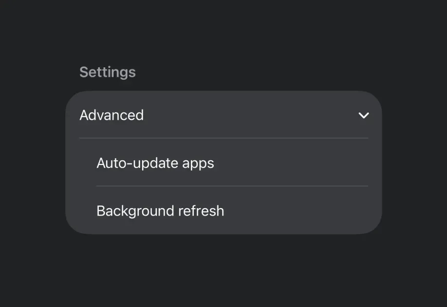


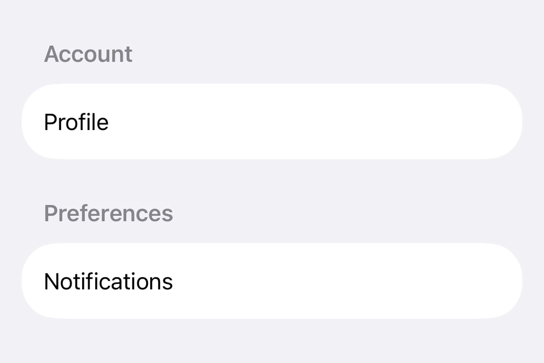

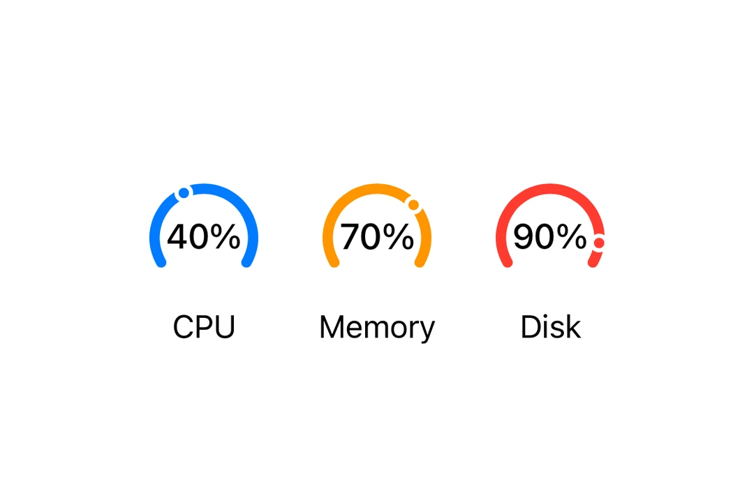









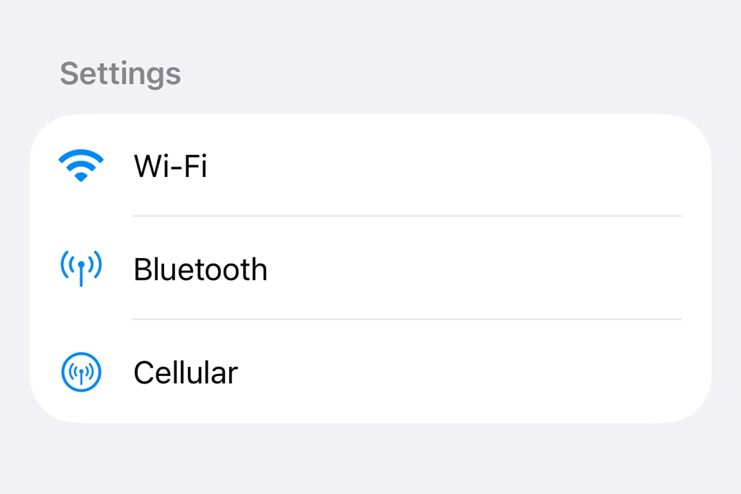
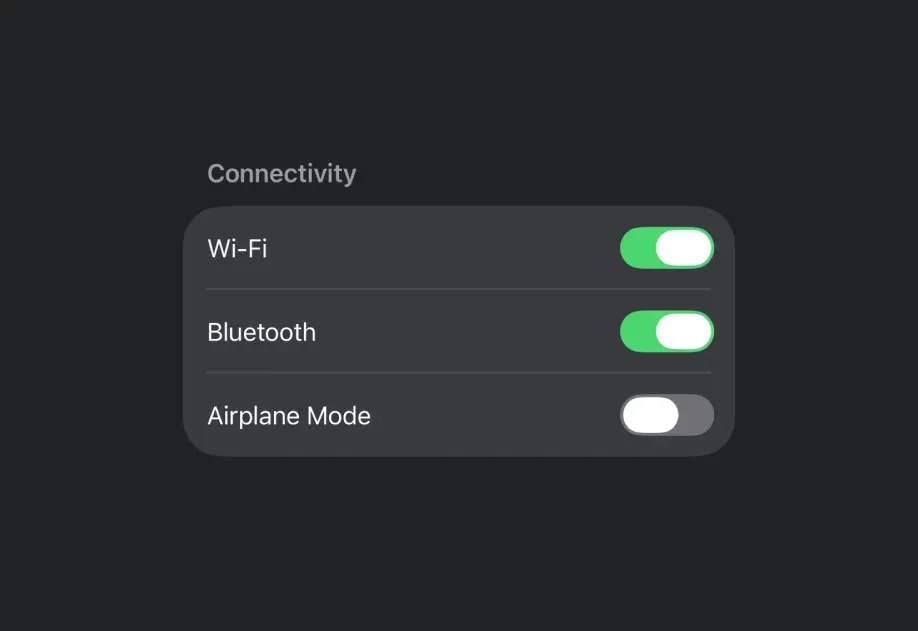
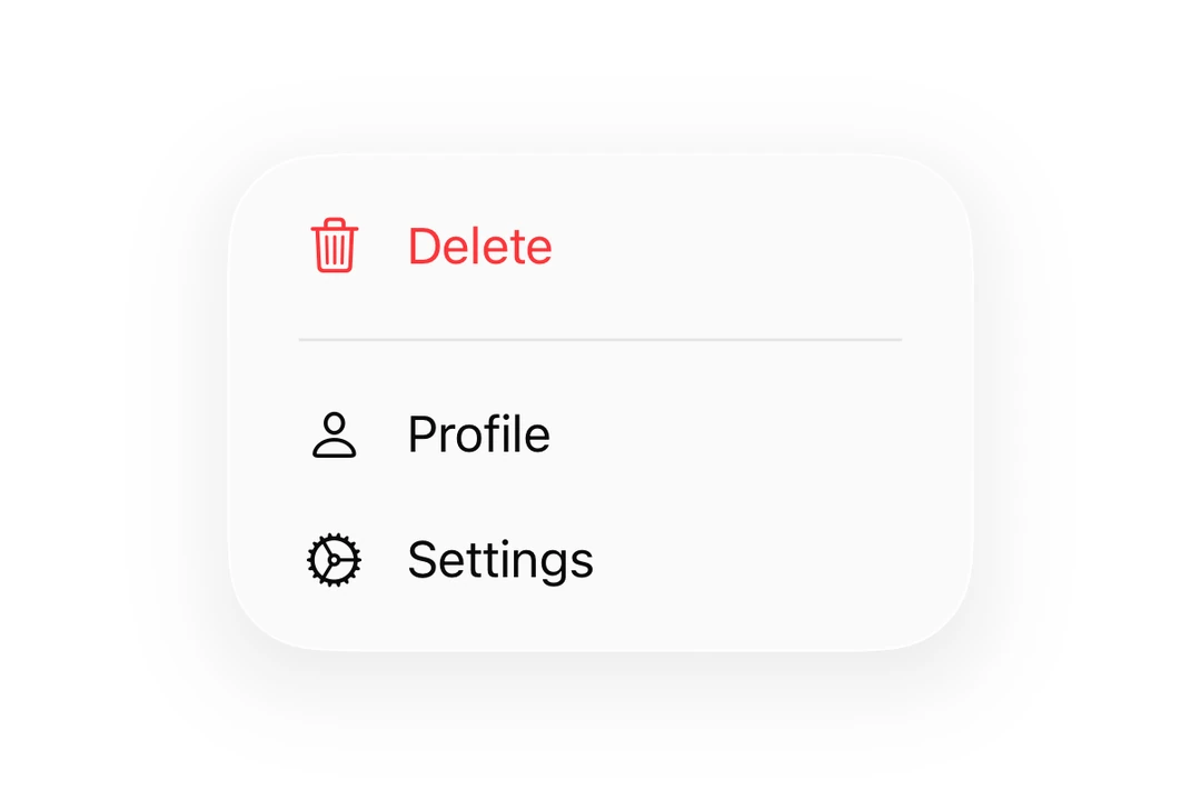
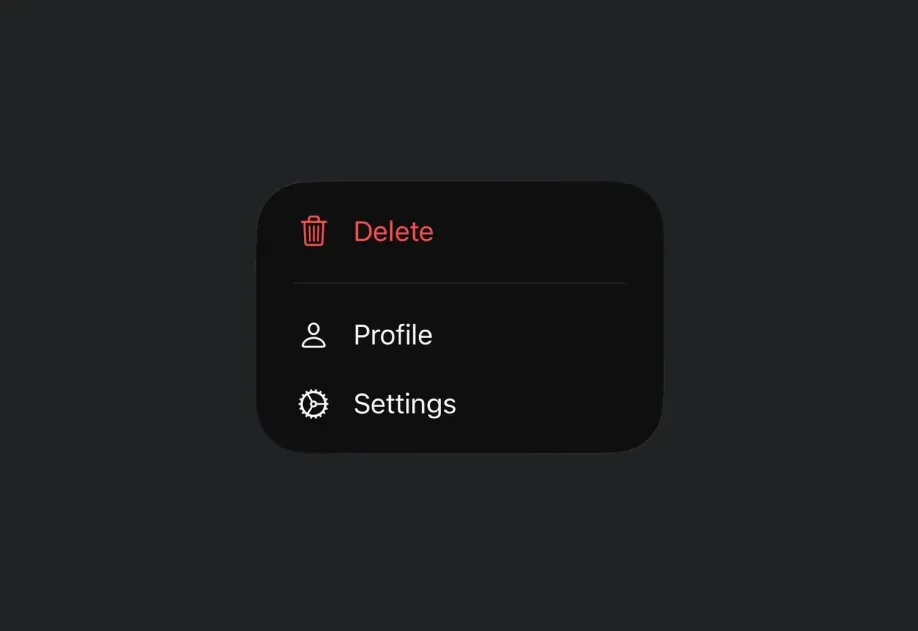


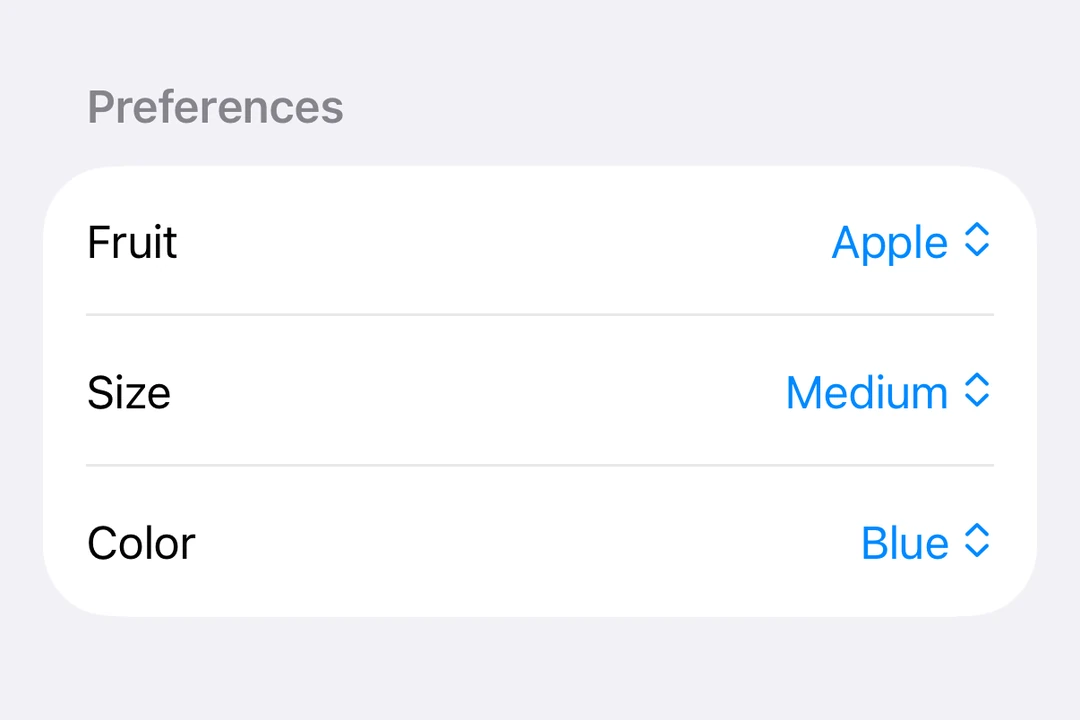
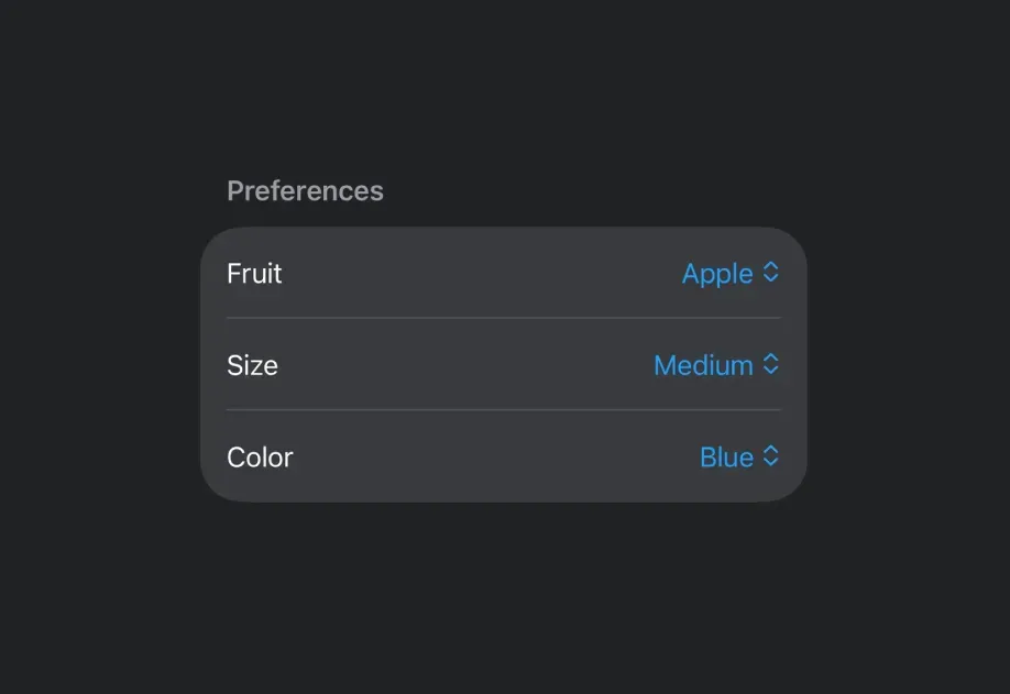
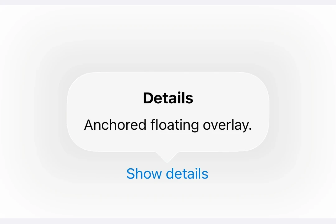
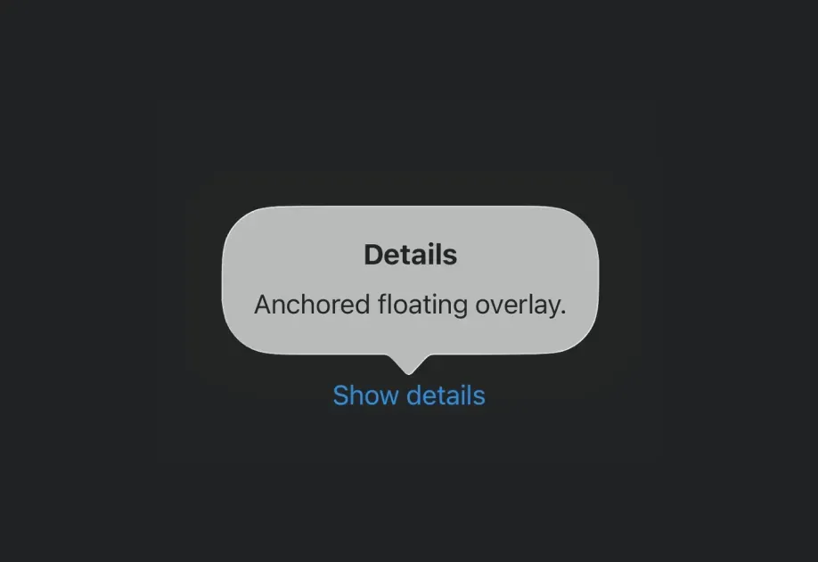


















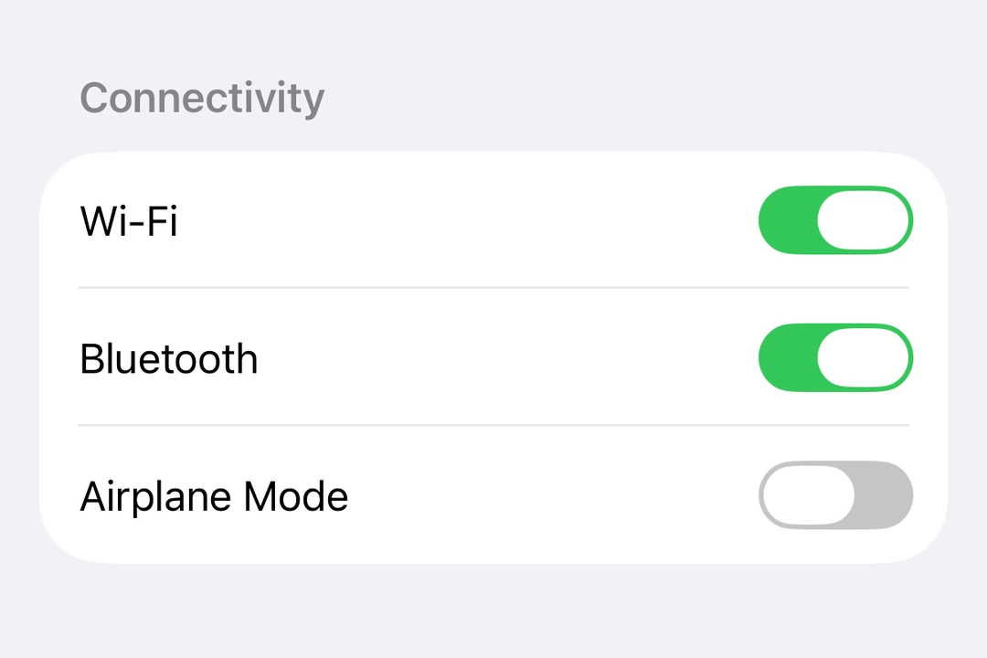
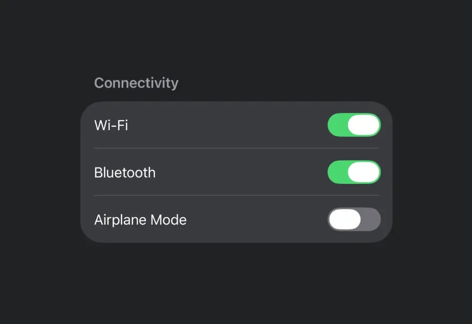




Drop-in replacements















Universal












Common questions
Can I use flexbox or other styles in Expo UI components?
Flexbox styles apply to the Host component itself. Once you are inside the native context, Yoga is not available. Define layouts with Row and Column on Android, or HStack and VStack on iOS.
What's the Host component?
Host is the bridge between React Native and the native UI toolkit. You must wrap every Expo UI component in one. You can think of it like <svg> in the DOM or <Canvas> in react-native-skia. On iOS, it uses UIHostingController to render SwiftUI views in UIKit. See the universal Host for cross-platform usage.
How is Expo UI different from libraries like react-native-paper or react-native-elements?
Expo UI is not "yet another" UI library and not an opinionated design kit. Instead, it's a primitives library. It exposes native Jetpack Compose and SwiftUI components directly to JavaScript, rather than re-implementing or simulating UI in JavaScript.
Can I use @expo/ui/swift-ui on Android or web?
No. @expo/ui/swift-ui renders SwiftUI views, which exist only on Apple platforms. Use @expo/ui/jetpack-compose for Android. Use the universal components when you want one component tree for Android, iOS, and web.
Can I use React Native components inside SwiftUI components?
Yes, you can place React Native components as JSX children of Expo UI components. Expo UI automatically creates a UIViewRepresentable wrapper for you.
However, keep in mind that the SwiftUI layout system works differently from UIKit and has some limitations. According to Apple's documentation:
SwiftUI fully controls the layout of the UIKit view's
center,bounds,frame, andtransformproperties. Don't directly set these layout-related properties on the view managed by aUIViewRepresentableinstance from your own code because that conflicts with SwiftUI and results in undefined behavior.
Also note that once you render React Native components, you're leaving the SwiftUI context. To add Expo UI components again, reintroduce a Host wrapper.
Keep SwiftUI layouts self-contained. Interop is possible, but it works best when boundaries are clearly defined.
I'm a Jetpack Compose or SwiftUI developer. Why should I learn Expo UI?
React's promise of "learn once, write anywhere" now extends to Jetpack Compose and SwiftUI. You can apply your existing knowledge to build apps that run in the React Native ecosystem. The same app can extend to the web through DOM components, and add 2D rendering with react-native-skia or 3D rendering with react-native-webgpu. Different parts of your app can use different approaches, because the integration works at the component level.
Additional resources
The latest Expo UI examples.
An example app replicating the YVR Hot Chocolate Fest app with Expo UI.
A project demonstrating the production-ready Expo UI package available in SDK 56 and later. The project works on both TV (Android TV, Apple TV) and mobile (Android, iOS). Demo screens include most of the available components for both Jetpack Compose and SwiftUI.