Reference version

This documentation is available as Markdown for AI agents and LLMs. See the full Markdown index or append .md to any documentation URL.

Universal

Cross-platform components for building shared UIs across Android, iOS, and web with @expo/ui.

Android
iOS
Web
Included in Expo Go
Recommended version:
~57.0.9

The universal components in @expo/ui are a single-API layer over the platform-native UI toolkits. On Android, they delegate to @expo/ui/jetpack-compose. On iOS, they delegate to @expo/ui/swift-ui. On web, they're JS implementations using react-dom or react-native-web and are picked per component to suit the control.

Installation

Terminal
npx expo install @expo/ui

If you are installing this in an existing React Native app, make sure to install expo in your project.

Usage

Universal components must still be wrapped in a Host, but you import everything, including Host, from the package root. The universal Host dispatches to the platform-native host on Android and iOS, so there's no need to reach for @expo/ui/swift-ui or @expo/ui/jetpack-compose directly.

UniversalExample.tsx
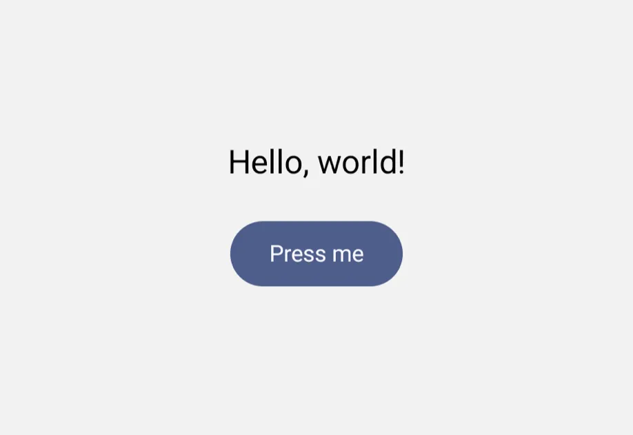
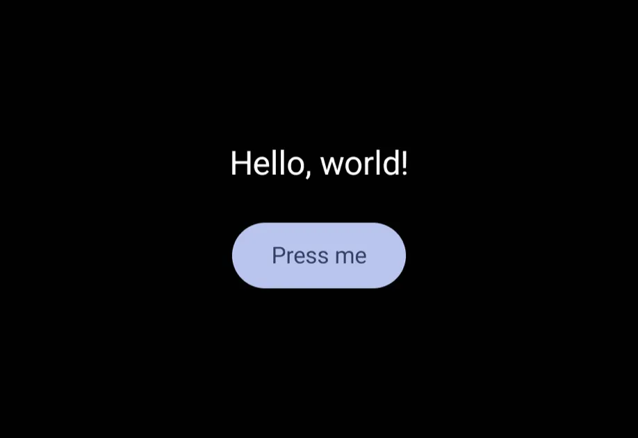
import { Host, Column, Button, Text } from '@expo/ui'; export default function Example() { return ( <Host style={{ flex: 1 }}> <Column spacing={12} alignment="center"> <Text>Hello, world!</Text> <Button label="Press me" onPress={() => alert('Pressed')} /> </Column> </Host> ); }

Components

ComponentDescription
BottomSheetA modal sheet that slides up from the bottom of the screen.
ButtonA pressable button with multiple visual variants.
CheckboxA toggle control that represents a checked or unchecked state.
CollapsibleA labelled tappable header that toggles visibility of its content.
ColumnA vertical layout container for universal @expo/ui components.
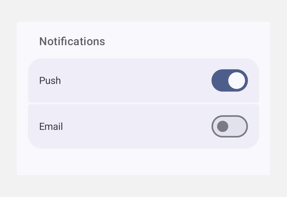
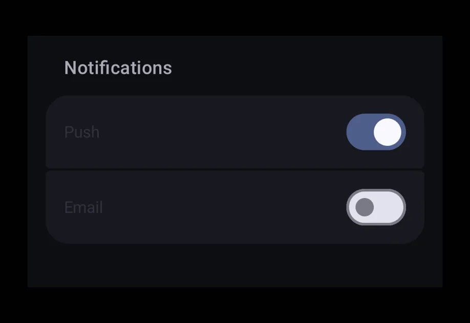
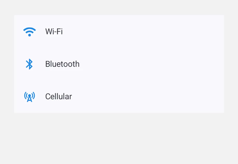
FieldGroupA scrollable container of grouped settings-style rows.
HostA cross-platform Host component that wraps universal @expo/ui content.
IconA platform-native icon — SF Symbol on iOS, Material Symbol on Android.
ListA virtualized vertical container of rows, paired with a tappable ListItem primitive.
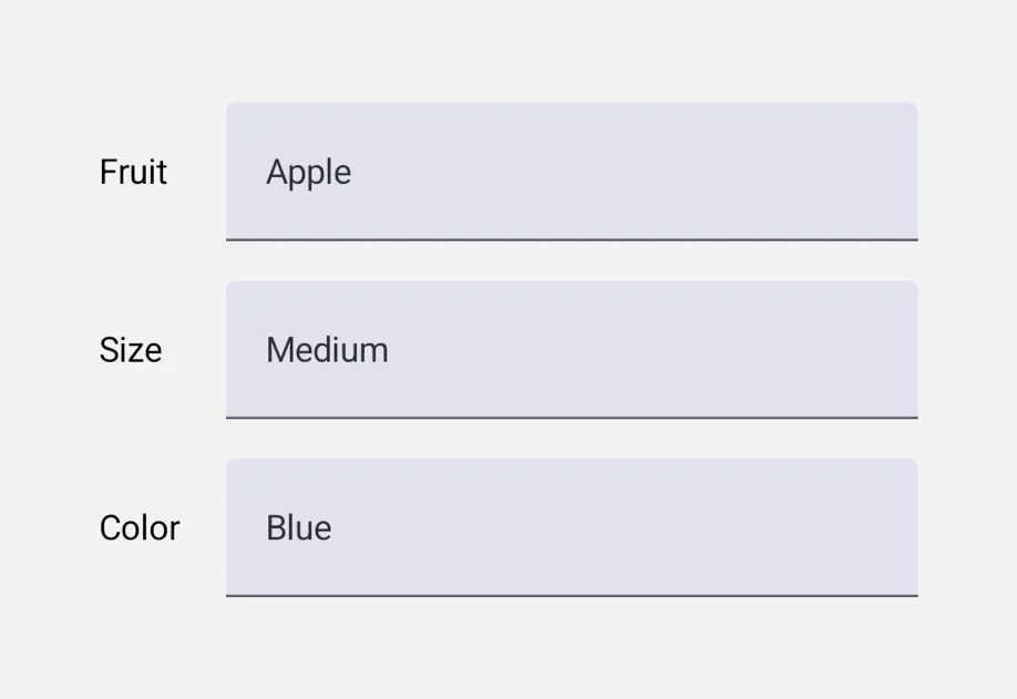
PickerA single-selection input with menu and wheel appearances.
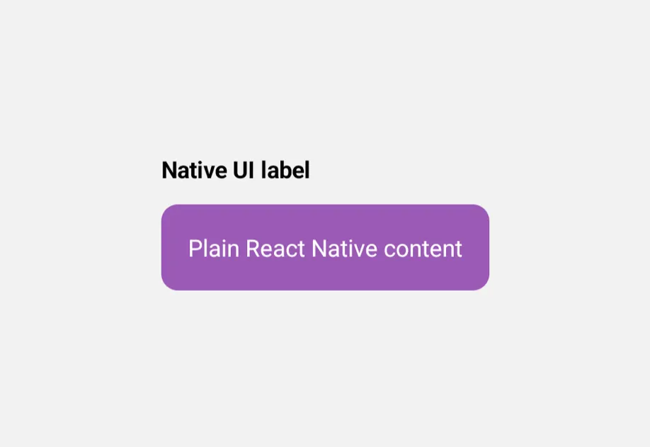
RNHostViewA cross-platform component for hosting React Native views inside @expo/ui views.
RowA horizontal layout container for universal @expo/ui components.
ScrollViewA scrollable container that supports vertical or horizontal scrolling.
SliderA control for selecting a value from a continuous or stepped range.
SpacerA layout spacer that produces empty space between siblings.
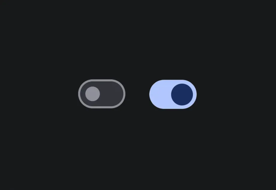
SwitchA toggle control that switches between on and off states.
TextA component for displaying styled text content.
TextInputA text input backed by native SwiftUI and Jetpack Compose components, with a React Native-compatible API.

When to use this versus swift-ui / jetpack-compose

  • Reach for universal components when you want one component tree that runs unmodified on Android, iOS, and web. The platform-native look and feel is preserved on Android and iOS because the components delegate to Jetpack Compose/SwiftUI under the hood.
  • Reach for @expo/ui/swift-ui or @expo/ui/jetpack-compose directly when you need platform-specific controls, modifiers, or behavior that the universal API doesn't surface.