This documentation is available as Markdown for AI agents and LLMs. See the full Markdown index or append .md to any documentation URL.
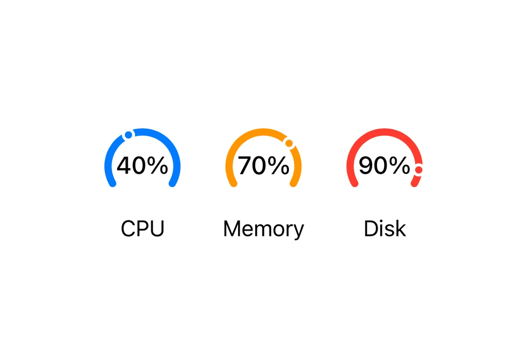
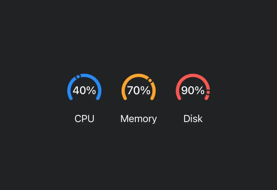
Gauge A SwiftUI Gauge component for displaying progress with visual indicators.
Recommended version:
~57.0.22
Expo UI Gauge matches the official SwiftUI Gauge API and supports styling via the gaugeStyle
Installation
- npx expo install @expo/ui
- yarn expo install @expo/ui
- pnpm expo install @expo/ui
- bun expo install @expo/ui
If you are installing this in an existing React Native app , make sure to install expo in your project.
Usage
Basic gauge
import { Host , Gauge } from '@expo/ui/swift-ui' ;
export default function BasicGaugeExample ( ) {
return (
< Host style = { { flex: 1 } } >
< Gauge value = { 0.5 } />
</ Host > ) ;
}
With label
You can pass custom components as children to provide a label for the gauge.
import { Host , Gauge , Text } from '@expo/ui/swift-ui' ;
export default function LabelExample ( ) {
return (
< Host style = { { flex: 1 } } >
< Gauge value = { 0.7 } >
< Text > Progress </ Text >
</ Gauge >
</ Host > ) ;
}
With value labels
Use the currentValueLabel, minimumValueLabel, and maximumValueLabel props to display value information.
import { Host , Gauge , Text } from '@expo/ui/swift-ui' ;
export default function ValueLabelsExample ( ) {
return (
< Host style = { { flex: 1 } } >
< Gauge value = { 50 } min = { 0 } max = { 100 } currentValueLabel = { < Text > 50% </ Text > } minimumValueLabel = { < Text > 0 </ Text > } maximumValueLabel = { < Text > 100 </ Text > } >
< Text > Usage </ Text >
</ Gauge >
</ Host > ) ;
}
Gauge styles
Use the gaugeStyle modifier to change the gauge's appearance. Available styles are: automatic, circular, circularCapacity, linear, and linearCapacity.
import { Host , Gauge , Text , VStack } from '@expo/ui/swift-ui' ;
import { gaugeStyle } from '@expo/ui/swift-ui/modifiers' ;
export default function GaugeStylesExample ( ) {
return (
< Host style = { { flex: 1 } } >
< VStack spacing = { 16 } >
< Text > Circular </ Text >
< Gauge value = { 0.5 } modifiers = { [ gaugeStyle ( 'circular' ) ] } >
< Text > Circular </ Text >
</ Gauge >
< Text > Circular Capacity </ Text >
< Gauge value = { 0.5 } modifiers = { [ gaugeStyle ( 'circularCapacity' ) ] } >
< Text > Circular Capacity </ Text >
</ Gauge >
< Text > Linear </ Text >
< Gauge value = { 0.5 } modifiers = { [ gaugeStyle ( 'linear' ) ] } >
< Text > Linear </ Text >
</ Gauge >
< Gauge value = { 0.5 } modifiers = { [ gaugeStyle ( 'linearCapacity' ) ] } >
< Text > Linear Capacity </ Text >
</ Gauge >
</ VStack >
</ Host > ) ;
}
Tinted gauge
Use the tint modifier to change the gauge's color.
import { Host , Gauge , VStack } from '@expo/ui/swift-ui' ;
import { gaugeStyle, tint } from '@expo/ui/swift-ui/modifiers' ;
export default function TintedGaugeExample ( ) {
return (
< Host style = { { flex: 1 } } >
< VStack spacing = { 16 } >
< Gauge value = { 0.7 } modifiers = { [ gaugeStyle ( 'circular' ) , tint ( 'green' ) ] } />
< Gauge value = { 0.3 } modifiers = { [ gaugeStyle ( 'linear' ) , tint ( 'red' ) ] } />
</ VStack >
</ Host > ) ;
}
API
import { Gauge } from '@expo/ui/swift-ui' ;
Component Type: React.Element < GaugeProps >
Renders a SwiftUI Gauge component.
Optional • Type:
ReactNode A label describing the gauge's purpose.
Optional • Type:
ReactNode A label showing the current value. Use Text or Label to display the value.
Optional • Type: number • Default: 1
The maximum value of the gauge range.
Optional • Type:
ReactNode A label showing the maximum value. Use Text or Label to display the value.
Optional • Type: number • Default: 0
The minimum value of the gauge range.
Optional • Type:
ReactNode A label showing the minimum value. Use Text or Label to display the value.
Type: number
The current value of the gauge.