This documentation is available as Markdown for AI agents and LLMs. See the full Markdown index or append .md to any documentation URL.
ProgressView
A SwiftUI ProgressView component for displaying progress indicators.
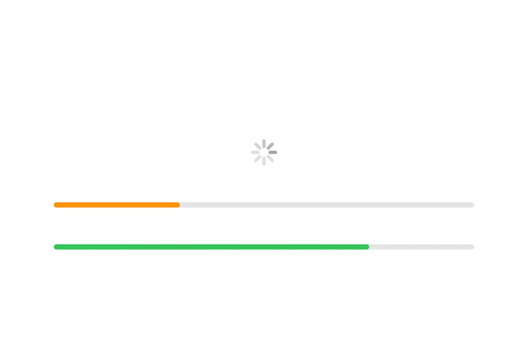
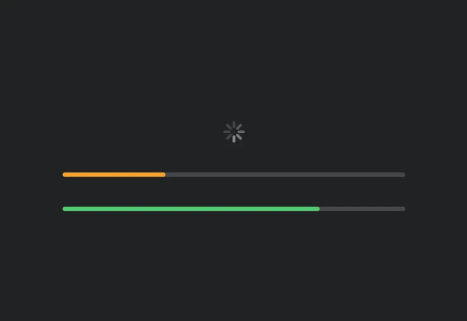
Expo UI ProgressView matches the official SwiftUI ProgressView API and supports styling via the progressViewStyle modifier.
Installation
If you are installing this in an existing React Native app, make sure to install expo in your project.
Usage
Note: When using the
linearstyle (which is the default for determinate progress),ProgressViewis a flexible-width component, it expands to fill available horizontal space. When usingmatchContentson theHost, you should apply aframemodifier on theProgressViewto give it an explicit width. Alternatively, give theHostan explicit size usingstyle(for example,style={{ width: 300 }}orstyle={{ flex: 1 }}). Thecircularstyle and indeterminate spinner have a fixed size and work withmatchContents.
Indeterminate progress
When no value is provided, the progress view displays an indeterminate indicator (spinner).
Determinate progress
Provide a value between 0 and 1 to show determinate progress.
Progress view styles
Use the progressViewStyle modifier to change the progress view's appearance. Available styles are: automatic, linear, and circular.
With label
You can pass custom components as children to provide a label for the progress view.
Tinted progress view
Use the tint modifier to change the progress view's color.
Timer-based progress
Use the timerInterval prop to create a progress view that automatically animates over a time range. This is useful for showing countdown timers or timed operations.
Note: Timer-based progress is only available on iOS 16+ and tvOS 16+.
API
import { ProgressView } from '@expo/ui/swift-ui';
Component
Type: React.Element<ProgressViewProps>
Renders a SwiftUI ProgressView component.
boolean • Default: trueA Boolean value that determines whether the view empties or fills as time passes. If true, which is the default, the view empties.
ClosedRangeDateThe lower and upper bounds for automatic timer progress.
unionThe current progress value. A value between 0 and 1.
When undefined, the progress view displays an indeterminate indicator.
Acceptable values are: number | null