Reference version

This documentation is available as Markdown for AI agents and LLMs. See the full Markdown index or append .md to any documentation URL.

BottomSheet

A modal sheet that slides up from the bottom of the screen.

Android
iOS
Web
Included in Expo Go
Recommended version:
~57.0.14

A modal sheet that slides up from the bottom of the screen. The sheet's visibility is controlled — toggle isPresented from React state and dismiss it from onDismiss (called when the user swipes down or taps the overlay).

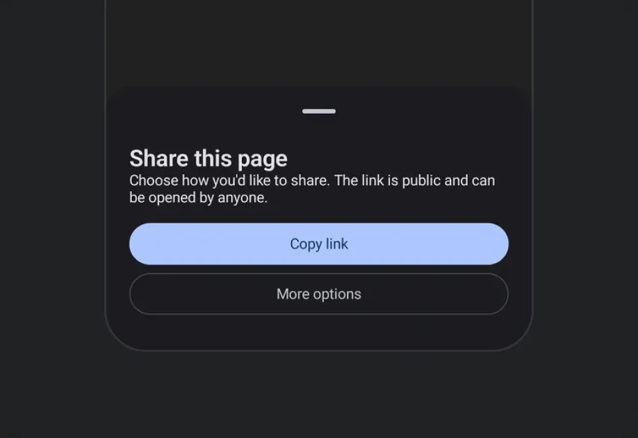
Modal bottom sheet with title, description, and action buttonsModal bottom sheet with title, description, and action buttons

Installation

Terminal
npx expo install @expo/ui
yarn expo install @expo/ui
pnpm expo install @expo/ui
bun expo install @expo/ui

If you are installing this in an existing React Native app, make sure to install expo in your project.

Usage

Basic bottom sheet

BottomSheetExample.tsx
import { useState } from 'react'; import { useColorScheme } from 'react-native'; import { Host, Column, Button, BottomSheet, Text } from '@expo/ui'; export default function BottomSheetExample() { const [isPresented, setIsPresented] = useState(false); const colorScheme = useColorScheme(); const ink = { color: colorScheme === 'dark' ? '#FFFFFF' : '#000000' }; return ( <> <Host matchContents> <Button label="Open sheet" onPress={() => setIsPresented(true)} /> </Host> <BottomSheet isPresented={isPresented} onDismiss={() => setIsPresented(false)}> <Column spacing={12}> <Text textStyle={{ ...ink, fontSize: 18, fontWeight: '700' }}>Sheet contents</Text> <Text textStyle={ink}>Drag down or tap the overlay to dismiss.</Text> <Button label="Close" onPress={() => setIsPresented(false)} /> </Column> </BottomSheet> </> ); }

Hiding the drag indicator

Pass showDragIndicator={false} for sheets without a handle.

BottomSheetNoIndicatorExample.tsx
import { useState } from 'react'; import { useColorScheme } from 'react-native'; import { Host, Button, BottomSheet, Text } from '@expo/ui'; export default function BottomSheetNoIndicatorExample() { const [isPresented, setIsPresented] = useState(false); const colorScheme = useColorScheme(); const ink = { color: colorScheme === 'dark' ? '#FFFFFF' : '#000000' }; return ( <> <Host matchContents> <Button label="Open" onPress={() => setIsPresented(true)} /> </Host> <BottomSheet isPresented={isPresented} onDismiss={() => setIsPresented(false)} showDragIndicator={false}> <Text textStyle={ink}>No drag handle.</Text> </BottomSheet> </> ); }

Snap points

Pass snapPoints to let the user drag the sheet between multiple resting heights. You can use the semantic values 'half' and 'full' for cross-platform parity. The { fraction } and { height } forms are honored precisely on iOS and web.

When sheet content can be taller than the smallest snap point, wrap it in a ScrollView so the overflow scrolls correctly.

BottomSheetSnapPointsExample.tsx
import { useState } from 'react'; import { useColorScheme } from 'react-native'; import { Host, BottomSheet, Button, Column, ScrollView, Text } from '@expo/ui'; export default function BottomSheetSnapPointsExample() { const [isPresented, setIsPresented] = useState(false); const colorScheme = useColorScheme(); const ink = { color: colorScheme === 'dark' ? '#FFFFFF' : '#000000' }; return ( <> <Host matchContents> <Button label="Open" onPress={() => setIsPresented(true)} /> </Host> <BottomSheet isPresented={isPresented} onDismiss={() => setIsPresented(false)} snapPoints={['half', 'full']}> <ScrollView> <Column spacing={12}> <Text textStyle={{ ...ink, fontSize: 20, fontWeight: '700' }}>Half / full sheet</Text> <Text textStyle={ink}>Drag the sheet between half and full screen height.</Text> </Column> </ScrollView> </BottomSheet> </> ); }

API

import { BottomSheet } from '@expo/ui';

Component

BottomSheet

Type: React.Element<BottomSheetProps>

A modal sheet that slides up from the bottom of the screen.

Props for the BottomSheet component, a modal sheet that slides up from the bottom of the screen.

BottomSheetProps

children

Optional • Type: ReactNode

Content to render inside the bottom sheet.

isPresented

Type: boolean

Whether the bottom sheet is currently visible.

modifiers

Optional • Type: ModifierConfig[]

Platform-specific modifier escape hatch. Pass an array of modifier configs from @expo/ui/swift-ui/modifiers or @expo/ui/jetpack-compose/modifiers.

onDismiss

Type: () => void

Called when the bottom sheet is dismissed by the user (e.g. swiping down or tapping the overlay).

showDragIndicator

Optional • Type: boolean • Default: true

Whether to show a drag indicator at the top of the sheet.

snapPoints

Optional • Type: SnapPoint[]

Heights the sheet can rest at. When omitted, the sheet auto-sizes to its content. See SnapPoint for the supported values.

Example

``['half', 'full'] — draggable between half and full

Example

``['full'] — always full height

testID

Optional • Type: string

Identifier used to locate the component in end-to-end tests.

Types

SnapPoint

A snap point describing one of the heights a BottomSheet can rest at.

  • 'half' — Approximately half-screen.
  • 'full' — Fully expanded.
  • { fraction } — A fraction of the screen height (0–1). iOS / web only.
  • { height } — A fixed pixel height. iOS / web only.

On Android, { fraction } and { height } snap to the nearest of 'half' / 'full'. See the component docs for platform behavior notes.

Type: 'half' or 'full' or object shaped as below:

PropertyTypeDescription
fractionnumber
-

Or object shaped as below:

PropertyTypeDescription
heightnumber
-