Reference version

This documentation is available as Markdown for AI agents and LLMs. See the full Markdown index or append .md to any documentation URL.

Slider

A control for selecting a value from a continuous or stepped range.

Android
iOS
Web
Included in Expo Go
Recommended version:
~57.0.14

A controlled slider for selecting a numeric value within a range. Pair value with onValueChange to manage state from React.
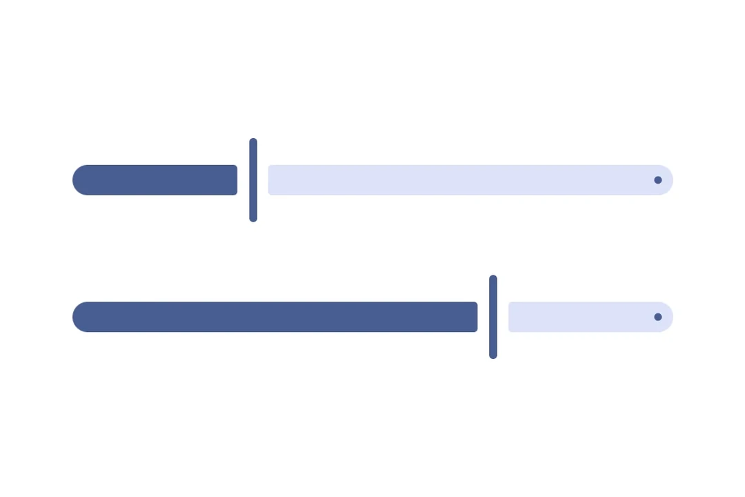
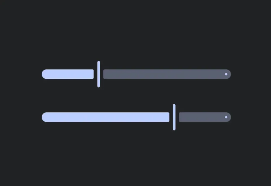
Two Material 3 sliders at different positionsTwo Material 3 sliders at different positions

Installation

Terminal
npx expo install @expo/ui
yarn expo install @expo/ui
pnpm expo install @expo/ui
bun expo install @expo/ui

If you are installing this in an existing React Native app, make sure to install expo in your project.

Usage

Continuous slider

The default range is [0, 1].

ContinuousSliderExample.tsx
import { useState } from 'react'; import { Host, Slider } from '@expo/ui'; export default function ContinuousSliderExample() { const [value, setValue] = useState(0.5); return ( <Host matchContents={{ vertical: true }} style={{ width: '100%' }}> <Slider value={value} onValueChange={setValue} /> </Host> ); }

Stepped slider with custom range

Use min, max, and step to constrain the values produced by the slider.

SteppedSliderExample.tsx
import { useState } from 'react'; import { useColorScheme } from 'react-native'; import { Host, Column, Slider, Text } from '@expo/ui'; export default function SteppedSliderExample() { const [volume, setVolume] = useState(50); const colorScheme = useColorScheme(); return ( <Host matchContents={{ vertical: true }} style={{ width: '100%' }}> <Column spacing={8}> <Text textStyle={{ color: colorScheme === 'dark' ? '#FFFFFF' : '#000000' }}> {`Volume: ${volume}`} </Text> <Slider value={volume} onValueChange={setVolume} min={0} max={100} step={10} /> </Column> </Host> ); }

API

import { Slider } from '@expo/ui';

Component

Slider

Type: React.Element<SliderProps>

A control for selecting a value from a continuous or stepped range.

Props for the Slider component.

SliderProps

disabled

Optional • Type: boolean

Whether the slider is disabled. Disabled sliders do not respond to user interaction.

max

Optional • Type: number • Default: 1

Maximum value of the slider range.

min

Optional • Type: number • Default: 0

Minimum value of the slider range.

modifiers

Optional • Type: ModifierConfig[]

Platform-specific modifier escape hatch. Pass an array of modifier configs from @expo/ui/swift-ui/modifiers or @expo/ui/jetpack-compose/modifiers.

onValueChange

Type: (value: number) => void

Called when the user changes the slider value.

step

Optional • Type: number

Increment size. For example, step={10} with min={0} and max={100} produces values 0, 10, 20, …, 100.

testID

Optional • Type: string

Identifier used to locate the component in end-to-end tests.

value

Type: number

Current value of the slider.