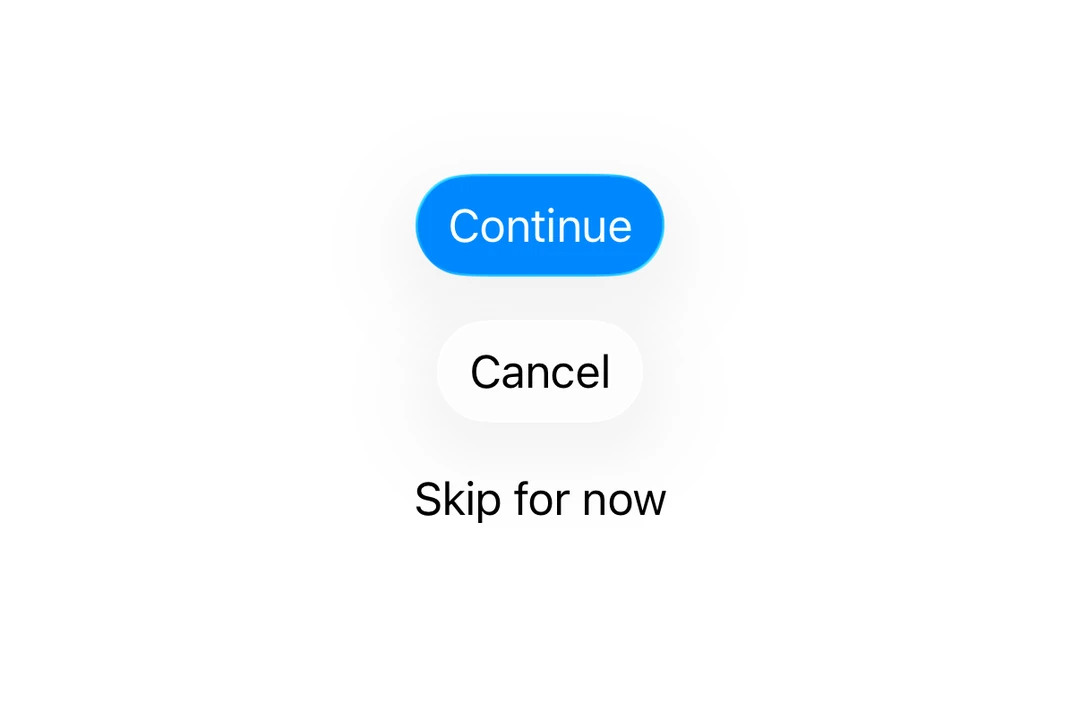
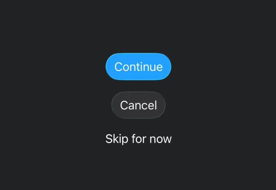
This documentation is available as Markdown for AI agents and LLMs. See the full Markdown index or append .md to any documentation URL.
Button A SwiftUI Button component for displaying native buttons.
Recommended version:
~57.0.22
For cross-platform usage, see the universal Button
Expo UI Button matches the official SwiftUI Button API and supports styling via the buttonStylecontrolSize
Installation
- npx expo install @expo/ui
- yarn expo install @expo/ui
- pnpm expo install @expo/ui
- bun expo install @expo/ui
If you are installing this in an existing React Native app , make sure to install expo in your project.
Usage
import { Host , Button } from '@expo/ui/swift-ui' ;
export default function BasicButtonExample ( ) {
return (
< Host style = { { flex: 1 } } >
< Button label = " Press me" onPress = { ( ) => alert ( 'Pressed!' ) } />
</ Host > ) ;
}
ButtonWithImageExample.tsx import { Host , Button } from '@expo/ui/swift-ui' ;
export default function ButtonWithImageExample ( ) {
return (
< Host style = { { flex: 1 } } >
< Button label = " Download" systemImage = " arrow.down.circle" onPress = { ( ) => alert ( 'Downloading...' ) } />
</ Host > ) ;
}
Use the labelStyle modifier to show only the icon while keeping the label for accessibility.
IconOnlyButtonExample.tsx import { Host , Button } from '@expo/ui/swift-ui' ;
import { labelStyle } from '@expo/ui/swift-ui/modifiers' ;
export default function IconOnlyButtonExample ( ) {
return (
< Host style = { { flex: 1 } } >
< Button label = " Settings" systemImage = " gear" modifiers = { [ labelStyle ( 'iconOnly' ) ] } onPress = { ( ) => alert ( 'Settings' ) } />
</ Host > ) ;
}
Use the buttonStyle modifier to change the button's appearance. Available styles are: bordered, borderedProminent, borderless, plain, glass, and glassProminent.
Note: The glass and glassProminent styles are only available on iOS 26+ when built with Xcode 26.
import { Host , Button , VStack } from '@expo/ui/swift-ui' ;
import { buttonStyle } from '@expo/ui/swift-ui/modifiers' ;
export default function ButtonStylesExample ( ) {
return (
< Host style = { { flex: 1 } } >
< VStack spacing = { 8 } >
< Button label = " Bordered" modifiers = { [ buttonStyle ( 'bordered' ) ] } />
< Button label = " Bordered Prominent" modifiers = { [ buttonStyle ( 'borderedProminent' ) ] } />
< Button label = " Borderless" modifiers = { [ buttonStyle ( 'borderless' ) ] } />
< Button label = " Plain" modifiers = { [ buttonStyle ( 'plain' ) ] } />
</ VStack >
</ Host > ) ;
}
Use the buttonBorderShape modifier to change the shape of a styled button. Available shapes are: automatic, capsule, roundedRectangle, and circle (iOS 17+).
ButtonBorderShapeExample.tsx import { Host , Button } from '@expo/ui/swift-ui' ;
import {
buttonStyle,
controlSize,
buttonBorderShape,
labelStyle,
} from '@expo/ui/swift-ui/modifiers' ;
export default function ButtonBorderShapeExample ( ) {
return (
< Host style = { { flex: 1 } } >
< Button label = " Favorite" systemImage = " heart.fill" modifiers = { [
buttonStyle ( 'glass' ) ,
controlSize ( 'extraLarge' ) ,
labelStyle ( 'iconOnly' ) ,
buttonBorderShape ( 'circle' ) ,
] } onPress = { ( ) => alert ( 'Favorited' ) } />
</ Host > ) ;
}
Control sizes
Use the controlSize modifier to adjust the button size. Available sizes are: mini, small, regular, large, and extraLarge.
Note: The extraLarge size is only available on iOS 17+.
import { Host , Button , VStack } from '@expo/ui/swift-ui' ;
import {
buttonStyle,
controlSize,
} from '@expo/ui/swift-ui/modifiers' ;
export default function ControlSizeExample ( ) {
return (
< Host style = { { flex: 1 } } >
< VStack spacing = { 8 } >
< Button label = " Mini" modifiers = { [ controlSize ( 'mini' ) , buttonStyle ( 'bordered' ) ] } />
< Button label = " Small" modifiers = { [
controlSize ( 'small' ) ,
buttonStyle ( 'bordered' ) ,
] } />
< Button label = " Regular" modifiers = { [
controlSize ( 'regular' ) ,
buttonStyle ( 'bordered' ) ,
] } />
< Button label = " Large" modifiers = { [
controlSize ( 'large' ) ,
buttonStyle ( 'bordered' ) ,
] } />
</ VStack >
</ Host > ) ;
}
Use the role prop to indicate the semantic role of the button. Available roles are: default, cancel, and destructive.
import { Host , Button , VStack } from '@expo/ui/swift-ui' ;
export default function ButtonRolesExample ( ) {
return (
< Host style = { { flex: 1 } } >
< VStack spacing = { 8 } >
< Button label = " Default" role = " default" />
< Button label = " Cancel" role = " cancel" />
< Button label = " Delete" role = " destructive" />
</ VStack >
</ Host > ) ;
}
Use the tint modifier to change the button's color.
import { Host , Button } from '@expo/ui/swift-ui' ;
import { tint } from '@expo/ui/swift-ui/modifiers' ;
export default function TintedButtonExample ( ) {
return (
< Host style = { { flex: 1 } } >
< Button label = " Custom Color" modifiers = { [ tint ( '#FF6347' ) ] } />
</ Host > ) ;
}
Use the disabled modifier to disable the button.
DisabledButtonExample.tsx import { Host , Button } from '@expo/ui/swift-ui' ;
import { disabled } from '@expo/ui/swift-ui/modifiers' ;
export default function DisabledButtonExample ( ) {
return (
< Host style = { { flex: 1 } } >
< Button label = " Disabled" modifiers = { [ disabled ( ) ] } />
</ Host > ) ;
}
Custom label content
You can pass custom components as children for more complex button label content.
import {
Host ,
Button ,
VStack ,
Image ,
Text ,
} from '@expo/ui/swift-ui' ;
export default function CustomContentExample ( ) {
return (
< Host style = { { flex: 1 } } >
< Button onPress = { ( ) => console . log ( 'Pressed!' ) } >
< VStack spacing = { 4 } >
< Image systemName = " folder" />
< Text > Folder </ Text >
</ VStack >
</ Button >
</ Host > ) ;
}
API
import { Button } from '@expo/ui/swift-ui' ;
Component Type: React.Element < ButtonProps >
Displays a native button component.
import { Button } from '@expo/ui/swift-ui' ;
import { buttonStyle, controlSize, tint, disabled } from '@expo/ui/swift-ui/modifiers' ;
< Button role = " destructive" onPress = { handlePress} label = " Delete" modifiers = { [
buttonStyle ( 'bordered' ) ,
controlSize ( 'large' ) ,
tint ( '#FF0000' ) ,
disabled ( true )
] } />
Optional • Literal type: union
Custom content for the button label. Use this for custom label views.
Only nested elements are supported, not plain strings.
Acceptable values are: ReactElement< unknown, string | JSXElementConstructor< any > > | ReactElement[]
Optional • Type: string
The text label for the button. Use this for simple text buttons.
Optional • Type: ( ) => void
A callback that is called when the button is pressed.
Optional • Type:
ButtonRole Indicates the role of the button.
Optional • Type:
SFSymbols7_0 A string describing the system image to display in the button.
Only used when label is provided.
Optional • Type: string
Target identifier for the button, used for identifying which button was pressed in widgets and live activities.
Types Literal type: string
The role of the button.
default - The default button role.cancel - A button that cancels the current operation.destructive - A button that deletes data or performs a destructive action. Acceptable values are: 'default' | 'cancel' | 'destructive'