Reference version

This documentation is available as Markdown for AI agents and LLMs. See the full Markdown index or append .md to any documentation URL.

Picker

A single-selection input with menu and wheel appearances.

Android
iOS
Web
Included in Expo Go
Recommended version:
~57.0.14

Picker is a single-selection input. You can use <Picker.Item label value /> children to declare options so that the parent Picker reads them and renders a platform-appropriate dropdown or rotor.

The universal Picker is independent of @expo/ui/community/picker, which remains a compat shim for @react-native-picker/picker. Prefer this universal Picker for new code unless you specifically need the RN-Picker API surface.
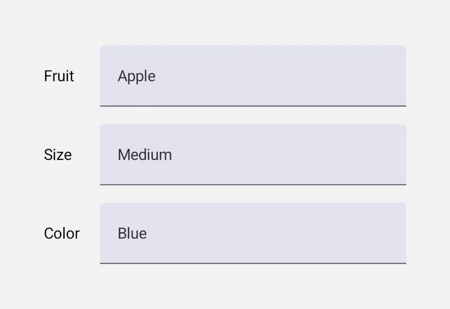
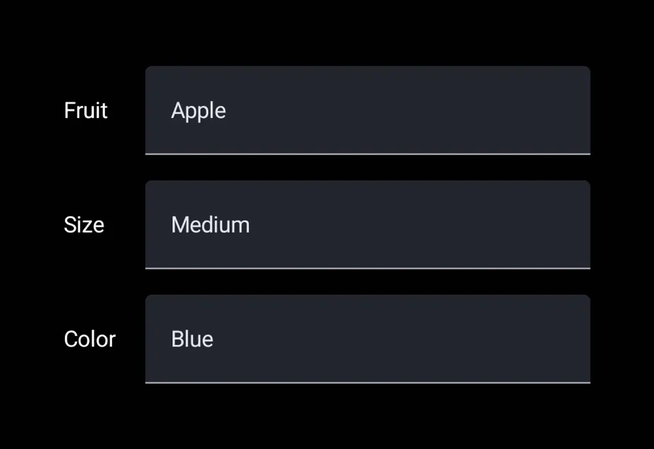
Three labeled rows with dropdown pickers set to Apple, Medium, and BlueThree labeled rows with dropdown pickers set to Apple, Medium, and Blue

Installation

Terminal
npx expo install @expo/ui
yarn expo install @expo/ui
pnpm expo install @expo/ui
bun expo install @expo/ui

If you are installing this in an existing React Native app, make sure to install expo in your project.

Usage

PickerMenuExample.tsx
import { useState } from 'react'; import { useColorScheme } from 'react-native'; import { Host, Row, Picker, Spacer, Text } from '@expo/ui'; const FLAVOURS = [ { label: 'Vanilla', value: 'vanilla' }, { label: 'Chocolate', value: 'chocolate' }, { label: 'Strawberry', value: 'strawberry' }, ]; export default function PickerMenuExample() { const [value, setValue] = useState('vanilla'); const colorScheme = useColorScheme(); return ( <Host matchContents={{ vertical: true }} style={{ width: '100%' }}> <Row alignment="center" spacing={12} style={{ padding: 16 }}> <Text textStyle={{ color: colorScheme === 'dark' ? '#FFFFFF' : '#000000' }}>Flavour:</Text> <Spacer flexible /> <Picker selectedValue={value} onValueChange={setValue}> {FLAVOURS.map(f => ( <Picker.Item key={f.value} label={f.label} value={f.value} /> ))} </Picker> </Row> </Host> ); }

Wheel appearance

appearance="wheel" renders an inline scrollable rotor on iOS. On Android and web, this falls back to the platform's default dropdown (Material 3 doesn't ship a wheel-style picker).

PickerWheelExample.tsx
import { useState } from 'react'; import { Host, Column, Picker } from '@expo/ui'; const FLAVOURS = [ { label: 'Vanilla', value: 'vanilla' }, { label: 'Chocolate', value: 'chocolate' }, { label: 'Strawberry', value: 'strawberry' }, ]; export default function PickerWheelExample() { const [value, setValue] = useState('chocolate'); return ( <Host matchContents={{ vertical: true }} style={{ width: '100%' }}> <Column spacing={8} style={{ padding: 16 }}> <Picker selectedValue={value} onValueChange={setValue} appearance="wheel"> {FLAVOURS.map(f => ( <Picker.Item key={f.value} label={f.label} value={f.value} /> ))} </Picker> </Column> </Host> ); }

API

import { Picker } from '@expo/ui';

Component

Picker

Type: React.Element<PickerProps<T>>

A single-selection input. Declare options via <Picker.Item label value /> children.

Props for the Picker component, a single-selection input.

PickerProps

appearance

Optional • Type: PickerAppearance • Default: 'menu'

Visual appearance of the picker. See PickerAppearance.

children

Optional • Type: ReactNode

<Picker.Item> children that declare the available options.

enabled

Optional • Type: boolean • Default: true

Whether the picker accepts input.

onValueChange

Type: (value: T) => void

Called when the user selects an option.

selectedValue

Type: T

The currently selected value. Must match the value of one of the <Picker.Item> children.

testID

Optional • Type: string

Identifier used to locate the component in end-to-end tests.

Interfaces

ExtractedPickerItem

Internal: extracted item data from <Picker.Item> children.

PropertyTypeDescription
labelstring
-
valueT
-

Types

PickerAppearance

Literal type: string

Visual appearance of the picker.

  • 'menu' — Compact button that opens a popup/dropdown on tap. Cross-platform default.
  • 'wheel' — Scrollable rotor UI that's always visible inline. iOS only; on Android and web this falls back to the platform's default dropdown.

Acceptable values are: 'wheel' | 'menu'

PickerItemValue

Literal type: union

The type of values a Picker.Item can carry.

Acceptable values are: string | number