This documentation is available as Markdown for AI agents and LLMs. See the full Markdown index or append .md to any documentation URL.
ColorPicker
A SwiftUI ColorPicker component for selecting colors.
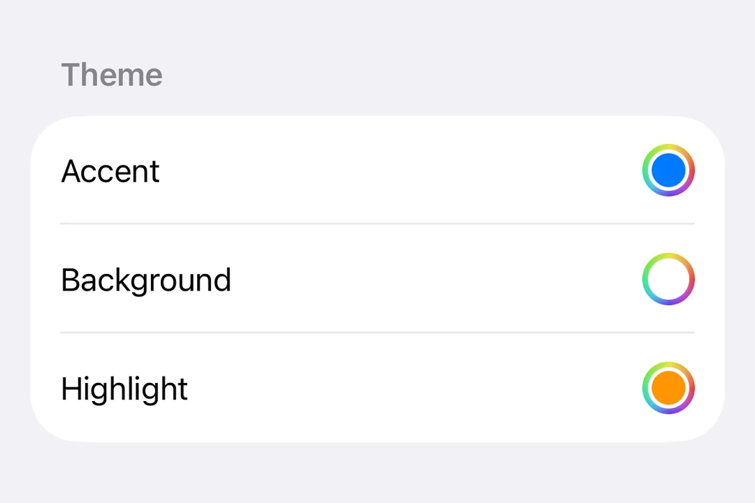
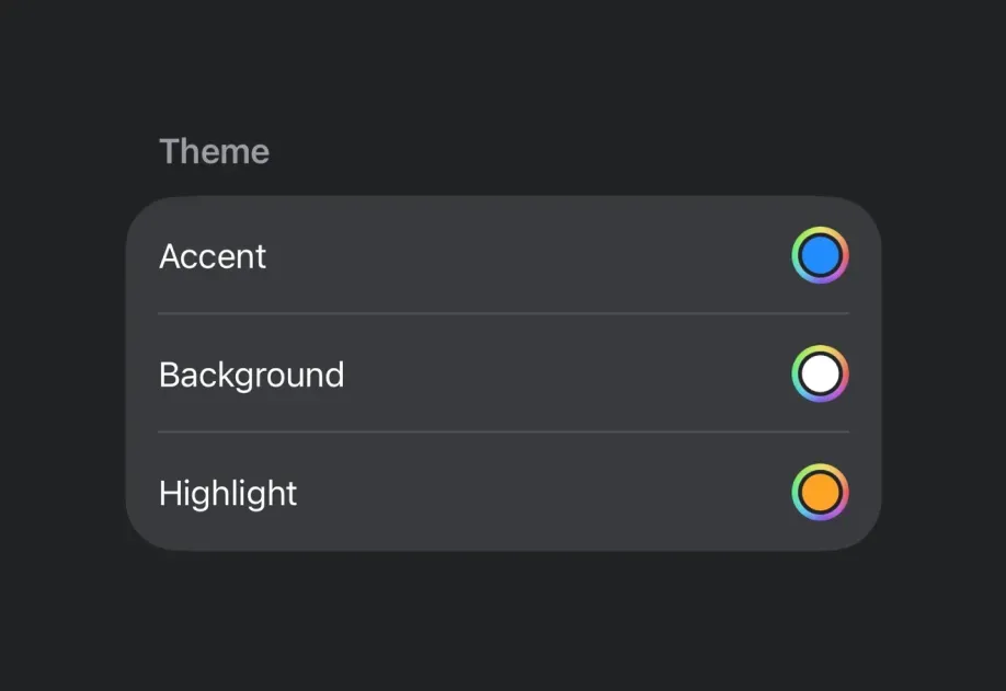
Expo UI ColorPicker matches the official SwiftUI ColorPicker API and allows app users to select colors from a palette.
Installation
- npx expo install @expo/ui- yarn expo install @expo/ui- pnpm expo install @expo/ui- bun expo install @expo/uiIf you are installing this in an existing React Native app, make sure to install expo in your project.
Usage
Basic color picker
import { useState } from 'react'; import { Host, ColorPicker } from '@expo/ui/swift-ui'; export default function ColorPickerExample() { const [color, setColor] = useState('#FF6347'); // A color picker fills the width it is given, so `matchContents` collapses it. return ( <Host style={{ flex: 1 }}> <ColorPicker label="Select a color" selection={color} onSelectionChange={setColor} /> </Host> ); }
Color picker with opacity support
Use the supportsOpacity prop to allow users to select colors with alpha transparency.
import { useState } from 'react'; import { Host, ColorPicker } from '@expo/ui/swift-ui'; export default function ColorPickerOpacityExample() { const [color, setColor] = useState('#FF634780'); return ( <Host style={{ flex: 1 }}> <ColorPicker label="Select a color with opacity" selection={color} onSelectionChange={setColor} supportsOpacity /> </Host> ); }
API
import { ColorPicker } from '@expo/ui/swift-ui';
Component
Type: React.Element<ColorPickerProps>
Renders a ColorPicker component using SwiftUI.
(value: string) => voidCallback function that is called when a new color is selected.
unionThe currently selected color in the format #RRGGBB or #RRGGBBAA.
Acceptable values are: string | null
booleanWhether the color picker should support opacity.