This documentation is available as Markdown for AI agents and LLMs. See the full Markdown index or append .md to any documentation URL.
This is documentation for the next SDK version. For up-to-date documentation, see the latest version (SDK 57).
TextField
Jetpack Compose TextField components for native Material3 text input.
For cross-platform usage, see the universalTextInput— it renders the appropriate native component per platform.
Expo UI provides three text field components that match the official Jetpack Compose TextField API: TextField (filled), OutlinedTextField (outlined border), and BasicTextField (unstyled). The Material variants TextField and OutlinedTextField share the same props and support composable slot children for label, placeholder, icons, prefix, suffix, and supporting text. BasicTextField has no Material chrome, so you supply your own decoration.
| Type | Appearance | Purpose |
|---|---|---|
| Filled | Solid background with a bottom indicator line. | Default text input style following Material3 design. Use for most forms and input fields. |
| Outlined | Transparent background with a border outline. | Alternative style that provides a distinct visual boundary. Use when filled fields blend into the background. |
| Basic | No container, indicator, or padding. Just the editable text. | Fully custom-styled inputs. Style it yourself and add decoration through DecorationBox. |
Installation
- npx expo install @expo/uiIf you are installing this in an existing React Native app, make sure to install expo in your project.
Usage
Uncontrolled text field
Bind a useNativeState observable to value. The field tracks the user's input on its own, and you read the current value from text.value. The filled style shown here is the default Material3 text input.
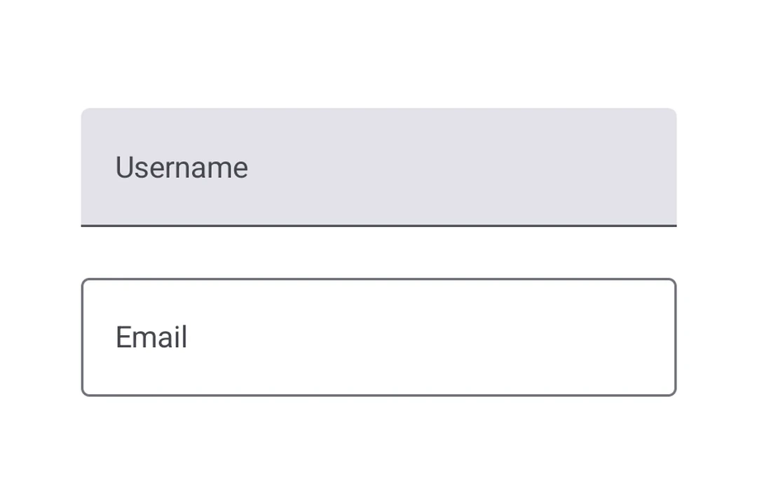
import { Host, TextField, Text, useNativeState } from '@expo/ui/jetpack-compose';

export default function UncontrolledTextFieldExample() {
  const text = useNativeState('');

  return (
    <Host matchContents>
      <TextField value={text}>
        <TextField.Label>
          <Text>Username</Text>
        </TextField.Label>
      </TextField>
    </Host>
  );
}
Controlled text field
Pass a useNativeState observable as value and an onValueChange worklet to transform or validate input before writing it back. The example below uppercases the text as it is typed.
Note: Worklets require installing
react-native-worklets.
import { Host, TextField, Text, useNativeState } from '@expo/ui/jetpack-compose';
import { useCallback } from 'react';

export default function ControlledTextFieldExample() {
  const text = useNativeState('');

  const handleValueChange = useCallback(
    (value: string) => {
      'worklet';
      text.value = value.toUpperCase();
    },
    [text]
  );

  return (
    <Host matchContents>
      <TextField value={text} onValueChange={handleValueChange}>
        <TextField.Label>
          <Text>Name</Text>
        </TextField.Label>
      </TextField>
    </Host>
  );
}
Outlined text field
Use OutlinedTextField for a text field with a border outline instead of a filled background.
import { Host, OutlinedTextField, Text, useNativeState } from '@expo/ui/jetpack-compose';

export default function OutlinedTextFieldExample() {
  const text = useNativeState('');

  return (
    <Host matchContents>
      <OutlinedTextField value={text}>
        <OutlinedTextField.Label>
          <Text>Email</Text>
        </OutlinedTextField.Label>
        <OutlinedTextField.Placeholder>
          <Text>you@example.com</Text>
        </OutlinedTextField.Placeholder>
      </OutlinedTextField>
    </Host>
  );
}
Basic text field
BasicTextField is the unstyled Compose primitive, with no container, indicator, or padding. Style it yourself with modifiers and supply decoration through DecorationBox, placing InnerTextField where the editable text should render. Wrap placeholder content in Placeholder to have it shown only while the field is empty, toggled natively from the field's text.
import { Host, BasicTextField, Box, Text, useNativeState } from '@expo/ui/jetpack-compose';
import {
  background,
  clip,
  fillMaxWidth,
  padding,
  Shapes,
} from '@expo/ui/jetpack-compose/modifiers';

export default function BasicTextFieldExample() {
  const value = useNativeState('');

  return (
    <Host matchContents>
      <BasicTextField
        cursorColor="#7c3aed"
        value={value}
        modifiers={[
          fillMaxWidth(),
          clip(Shapes.RoundedCorner(12)),
          background('#f3f4f6'),
          padding(12, 10, 12, 10),
        ]}>
        <BasicTextField.DecorationBox>
          <Box>
            <BasicTextField.Placeholder>
              <Text color="#9ca3af">Search…</Text>
            </BasicTextField.Placeholder>
            <BasicTextField.InnerTextField />
          </Box>
        </BasicTextField.DecorationBox>
      </BasicTextField>
    </Host>
  );
}
Slots
Both TextField and OutlinedTextField support 7 composable slots that match the Compose API: Label, Placeholder, LeadingIcon, TrailingIcon, Prefix, Suffix, and SupportingText.
import { Host, TextField, Text, useNativeState } from '@expo/ui/jetpack-compose';

export default function TextFieldSlotsExample() {
  const text = useNativeState('');

  return (
    <Host matchContents>
      <TextField value={text}>
        <TextField.Label>
          <Text>Price</Text>
        </TextField.Label>
        <TextField.Placeholder>
          <Text>0.00</Text>
        </TextField.Placeholder>
        <TextField.LeadingIcon>
          <Text>💰</Text>
        </TextField.LeadingIcon>
        <TextField.Prefix>
          <Text>$</Text>
        </TextField.Prefix>
        <TextField.Suffix>
          <Text>USD</Text>
        </TextField.Suffix>
        <TextField.SupportingText>
          <Text>Enter the amount</Text>
        </TextField.SupportingText>
      </TextField>
    </Host>
  );
}
Keyboard options
Use the keyboardOptions prop to configure the keyboard type, capitalization, auto-correct, and IME action.
import { Host, TextField, Text, useNativeState } from '@expo/ui/jetpack-compose';

export default function KeyboardOptionsExample() {
  const text = useNativeState('');

  return (
    <Host matchContents>
      <TextField
        value={text}
        singleLine
        keyboardOptions={{
          keyboardType: 'email',
          capitalization: 'none',
          autoCorrectEnabled: false,
          imeAction: 'done',
        }}>
        <TextField.Label>
          <Text>Email</Text>
        </TextField.Label>
      </TextField>
    </Host>
  );
}
Keyboard actions
Use the keyboardActions prop to handle IME action button presses. The triggered callback depends on the imeAction set in keyboardOptions. Each callback receives the current text value.
import { Host, TextField, Text, useNativeState } from '@expo/ui/jetpack-compose';

export default function KeyboardActionsExample() {
  const text = useNativeState('');

  return (
    <Host matchContents>
      <TextField
        value={text}
        singleLine
        keyboardOptions={{ imeAction: 'search' }}
        keyboardActions={{
          onSearch: value => console.log('Searched:', value),
        }}>
        <TextField.Label>
          <Text>Search</Text>
        </TextField.Label>
      </TextField>
    </Host>
  );
}
Imperative ref
Use a ref to imperatively set text, clear the field, change the selection, or move focus.
import { useRef } from 'react';
import {
  Host,
  TextField,
  TextFieldRef,
  Button,
  Row,
  Text,
  Column,
  useNativeState,
} from '@expo/ui/jetpack-compose';
import { padding } from '@expo/ui/jetpack-compose/modifiers';

export default function ImperativeRefExample() {
  const ref = useRef<TextFieldRef>(null);
  const text = useNativeState('');

  return (
    <Host matchContents>
      <Column>
        <TextField ref={ref} value={text} singleLine>
          <TextField.Label>
            <Text>Name</Text>
          </TextField.Label>
        </TextField>
        <Row horizontalArrangement={{ spacedBy: 8 }} modifiers={[padding(8, 0, 0, 0)]}>
          <Button onClick={() => ref.current?.setText('Hello world')}>
            <Text>Set text</Text>
          </Button>
          <Button onClick={() => ref.current?.clear()}>
            <Text>Clear</Text>
          </Button>
          <Button onClick={() => ref.current?.setSelection(0, 5)}>
            <Text>Select first word</Text>
          </Button>
        </Row>
        <Row horizontalArrangement={{ spacedBy: 8 }} modifiers={[padding(8, 0, 0, 0)]}>
          <Button onClick={() => ref.current?.focus()}>
            <Text>Focus</Text>
          </Button>
          <Button onClick={() => ref.current?.blur()}>
            <Text>Blur</Text>
          </Button>
        </Row>
      </Column>
    </Host>
  );
}
Worklet text masking
When onValueChange is marked with the 'worklet' directive, it runs synchronously on the UI thread, so writes to useNativeState observables inside the callback take effect before the next frame. There is no flicker between the typed text and the masked text. The example below masks a phone number as the user types and writes both value and selection from the worklet to keep the cursor at the end of the formatted value.
Note: Worklets require installing
react-native-worklets.
import { Host, TextField, Text, useNativeState } from '@expo/ui/jetpack-compose';
import { fillMaxWidth } from '@expo/ui/jetpack-compose/modifiers';
import { useCallback } from 'react';

export default function WorkletPhoneMaskExample() {
  const phone = useNativeState('');
  const selection = useNativeState({ start: 0, end: 0 });

  const handleValueChange = useCallback(
    (v: string) => {
      'worklet';
      const digits = v.replace(/\D/g, '').slice(0, 10);
      let formatted = digits;
      if (digits.length > 6) {
        formatted = `(${digits.slice(0, 3)}) ${digits.slice(3, 6)}-${digits.slice(6)}`;
      } else if (digits.length > 3) {
        formatted = `(${digits.slice(0, 3)}) ${digits.slice(3)}`;
      }
      if (formatted !== v) {
        phone.value = formatted;
        // Snaps to end for demo. Real masks need smarter cursor handling.
        selection.value = { start: formatted.length, end: formatted.length };
      }
    },
    [phone, selection]
  );

  return (
    <Host matchContents>
      <TextField
        value={phone}
        selection={selection}
        keyboardOptions={{ keyboardType: 'phone' }}
        modifiers={[fillMaxWidth()]}
        onValueChange={handleValueChange}>
        <TextField.Placeholder>
          <Text>(555) 123-4567</Text>
        </TextField.Placeholder>
      </TextField>
    </Host>
  );
}
API
import { TextField, OutlinedTextField, BasicTextField } from '@expo/ui/jetpack-compose';
Components
Type: React.Element<BasicTextFieldProps>
A bare, unstyled Compose BasicTextField with no Material decoration.
Props for BasicTextField. Mirrors Compose's BasicTextField: a bare,
unstyled text field with no Material chrome (no container, indicator, or
built-in padding). Shares CommonTextFieldProperties with TextField and
OutlinedTextField; use BasicTextField.DecorationBox to add your own
decoration.
ColorValueColor of the text cursor. Maps to Compose's cursorBrush via
SolidColor(color). Defaults to the theme's primary color
(MaterialTheme.colorScheme.primary) so it stays visible in light and dark.
Type: React.Element<OutlinedTextFieldProps>
A Material3 OutlinedTextField with a transparent background and border outline.
Props shared by every Compose text field variant — TextField,
OutlinedTextField, and BasicTextField. The Material variants add their
own decoration props (isError, shape, colors, slot children);
BasicTextField adds cursorColor.
TextFieldColorsShapeJSXElementShape used for the field's container outline/fill. Use the helpers from
Shape (for example, <Shape.Pill /> or <Shape.RoundedCorner cornerRadii={...} />).
Defaults to the Material OutlinedTextFieldDefaults.shape/TextFieldDefaults.shape.
Type: React.Element<TextFieldProps>
A Material3 TextField.
Props shared by every Compose text field variant — TextField,
OutlinedTextField, and BasicTextField. The Material variants add their
own decoration props (isError, shape, colors, slot children);
BasicTextField adds cursorColor.
TextFieldColorsShapeJSXElementShape used for the field's container outline/fill. Use the helpers from
Shape (for example, <Shape.Pill /> or <Shape.RoundedCorner cornerRadii={...} />).
Defaults to the Material OutlinedTextFieldDefaults.shape/TextFieldDefaults.shape.
Types
Type: TextFieldRef
Imperative methods for BasicTextField. Identical to TextFieldRef.
Props shared by every Compose text field variant — TextField,
OutlinedTextField, and BasicTextField. The Material variants add their
own decoration props (isError, shape, colors, slot children);
BasicTextField adds cursorColor.
| Property | Type | Description |
|---|---|---|
| autoFocus(optional) | boolean | If true, the text field will be focused automatically when mounted. Default: false |
| children(optional) | ReactNode | Slot children that configure the field's decoration. |
| enabled(optional) | boolean | Default: true |
| keyboardActions(optional) | TextFieldKeyboardActions | - |
| keyboardOptions(optional) | TextFieldKeyboardOptions | - |
| maxLength(optional) | number | Maximum number of characters allowed. Truncates natively as the user types. |
| maxLines(optional) | number | - |
| minLines(optional) | number | - |
| modifiers(optional) | ModifierConfig[] | - |
| onFocusChanged(optional) | (focused: boolean) => void | A callback triggered when the field gains or loses focus. |
| onSelectionChange(optional) | (selection: {
end: number,
start: number
}) => void | Called when the selection range changes. |
| onValueChange(optional) | (value: string) => void | Fires whenever the text value changes. If marked with the |
| readOnly(optional) | boolean | Default: false |
| ref(optional) | Ref<TextFieldRef> | - |
| selection(optional) | ObservableState<{
end: number,
start: number
}> | Observable state holding the current selection range. Create with
|
| singleLine(optional) | boolean | Default: false |
| textSelectionColors(optional) | {
backgroundColor: ColorValue,
handleColor: ColorValue
} | Selection-related colors. Maps to Compose's |
| textStyle(optional) | TextFieldTextStyle | Text styling for the field's content. Maps to Compose's |
| value(optional) | ObservableState<string> | An observable state that holds the current text value. Create one with
|
| visualTransformation(optional) | 'password' | 'none' | Display-time text transformation. |
Observable state shared between JavaScript and native views (Jetpack Compose on Android and SwiftUI on iOS).
Type: SharedObject extended by:
| Property | Type | Description |
|---|---|---|
| onChange | [listener] | null | A single listener invoked on the native UI runtime whenever the value changes
(after iOS The callback must be a worklet so it can run synchronously on the UI thread.
Attach it inside Example
|
| value | T | The current value. Writes from a UI worklet are synchronous and immediately readable. Writes from the JS thread are scheduled to the UI thread asynchronously, the new value is not readable until the update has been applied. Prefer writing from a worklet when you need synchronous updates |
| get | () => T | Reads the current value. A React Compiler compliant alternative to reading |
| set | (value: T) => void | Writes a new value. A React Compiler-compliant alternative to assigning |
Literal Type: string
Acceptable values are: 'none' | 'characters' | 'words' | 'sentences'
Colors for TextField and OutlinedTextField.
Maps to TextFieldColors in Compose, shared by both variants.
| Property | Type | Description |
|---|---|---|
| cursorColor(optional) | ColorValue | - |
| disabledContainerColor(optional) | ColorValue | - |
| disabledIndicatorColor(optional) | ColorValue | - |
| disabledLabelColor(optional) | ColorValue | - |
| disabledLeadingIconColor(optional) | ColorValue | - |
| disabledPlaceholderColor(optional) | ColorValue | - |
| disabledPrefixColor(optional) | ColorValue | - |
| disabledSuffixColor(optional) | ColorValue | - |
| disabledSupportingTextColor(optional) | ColorValue | - |
| disabledTextColor(optional) | ColorValue | - |
| disabledTrailingIconColor(optional) | ColorValue | - |
| errorContainerColor(optional) | ColorValue | - |
| errorCursorColor(optional) | ColorValue | - |
| errorIndicatorColor(optional) | ColorValue | - |
| errorLabelColor(optional) | ColorValue | - |
| errorLeadingIconColor(optional) | ColorValue | - |
| errorPlaceholderColor(optional) | ColorValue | - |
| errorPrefixColor(optional) | ColorValue | - |
| errorSuffixColor(optional) | ColorValue | - |
| errorSupportingTextColor(optional) | ColorValue | - |
| errorTextColor(optional) | ColorValue | - |
| errorTrailingIconColor(optional) | ColorValue | - |
| focusedContainerColor(optional) | ColorValue | - |
| focusedIndicatorColor(optional) | ColorValue | - |
| focusedLabelColor(optional) | ColorValue | - |
| focusedLeadingIconColor(optional) | ColorValue | - |
| focusedPlaceholderColor(optional) | ColorValue | - |
| focusedPrefixColor(optional) | ColorValue | - |
| focusedSuffixColor(optional) | ColorValue | - |
| focusedSupportingTextColor(optional) | ColorValue | - |
| focusedTextColor(optional) | ColorValue | - |
| focusedTrailingIconColor(optional) | ColorValue | - |
| unfocusedContainerColor(optional) | ColorValue | - |
| unfocusedIndicatorColor(optional) | ColorValue | - |
| unfocusedLabelColor(optional) | ColorValue | - |
| unfocusedLeadingIconColor(optional) | ColorValue | - |
| unfocusedPlaceholderColor(optional) | ColorValue | - |
| unfocusedPrefixColor(optional) | ColorValue | - |
| unfocusedSuffixColor(optional) | ColorValue | - |
| unfocusedSupportingTextColor(optional) | ColorValue | - |
| unfocusedTextColor(optional) | ColorValue | - |
| unfocusedTrailingIconColor(optional) | ColorValue | - |
Literal Type: string
Acceptable values are: 'default' | 'none' | 'go' | 'search' | 'send' | 'previous' | 'next' | 'done'
Keyboard actions matching Compose KeyboardActions.
The triggered callback depends on the imeAction in keyboardOptions.
| Property | Type | Description |
|---|---|---|
| onDone(optional) | (value: string) => void | - |
| onGo(optional) | (value: string) => void | - |
| onNext(optional) | (value: string) => void | - |
| onPrevious(optional) | (value: string) => void | - |
| onSearch(optional) | (value: string) => void | - |
| onSend(optional) | (value: string) => void | - |
Keyboard options matching Compose KeyboardOptions.
| Property | Type | Description |
|---|---|---|
| autoCorrectEnabled(optional) | boolean | Default: true |
| capitalization(optional) | TextFieldCapitalization | Default: 'none' |
| imeAction(optional) | TextFieldImeAction | Default: 'default' |
| keyboardType(optional) | TextFieldKeyboardType | Default: 'text' |
Literal Type: string
Acceptable values are: 'text' | 'number' | 'email' | 'phone' | 'decimal' | 'password' | 'ascii' | 'uri' | 'numberPassword'
Can be used for imperatively focusing and setting text/selection on the
TextField, OutlinedTextField, and BasicTextField components.
Text styling for a text field's content. Maps to Compose's TextStyle.
Shared by TextField, OutlinedTextField, and BasicTextField.
| Property | Type | Description |
|---|---|---|
| color(optional) | ColorValue | - |
| fontFamily(optional) | string | - |
| fontSize(optional) | number | - |
| fontWeight(optional) | '100' | '200' | '300' | '400' | '500' | '600' | '700' | '800' | '900' | 'normal' | 'bold' | - |
| letterSpacing(optional) | number | - |
| lineHeight(optional) | number | - |
| textAlign(optional) | 'left' | 'right' | 'center' | 'justify' | - |