This documentation is available as Markdown for AI agents and LLMs. See the full Markdown index or append .md to any documentation URL.
This is documentation for the next SDK version.
Image
A Jetpack Compose Image component for displaying images.
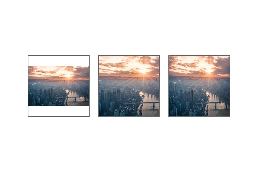
Expo UI Image wraps the official Jetpack Compose Image API and displays a bundled or remote image. Set the size with modifiers such as size, width, or fillMaxWidth, then contentScale to control how the image fills those bounds.
Installation
- npx expo install @expo/uiIf you are installing this in an existing React Native app, make sure to install expo in your project.
Usage
import { Host, Image } from '@expo/ui/jetpack-compose';
import { size } from '@expo/ui/jetpack-compose/modifiers';

export default function ImageExample() {
  return (
    <Host matchContents>
      <Image
        source={require('./assets/photo.jpg')}
        contentScale="crop"
        contentDescription="A mountain at sunset"
        modifiers={[size(240, 160)]}
      />
    </Host>
  );
}
API
import { Image } from '@expo/ui/jetpack-compose';
Component
Type: React.Element<ImageProps>
Displays an image using Jetpack Compose.
Size the image with modifiers such as size, width, height, or fillMaxSize.
Example
import { Image } from '@expo/ui/jetpack-compose';
import { size } from '@expo/ui/jetpack-compose/modifiers';

<Image
  source={require('./photo.png')}
  contentScale="crop"
  contentDescription="A mountain at sunset"
  modifiers={[size(160, 100)]}
/>
ContentAlignment • Default: 'center'How the image should be aligned within its bounds.
number • Default: 1Opacity of the image between 0 and 1.
Example
<Image source={require('./icon.png')} alpha={0.5} />
unionAccessibility label for the image.
Used by screen readers to describe the image to users.
Use null for decorative images.
Example
<Image
  source={require('./photo.png')}
  contentDescription="A mountain at sunset"
/>
Acceptable values are: string | null
ImageContentScale • Default: 'fit'How the image should be scaled to fit its bounds.
Example
<Image source={require('./photo.png')} contentScale="crop" />
(error: string) => voidCallback that is called when the image fails to load.
ImageSourceA bundled image or an object containing a single local or remote URI.
Example
<Image source={require('./photo.png')} />
<Image source={{ uri: 'file:///path/to/photo.png' }} />
ColorValueOptional color applied to every non-transparent image pixel.
Example
<Image source={require('./icon.png')} tint="#007AFF" />
<Image source={require('./icon.png')} tint="blue" />
Types
Literal type: string
Controls how an image is scaled inside its bounds.
Acceptable values are: 'fit' | 'crop' | 'fillBounds' | 'fillWidth' | 'fillHeight' | 'inside' | 'none'