This documentation is available as Markdown for AI agents and LLMs. See the full Markdown index or append .md to any documentation URL.
This is documentation for the next SDK version. For up-to-date documentation, see the latest version (SDK 57).
Surface
A Jetpack Compose Surface component for styled content containers.
Expo UI Surface matches the official Jetpack Compose Surface API and provides a container that applies Material Design surface styling including color, elevation, and content color.
Installation
- npx expo install @expo/uiIf you are installing this in an existing React Native app, make sure to install expo in your project.
Usage
Basic surface
import { Host, Surface, Text } from '@expo/ui/jetpack-compose';
import { paddingAll } from '@expo/ui/jetpack-compose/modifiers';

export default function BasicSurfaceExample() {
  return (
    <Host matchContents>
      <Surface modifiers={[paddingAll(16)]}>
        <Text>Content on a surface</Text>
      </Surface>
    </Host>
  );
}
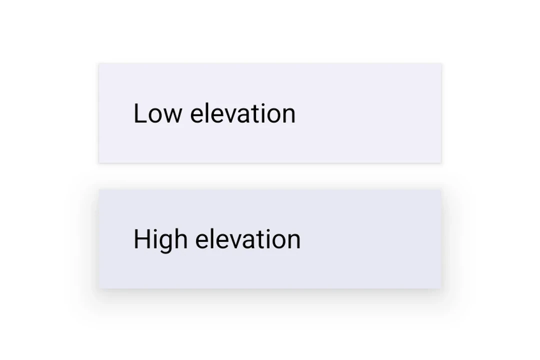
Surface with elevation
Use tonalElevation and shadowElevation to control the visual depth of the surface.
import { Host, Surface, Column, Text } from '@expo/ui/jetpack-compose';
import { paddingAll } from '@expo/ui/jetpack-compose/modifiers';

export default function SurfaceElevationExample() {
  return (
    <Host matchContents>
      <Column modifiers={[paddingAll(16)]}>
        <Surface tonalElevation={1} shadowElevation={2} modifiers={[paddingAll(16)]}>
          <Text>Low elevation</Text>
        </Surface>
        <Surface tonalElevation={4} shadowElevation={8} modifiers={[paddingAll(16)]}>
          <Text>High elevation</Text>
        </Surface>
      </Column>
    </Host>
  );
}
Surface with custom colors
Use the color and contentColor props to override the default Material theme colors.
import { Host, Surface, Text } from '@expo/ui/jetpack-compose';
import { paddingAll } from '@expo/ui/jetpack-compose/modifiers';

export default function SurfaceCustomColorsExample() {
  return (
    <Host matchContents>
      <Surface
        color="#1E3A5F"
        contentColor="#FFFFFF"
        tonalElevation={2}
        modifiers={[paddingAll(16)]}>
        <Text color="#FFFFFF">Custom colored surface</Text>
      </Surface>
    </Host>
  );
}
Surface with shape and border
Use the shape prop to clip content and border to draw a stroke around the surface.
import { Host, Surface, Shape, Text } from '@expo/ui/jetpack-compose';
import { paddingAll } from '@expo/ui/jetpack-compose/modifiers';

export default function SurfaceShapeBorderExample() {
  return (
    <Host matchContents>
      <Surface
        shape={Shape.RoundedCorner({
          cornerRadii: { topStart: 16, topEnd: 16, bottomStart: 16, bottomEnd: 16 },
        })}
        border={{ width: 2, color: '#6200EE' }}
        modifiers={[paddingAll(16)]}>
        <Text>Rounded surface with border</Text>
      </Surface>
    </Host>
  );
}
API
import { Surface } from '@expo/ui/jetpack-compose';
Component
Type: React.Element<SurfaceProps>
A Material Design surface container. Surface is responsible for:
- Clipping content to the shape
- Applying background color based on tonal elevation
- Providing content color to its children
booleanWhether the surface is in a checked (toggled on) state. When provided together with
onCheckedChange, the surface becomes a toggleable surface.
ColorValueThe background color of the surface.
Defaults to MaterialTheme.colorScheme.surface.
ColorValueThe color of the content inside the surface.
Defaults to contentColorFor(color).
boolean • Default: trueWhether the surface is enabled and responds to user interaction.
(checked: boolean) => voidCalled when the checked state of a toggleable surface changes.
Providing this callback together with checked enables the toggleable variant.
() => voidCalled when the surface is clicked. Providing this callback makes the surface clickable.
When combined with selected, the surface becomes a selectable variant.
booleanWhether the surface is in a selected state. When provided together with onClick,
the surface becomes a selectable surface that visually reflects its selection state.
number • Default: 0The shadow elevation of the surface. Value in dp.
Types
Border stroke configuration.
| Property | Type | Description |
|---|---|---|
| color(optional) | ColorValue | Border color. Default: MaterialTheme.colorScheme.outline |
| width(optional) | number | Border width in dp. Default: 1 |