This documentation is available as Markdown for AI agents and LLMs. See the full Markdown index or append .md to any documentation URL.
This is documentation for the next SDK version. For up-to-date documentation, see the latest version (SDK 57).
HorizontalFloatingToolbar
A Jetpack Compose HorizontalFloatingToolbar component for displaying a floating action bar.
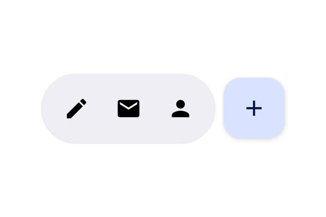
Expo UI HorizontalFloatingToolbar wraps the official Jetpack Compose HorizontalFloatingToolbar and displays a horizontal toolbar that floats above content, containing action buttons.
Note: If you only need a single floating button, use
FloatingActionButtoninstead.
Installation
- npx expo install @expo/uiIf you are installing this in an existing React Native app, make sure to install expo in your project.
Usage
Floating toolbar over scrollable content
Place the toolbar inside a Box with floatingToolbarExitAlwaysScrollBehavior to get scroll-driven hide/show behavior. Use align('bottomCenter') to position the toolbar at the bottom of the screen. The entire layout stays within the Compose layer — no React Native absolute positioning needed.
import {
  Box,
  HorizontalFloatingToolbar,
  Host,
  Icon,
  IconButton,
  LazyColumn,
  ListItem,
  Text,
} from '@expo/ui/jetpack-compose';
import {
  align,
  fillMaxSize,
  offset,
} from '@expo/ui/jetpack-compose/modifiers';

const ITEMS = Array.from(
  { length: 20 },
  (_, index) => `Item ${index + 1}`
);

export default function FloatingToolbarExample() {
  return (
    <Host style={{ flex: 1 }}>
      <Box
        modifiers={[fillMaxSize()]}
        floatingToolbarExitAlwaysScrollBehavior="bottom">
        <LazyColumn modifiers={[fillMaxSize()]}>
          {ITEMS.map(item => (
            <ListItem key={item}>
              <ListItem.HeadlineContent>
                <Text>{item}</Text>
              </ListItem.HeadlineContent>
            </ListItem>
          ))}
        </LazyColumn>

        <HorizontalFloatingToolbar
          variant="vibrant"
          modifiers={[align('bottomCenter'), offset(0, -16)]}>
          <IconButton onClick={() => console.log('Edit pressed')}>
            <Icon source={require('./assets/edit.xml')} />
          </IconButton>
          <HorizontalFloatingToolbar.FloatingActionButton
            onPress={() => console.log('Add pressed')}>
            <Icon source={require('./assets/add.xml')} />
          </HorizontalFloatingToolbar.FloatingActionButton>
        </HorizontalFloatingToolbar>
      </Box>
    </Host>
  );
}
Toolbar with FloatingActionButton
Use IconButton as direct children for toolbar items, and HorizontalFloatingToolbar.FloatingActionButton for the primary action.
import {
  Host,
  HorizontalFloatingToolbar,
  IconButton,
  Icon,
} from '@expo/ui/jetpack-compose';

export default function ToolbarWithFABExample() {
  return (
    <Host matchContents>
      <HorizontalFloatingToolbar>
        <IconButton onClick={() => console.log('Edit pressed')}>
          <Icon
            source={require('./assets/edit.xml')}
            contentDescription="Edit"
          />
        </IconButton>
        <IconButton onClick={() => console.log('Share pressed')}>
          <Icon
            source={require('./assets/share.xml')}
            contentDescription="Share"
          />
        </IconButton>
        <HorizontalFloatingToolbar.FloatingActionButton
          onPress={() => console.log('Add pressed')}>
          <Icon
            source={require('./assets/add.xml')}
            contentDescription="Add"
          />
        </HorizontalFloatingToolbar.FloatingActionButton>
      </HorizontalFloatingToolbar>
    </Host>
  );
}
API
import { HorizontalFloatingToolbar } from '@expo/ui/jetpack-compose';
Components
Type: React.Element<HorizontalFloatingToolbarProps>
Renders a HorizontalFloatingToolbar component.
A horizontal toolbar that floats above content, typically used for action buttons.
HorizontalFloatingToolbarColorsPer-slot color overrides. Any field set here replaces the corresponding color from the variant default; unset fields fall back to the variant.
Type: React.Element<HorizontalFloatingToolbarFloatingActionButtonProps>
FloatingActionButton component for HorizontalFloatingToolbar. This component marks its children to be rendered in the FAB slot.
Types
| Property | Type | Description |
|---|---|---|
| fabContainerColor(optional) | ColorValue | Color of the floating action button container (background). |
| fabContentColor(optional) | ColorValue | Color of the floating action button content (icon). |
| toolbarContainerColor(optional) | ColorValue | Color of the toolbar container (background). |
| toolbarContentColor(optional) | ColorValue | Color of the toolbar content (icons/text). |