This documentation is available as Markdown for AI agents and LLMs. See the full Markdown index or append .md to any documentation URL.
This is documentation for the next SDK version. For up-to-date documentation, see the latest version (SDK 57).
BadgedBox
A Jetpack Compose BadgedBox component for overlaying badges on content.
Android
Included in Expo Go
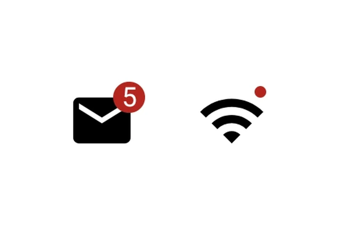
Expo UI BadgedBox matches the official Jetpack Compose BadgedBox API. It overlays a badge on top of content such as an icon.
Installation
Terminal
- npx expo install @expo/uiIf you are installing this in an existing React Native app, make sure to install expo in your project.
Usage
Icon with badge count
IconWithBadge.tsx
import { Host, Badge, BadgedBox, Icon, Text } from '@expo/ui/jetpack-compose';

// Replace with your own vector drawable asset
const mailIcon = require('./assets/mail.xml');

export default function IconWithBadge() {
  return (
    <Host matchContents>
      <BadgedBox>
        <BadgedBox.Badge>
          <Badge>
            <Text>5</Text>
          </Badge>
        </BadgedBox.Badge>
        <Icon source={mailIcon} size={24} />
      </BadgedBox>
    </Host>
  );
}
Interactive counter
InteractiveBadge.tsx
import { useState } from 'react';
import { Host, Badge, BadgedBox, Icon, Button, Text, Column } from '@expo/ui/jetpack-compose';

// Replace with your own vector drawable asset
const cartIcon = require('./assets/cart.xml');

export default function InteractiveBadge() {
  const [count, setCount] = useState(0);

  return (
    <Host matchContents>
      <Column>
        <BadgedBox>
          <BadgedBox.Badge>
            {count > 0 ? (
              <Badge>
                <Text>{String(count)}</Text>
              </Badge>
            ) : null}
          </BadgedBox.Badge>
          <Icon source={cartIcon} size={24} />
        </BadgedBox>
        <Button onClick={() => setCount(c => c + 1)}>
          <Text>Add item</Text>
        </Button>
      </Column>
    </Host>
  );
}
API
import { BadgedBox } from '@expo/ui/jetpack-compose';
Component
Type: React.Element<BadgedBoxProps>
A badged box matching Compose's BadgedBox.
Overlays a badge on top of content (for example, an icon).
Optional • Type:
ReactNodeChildren containing the main content and a BadgedBox.Badge slot.