This documentation is available as Markdown for AI agents and LLMs. See the full Markdown index or append .md to any documentation URL.
This is documentation for the next SDK version. For up-to-date documentation, see the latest version (SDK 57).
Shape
A Jetpack Compose Shape component for drawing geometric shapes.
Expo UI Shape matches the official Jetpack Compose Shapes API and provides a set of sub-components for drawing geometric shapes such as stars, circles, rectangles, pills, and polygons.
Installation
- npx expo install @expo/uiIf you are installing this in an existing React Native app, make sure to install expo in your project.
Usage
Basic shapes
Render common shapes using the Shape sub-components.
import { Host, Shape, Row } from '@expo/ui/jetpack-compose';
import { size } from '@expo/ui/jetpack-compose/modifiers';

export default function BasicShapesExample() {
  return (
    <Host matchContents>
      <Row horizontalArrangement={{ spacedBy: 16 }} verticalAlignment="center">
        <Shape.Star color="#FFD700" modifiers={[size(80, 80)]} />
        <Shape.Circle radius={40} color="#4285F4" modifiers={[size(80, 80)]} />
        <Shape.Rectangle color="#34A853" modifiers={[size(80, 80)]} />
        <Shape.Pill color="#EA4335" modifiers={[size(100, 50)]} />
      </Row>
    </Host>
  );
}
Shapes with rounded corners
Use cornerRounding and smoothing to customize the appearance of shapes.
import { Host, Shape, Row } from '@expo/ui/jetpack-compose';
import { size } from '@expo/ui/jetpack-compose/modifiers';

export default function RoundedShapesExample() {
  return (
    <Host matchContents>
      <Row horizontalArrangement={{ spacedBy: 16 }} verticalAlignment="center">
        <Shape.Rectangle
          cornerRounding={16}
          smoothing={0.5}
          color="#9C27B0"
          modifiers={[size(100, 80)]}
        />
        <Shape.RoundedCorner
          cornerRadii={{ topStart: 20, topEnd: 20, bottomStart: 0, bottomEnd: 0 }}
          color="#FF5722"
          modifiers={[size(100, 80)]}
        />
      </Row>
    </Host>
  );
}
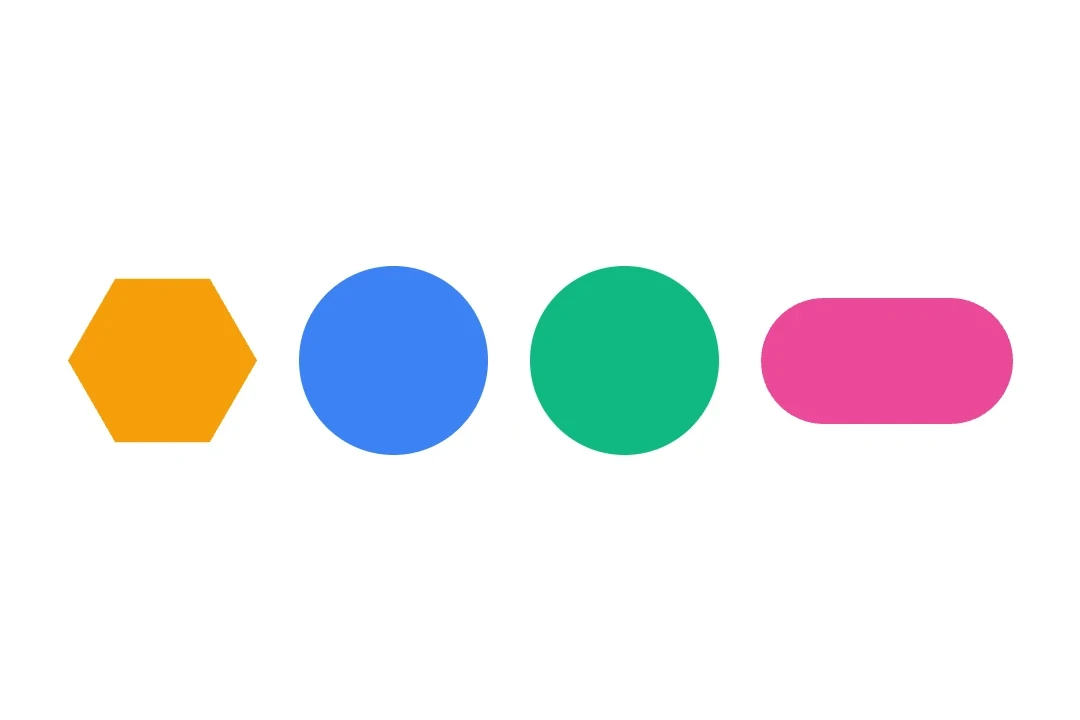
Polygon and star variants
Use verticesCount and innerRadius to control the shape geometry.
import { Host, Shape, Row } from '@expo/ui/jetpack-compose';
import { size } from '@expo/ui/jetpack-compose/modifiers';

export default function PolygonShapesExample() {
  return (
    <Host matchContents>
      <Row horizontalArrangement={{ spacedBy: 16 }} verticalAlignment="center">
        <Shape.Polygon
          verticesCount={6}
          cornerRounding={4}
          color="#00BCD4"
          modifiers={[size(80, 80)]}
        />
        <Shape.Star
          verticesCount={8}
          innerRadius={0.4}
          cornerRounding={2}
          color="#FF9800"
          modifiers={[size(80, 80)]}
        />
        <Shape.PillStar
          verticesCount={6}
          innerRadius={0.5}
          color="#E91E63"
          modifiers={[size(80, 80)]}
        />
      </Row>
    </Host>
  );
}
API
import { Shape } from '@expo/ui/jetpack-compose';
Constants
Type: {
Circle: (props: Pick<ShapeProps, 'radius' | 'verticesCount' | 'color' | 'modifiers'>) => ShapeJSXElement,
Pill: (props: Pick<ShapeProps, 'smoothing' | 'color' | 'modifiers'>) => ShapeJSXElement,
PillStar: (props: ShapeProps) => ShapeJSXElement,
Polygon: (props: Pick<ShapeProps, 'smoothing' | 'cornerRounding' | 'verticesCount' | 'color' | 'modifiers'>) => ShapeJSXElement,
Rectangle: (props: Pick<ShapeProps, 'smoothing' | 'cornerRounding' | 'color' | 'modifiers'>) => ShapeJSXElement,
RoundedCorner: (props: Pick<ShapeProps, 'cornerRadii' | 'color' | 'modifiers'>) => ShapeJSXElement,
Star: (props: ShapeProps) => ShapeJSXElement
}
Props
CornerRadiiCorner radii for RoundedCorner shape. Values are in dp.
number • Default: 0.0Corner rounding percentage. Multiplied by the shorter dimension of the view to produce pixel values.
number • Default: 1.0Inner radius of star-related shapes ('STAR' and 'PILL_STAR'). Multiplied by the shorter dimension of the view to produce pixel values.
number • Default: 1.0Radius of the circular shape. Multiplied by the shorter dimension of the view to produce pixel values.
number • Default: 0.0Number between 0.0 and 1.0 that determines how much each line between vertices is "smoothed".
Methods
Types
Corner radii for RoundedCorner shape.
| Property | Type | Description |
|---|---|---|
| bottomEnd(optional) | number | Bottom-end corner radius in dp. |
| bottomStart(optional) | number | Bottom-start corner radius in dp. |
| topEnd(optional) | number | Top-end corner radius in dp. |
| topStart(optional) | number | Top-start corner radius in dp. |