This documentation is available as Markdown for AI agents and LLMs. See the full Markdown index or append .md to any documentation URL.
This is documentation for the next SDK version. For up-to-date documentation, see the latest version (SDK 57).
DockedSearchBar
A Jetpack Compose DockedSearchBar component for displaying an inline search input.
Android
Included in Expo Go
Expo UI DockedSearchBar matches the official Jetpack Compose SearchBar API and displays a search input that remains anchored in its parent layout rather than expanding to full screen.
Installation
Terminal
- npx expo install @expo/uiIf you are installing this in an existing React Native app, make sure to install expo in your project.
Usage
Basic docked search bar
BasicDockedSearchBarExample.tsx
import { useState } from 'react';
import { Host, DockedSearchBar } from '@expo/ui/jetpack-compose';

export default function BasicDockedSearchBarExample() {
  const [query, setQuery] = useState('');

  return (
    <Host matchContents>
      <DockedSearchBar onQueryChange={setQuery} />
    </Host>
  );
}
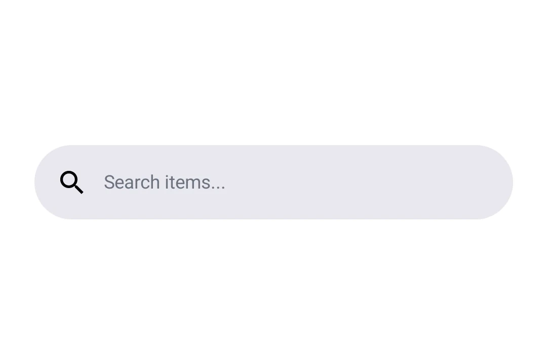
With placeholder and leading icon
Use the DockedSearchBar.Placeholder and DockedSearchBar.LeadingIcon slot components to customize the search bar appearance.
DockedSearchBarWithSlotsExample.tsx
import { useState } from 'react';
import { Host, DockedSearchBar, Text } from '@expo/ui/jetpack-compose';

export default function DockedSearchBarWithSlotsExample() {
  const [query, setQuery] = useState('');

  return (
    <Host matchContents>
      <DockedSearchBar onQueryChange={setQuery}>
        <DockedSearchBar.Placeholder>
          <Text>Search items...</Text>
        </DockedSearchBar.Placeholder>
        <DockedSearchBar.LeadingIcon>
          <Text>🔍</Text>
        </DockedSearchBar.LeadingIcon>
      </DockedSearchBar>
    </Host>
  );
}
API
import { DockedSearchBar } from '@expo/ui/jetpack-compose';
Components
Type: React.Element<DockedSearchBarProps>
Type: React.Element<LeadingIconProps>
Type: React.Element<PlaceholderProps>