This documentation is available as Markdown for AI agents and LLMs. See the full Markdown index or append .md to any documentation URL.
This is documentation for the next SDK version. For up-to-date documentation, see the latest version (SDK 57).
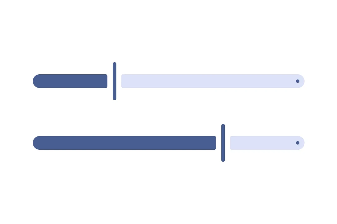
Slider
A Jetpack Compose Slider component for selecting values from a range.
For cross-platform usage, see the universalSlider— it renders the appropriate native component per platform.
Expo UI Slider matches the official Jetpack Compose Slider API and allows selecting values from a bounded range.
Installation
- npx expo install @expo/uiIf you are installing this in an existing React Native app, make sure to install expo in your project.
Usage
Basic slider
import { useState } from 'react';
import { Host, Slider } from '@expo/ui/jetpack-compose';

export default function BasicSliderExample() {
  const [value, setValue] = useState(0.5);

  return (
    <Host matchContents>
      <Slider value={value} onValueChange={setValue} />
    </Host>
  );
}
Slider with custom range
Use the min and max props to define the slider's value range.
import { useState } from 'react';
import { Host, Slider } from '@expo/ui/jetpack-compose';

export default function CustomRangeSliderExample() {
  const [value, setValue] = useState(50);

  return (
    <Host matchContents>
      <Slider value={value} min={0} max={100} onValueChange={setValue} />
    </Host>
  );
}
Slider with steps
Use the steps prop to define discrete increments. Set steps to 0 for continuous values.
import { useState } from 'react';
import { Host, Slider } from '@expo/ui/jetpack-compose';

export default function SteppedSliderExample() {
  const [value, setValue] = useState(0);

  return (
    <Host matchContents>
      <Slider value={value} min={0} max={100} steps={10} onValueChange={setValue} />
    </Host>
  );
}
Custom colors
Use the colors prop to override the default Material3 colors for the slider's thumb, track, and tick marks.
import { useState } from 'react';
import { Host, Slider } from '@expo/ui/jetpack-compose';

export default function CustomColorsSliderExample() {
  const [value, setValue] = useState(0.5);

  return (
    <Host matchContents>
      <Slider
        value={value}
        colors={{
          thumbColor: '#6200EE',
          activeTrackColor: '#6200EE',
          inactiveTrackColor: '#E0E0E0',
        }}
        onValueChange={setValue}
      />
    </Host>
  );
}
Custom thumb and track
Use both Slider.Thumb and Slider.Track slots for a fully custom slider appearance.
import { useState } from 'react';
import { Host, Slider, Shape, Row, Box } from '@expo/ui/jetpack-compose';
import {
  fillMaxWidth,
  height,
  weight,
  size,
  clip,
  background,
  Shapes,
} from '@expo/ui/jetpack-compose/modifiers';

export default function FullyCustomSliderExample() {
  const [value, setValue] = useState(0.5);

  return (
    <Host matchContents>
      <Slider value={value} onValueChange={setValue}>
        <Slider.Thumb>
          <Box modifiers={[size(24, 24), clip(Shapes.Circle), background('#6200EE')]} />
        </Slider.Thumb>
        <Slider.Track>
          <Row modifiers={[fillMaxWidth(), height(8)]}>
            <Shape.RoundedCorner
              color="#6200EE"
              cornerRadii={{ topStart: 4, bottomStart: 4 }}
              modifiers={[weight(Math.max(value, 0.01)), height(8)]}
            />
            <Shape.RoundedCorner
              color="#BDBDBD"
              cornerRadii={{ topEnd: 4, bottomEnd: 4 }}
              modifiers={[weight(Math.max(1 - value, 0.01)), height(8)]}
            />
          </Row>
        </Slider.Track>
      </Slider>
    </Host>
  );
}
API
import { Slider } from '@expo/ui/jetpack-compose';
Component
Type: React.Element<SliderProps>
A slider component that wraps Material3's Slider.
SliderColorsColors for slider elements. Maps to Material3's SliderDefaults.colors().
boolean • Default: trueWhether the slider is enabled for user interaction.
numberLower limit the user can drag the thumb to. The visible track still
spans min..max, but the thumb stops at lowerLimit during drag.
number • Default: 1The maximum value of the slider. Updating this value does not trigger callbacks if the current value is above max.
number • Default: 0The minimum value of the slider. Updating this value does not trigger callbacks if the current value is below min.
(value: number) => voidCallback triggered on dragging along the slider.
() => voidCallback triggered when the user finishes changing the value (for example, lifts a finger).
Maps to Material3's onValueChangeFinished.
number • Default: 0The number of steps between the minimum and maximum values, 0 signifies infinite steps.
numberUpper limit the user can drag the thumb to. The visible track still
spans min..max, but the thumb stops at upperLimit during drag.
Types
Colors for slider elements. Maps directly to Material3's SliderDefaults.colors().
| Property | Type | Description |
|---|---|---|
| activeTickColor(optional) | ColorValue | - |
| activeTrackColor(optional) | ColorValue | - |
| inactiveTickColor(optional) | ColorValue | - |
| inactiveTrackColor(optional) | ColorValue | - |
| thumbColor(optional) | ColorValue | - |