This documentation is available as Markdown for AI agents and LLMs. See the full Markdown index or append .md to any documentation URL.
This is documentation for the next SDK version. For up-to-date documentation, see the latest version (SDK 57).
Spacer
A Jetpack Compose Spacer component for adding flexible space between elements.
For cross-platform usage, see the universalSpacer— it renders the appropriate native component per platform.
Expo UI Spacer matches the official Jetpack Compose Spacer API and is used to add flexible or fixed-size space between elements in a layout.
Installation
- npx expo install @expo/uiIf you are installing this in an existing React Native app, make sure to install expo in your project.
Usage
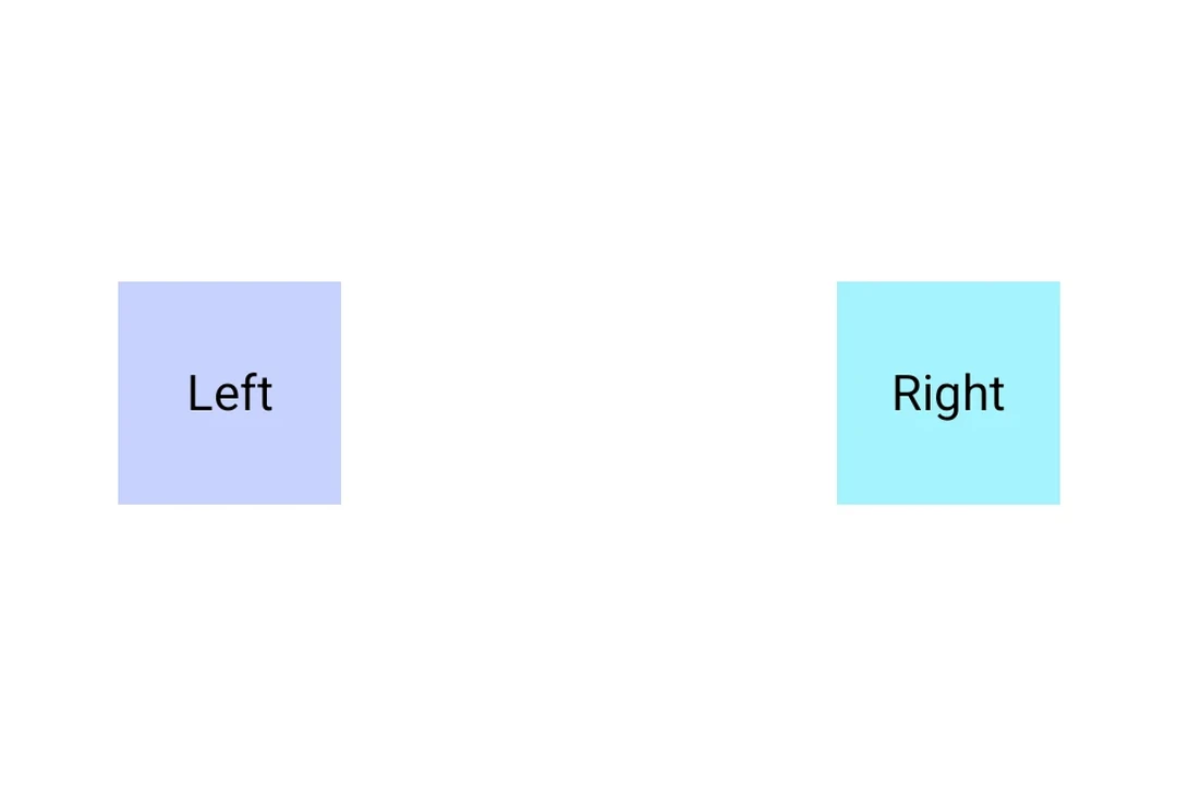
Spacer with weight
Use the weight() modifier to make the spacer fill available space proportionally within a Row or Column.
import { Host, Row, Spacer, Text } from '@expo/ui/jetpack-compose';
import { fillMaxWidth, weight } from '@expo/ui/jetpack-compose/modifiers';

export default function SpacerWeightExample() {
  return (
    <Host matchContents>
      <Row modifiers={[fillMaxWidth()]}>
        <Text>Left</Text>
        <Spacer modifiers={[weight(1)]} />
        <Text>Right</Text>
      </Row>
    </Host>
  );
}
Spacer with fixed size
Use a height or width modifier to create a spacer with a fixed dimension.
import { Host, Column, Spacer, Text } from '@expo/ui/jetpack-compose';
import { height } from '@expo/ui/jetpack-compose/modifiers';

export default function SpacerFixedSizeExample() {
  return (
    <Host matchContents>
      <Column>
        <Text>Above</Text>
        <Spacer modifiers={[height(24)]} />
        <Text>Below (24dp gap)</Text>
      </Column>
    </Host>
  );
}
API
import { Spacer } from '@expo/ui/jetpack-compose';
Component
Type: React.Element<SpacerProps>
A spacer component that fills available space.
Use with the weight() modifier to create flexible spacing in Row or Column layouts.
Example
<Row>
  <Text>Left</Text>
  <Spacer modifiers={[weight(1)]} />
  <Text>Right</Text>
</Row>