This documentation is available as Markdown for AI agents and LLMs. See the full Markdown index or append .md to any documentation URL.
This is documentation for the next SDK version. For up-to-date documentation, see the latest version (SDK 57).
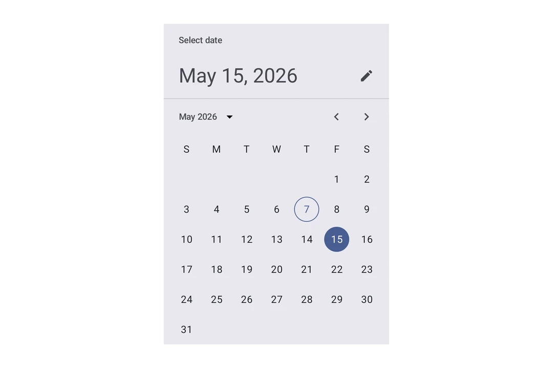
DateTimePicker
A Jetpack Compose DateTimePicker component for selecting dates and times.
Expo UI DateTimePicker matches the official Jetpack Compose Date Picker and Time Picker APIs and supports date, time, and combined selection.
Note: The date variants render Material's calendar grid and input field, both of which scroll horizontally internally. The parent
Hostmust provide a finite width on the horizontal axis, usematchContents={{ vertical: true }}together withstyle={{ width: '100%' }}(or any finite width). See Match contents in Host reference for details.
Installation
- npx expo install @expo/uiIf you are installing this in an existing React Native app, make sure to install expo in your project.
Usage
Date picker
import { useState } from 'react';
import { Host, DateTimePicker } from '@expo/ui/jetpack-compose';

export default function DatePickerExample() {
  const [selectedDate, setSelectedDate] = useState(new Date());

  return (
    <Host matchContents={{ vertical: true }} style={{ width: '100%' }}>
      <DateTimePicker
        onDateSelected={date => {
          setSelectedDate(date);
        }}
        displayedComponents="date"
        initialDate={selectedDate.toISOString()}
        variant="picker"
      />
    </Host>
  );
}
Time picker
import { useState } from 'react';
import { Host, DateTimePicker } from '@expo/ui/jetpack-compose';

export default function TimePickerExample() {
  const [selectedDate, setSelectedDate] = useState(new Date());

  return (
    <Host matchContents={{ vertical: true }} style={{ width: '100%' }}>
      <DateTimePicker
        onDateSelected={date => {
          setSelectedDate(date);
        }}
        displayedComponents="hourAndMinute"
        initialDate={selectedDate.toISOString()}
        variant="picker"
      />
    </Host>
  );
}
Input variant
Use variant="input" to display the picker as a text input field instead of the default picker UI.
import { useState } from 'react';
import { Host, DateTimePicker } from '@expo/ui/jetpack-compose';

export default function InputVariantExample() {
  const [selectedDate, setSelectedDate] = useState(new Date());

  return (
    <Host matchContents={{ vertical: true }} style={{ width: '100%' }}>
      <DateTimePicker
        onDateSelected={date => {
          setSelectedDate(date);
        }}
        displayedComponents="date"
        initialDate={selectedDate.toISOString()}
        variant="input"
      />
    </Host>
  );
}
API
import { DateTimePicker } from '@expo/ui/jetpack-compose';
Components
Type: React.Element<DatePickerDialogProps>
ColorValueDatePickerElementColors & TimePickerElementColors(date: Date) => voidAndroidVariantType: React.Element<DateTimePickerProps>
Renders an inline DateTimePicker component.
ColorValueThe tint color to use on the picker elements.
When elementColors is not provided, this color is applied to a subset of
picker elements (selected day, title, headline, today border for date picker;
selector, selected time segment, clock dial for time picker).
DisplayedComponents • Default: 'date'The components that the picker should display.
On Android, you can have a picker that selects just the date or just the time.
dateAndTime is only available on iOS and will result in a date picker on Android.
On iOS, you can have a picker that selects both date and time.
DatePickerElementColors & TimePickerElementColorsFine-grained color overrides for individual picker elements.
When provided, these take precedence over the color prop.
Date picker color keys are used when displayedComponents is 'date' or 'dateAndTime'.
Time picker color keys are used when displayedComponents is 'hourAndMinute'.
Unset values fall back to Material 3 theme defaults.
unionThe initial date to display on the picker.
Acceptable values are: string | null
boolean • Default: trueDetermines what format the clock should be displayed in on Android.
(date: Date) => voidCallback function that is called when a date is selected.
Constrains which dates can be selected. Mirrors the native Compose selectableDates parameter.
start is the earliest selectable date, end is the latest.
boolean • Default: trueShow a button to toggle between variants on Android.
AndroidVariant • Default: 'picker'The variant of the picker, which determines its appearance and behavior.
Type: React.Element<TimePickerDialogProps>
ColorValueDatePickerElementColors & TimePickerElementColors(date: Date) => voidTypes
Color overrides for the Material 3 DatePicker component. All properties are optional — unset values use Material 3 theme defaults.
| Property | Type | Description |
|---|---|---|
| containerColor(optional) | ColorValue | The background color of the date picker. |
| currentYearContentColor(optional) | ColorValue | The color used for the current year content. |
| dayContentColor(optional) | ColorValue | The color used for day content (number text). |
| dayInSelectionRangeContainerColor(optional) | ColorValue | The container color for days within a date range selection. |
| dayInSelectionRangeContentColor(optional) | ColorValue | The content color for days within a date range selection. |
| disabledDayContentColor(optional) | ColorValue | The color used for disabled day content. |
| disabledSelectedDayContainerColor(optional) | ColorValue | The color used for a disabled selected day container. |
| disabledSelectedDayContentColor(optional) | ColorValue | The color used for a disabled selected day content. |
| disabledSelectedYearContainerColor(optional) | ColorValue | The color used for a disabled selected year container. |
| disabledSelectedYearContentColor(optional) | ColorValue | The color used for a disabled selected year content. |
| disabledYearContentColor(optional) | ColorValue | The color used for disabled year item content. |
| dividerColor(optional) | ColorValue | The color used for divider lines. |
| headlineContentColor(optional) | ColorValue | The color used for the date picker's headline. |
| navigationContentColor(optional) | ColorValue | The color used for navigation arrows and year selection menu button. |
| selectedDayContainerColor(optional) | ColorValue | The color used for the selected day container/background circle. |
| selectedDayContentColor(optional) | ColorValue | The color used for selected day content. |
| selectedYearContainerColor(optional) | ColorValue | The color used for the selected year container/background. |
| selectedYearContentColor(optional) | ColorValue | The color used for the selected year content. |
| subheadContentColor(optional) | ColorValue | The color used for the month and year subhead labels. |
| titleContentColor(optional) | ColorValue | The color used for the date picker's title. |
| todayContentColor(optional) | ColorValue | The color used for today's date text. |
| todayDateBorderColor(optional) | ColorValue | The color used for today's date border. |
| weekdayContentColor(optional) | ColorValue | The color used for the weekday letters (Mon, Tue, etc.). |
| yearContentColor(optional) | ColorValue | The color used for year item content. |
Literal Type: string
Acceptable values are: 'date' | 'hourAndMinute' | 'dateAndTime'
Color overrides for the Material 3 TimePicker component. All properties are optional — unset values use Material 3 theme defaults.
| Property | Type | Description |
|---|---|---|
| clockDialColor(optional) | ColorValue | The background color of the clock dial. |
| clockDialSelectedContentColor(optional) | ColorValue | The color of clock dial numbers when selected or overlapping the selector. |
| clockDialUnselectedContentColor(optional) | ColorValue | The color of clock dial numbers when unselected. |
| containerColor(optional) | ColorValue | The container/background color of the time picker. |
| periodSelectorBorderColor(optional) | ColorValue | The border color of the AM/PM period selector. |
| periodSelectorSelectedContainerColor(optional) | ColorValue | The background color of the selected AM/PM period. |
| periodSelectorSelectedContentColor(optional) | ColorValue | The text color of the selected AM/PM period. |
| periodSelectorUnselectedContainerColor(optional) | ColorValue | The background color of the unselected AM/PM period. |
| periodSelectorUnselectedContentColor(optional) | ColorValue | The text color of the unselected AM/PM period. |
| selectorColor(optional) | ColorValue | The color of the clock dial selector (hand). |
| timeSelectorSelectedContainerColor(optional) | ColorValue | The background color of the selected hour/minute segment. |
| timeSelectorSelectedContentColor(optional) | ColorValue | The text color of the selected hour/minute segment. |
| timeSelectorUnselectedContainerColor(optional) | ColorValue | The background color of the unselected hour/minute segment. |
| timeSelectorUnselectedContentColor(optional) | ColorValue | The text color of the unselected hour/minute segment. |