This documentation is available as Markdown for AI agents and LLMs. See the full Markdown index or append .md to any documentation URL.
This is documentation for the next SDK version. For up-to-date documentation, see the latest version (SDK 57).
Badge
A Jetpack Compose Badge component for displaying status indicators and counts.
Expo UI Badge matches the official Jetpack Compose Badge API. It renders as a small colored indicator dot, or with content such as a count number.
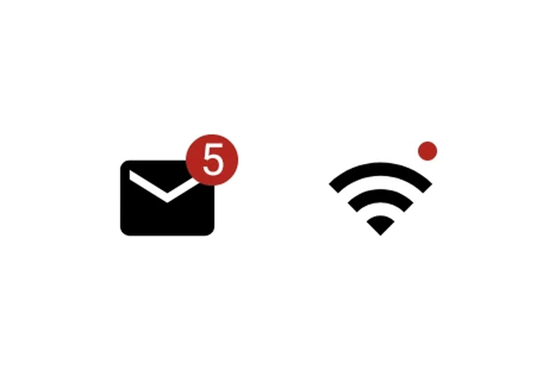
Installation
- npx expo install @expo/uiIf you are installing this in an existing React Native app, make sure to install expo in your project.
Usage
Indicator dot
A badge with no children renders as a small dot indicator.
import { Host, Badge } from '@expo/ui/jetpack-compose';

export default function BadgeDot() {
  return (
    <Host matchContents>
      <Badge />
    </Host>
  );
}
Badge with count
Pass a Text child to display a number or label.
import { Host, Badge, Text } from '@expo/ui/jetpack-compose';

export default function BadgeCount() {
  return (
    <Host matchContents>
      <Badge containerColor="#EF5350" contentColor="#FFFFFF">
        <Text>3</Text>
      </Badge>
    </Host>
  );
}
API
import { Badge } from '@expo/ui/jetpack-compose';
Component
Type: React.Element<BadgeProps>
A badge component matching Compose's Badge.
Renders as a small colored indicator dot, or with content (for example, a count).
ReactNodeOptional content inside the badge (for example, a Text with a count).
When omitted, renders as a small indicator dot.
ColorValue • Default: BadgeDefaults.containerColorBackground color of the badge.
ColorValue • Default: BadgeDefaults.contentColorContent color inside the badge (text/icon tint).