This documentation is available as Markdown for AI agents and LLMs. See the full Markdown index or append .md to any documentation URL.
This is documentation for the next SDK version. For up-to-date documentation, see the latest version (SDK 57).
Text
A Jetpack Compose Text component for displaying styled text.
For cross-platform usage, see the universalText— it renders the appropriate native component per platform.
Expo UI Text matches the official Jetpack Compose Text styling API and displays text with Material 3 typography styles, custom fonts, and text formatting options.
Installation
- npx expo install @expo/uiIf you are installing this in an existing React Native app, make sure to install expo in your project.
Usage
Basic text
import { Host, Text } from '@expo/ui/jetpack-compose';

export default function BasicTextExample() {
  return (
    <Host matchContents>
      <Text>Hello, world!</Text>
    </Host>
  );
}
Typography styles
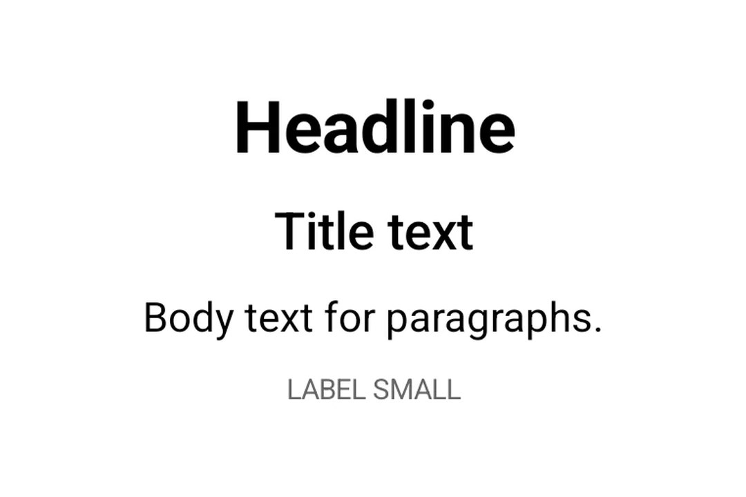
Use the style prop with typography to apply Material 3 typography presets.
import { Host, Text, Column } from '@expo/ui/jetpack-compose';
import { paddingAll } from '@expo/ui/jetpack-compose/modifiers';

export default function TypographyExample() {
  return (
    <Host matchContents>
      <Column modifiers={[paddingAll(16)]}>
        <Text style={{ typography: 'displayLarge' }}>Display Large</Text>
        <Text style={{ typography: 'headlineMedium' }}>Headline Medium</Text>
        <Text style={{ typography: 'bodySmall' }}>Body Small</Text>
        <Text style={{ typography: 'labelLarge' }}>Label Large</Text>
      </Column>
    </Host>
  );
}
Text with maxLines and overflow
Control text truncation with maxLines and overflow.
import { Host, Text } from '@expo/ui/jetpack-compose';
import { width } from '@expo/ui/jetpack-compose/modifiers';

export default function TextOverflowExample() {
  return (
    <Host matchContents>
      <Text maxLines={2} overflow="ellipsis" modifiers={[width(200)]}>
        This is a long paragraph of text that will be truncated after two lines with an ellipsis at
        the end to indicate there is more content.
      </Text>
    </Host>
  );
}
Styled text
Apply custom text styles including font weight, style, size, and decoration.
import { Host, Text, Column } from '@expo/ui/jetpack-compose';
import { paddingAll } from '@expo/ui/jetpack-compose/modifiers';

export default function StyledTextExample() {
  return (
    <Host matchContents>
      <Column modifiers={[paddingAll(16)]}>
        <Text style={{ fontWeight: 'bold', fontSize: 20 }}>Bold text</Text>
        <Text style={{ fontStyle: 'italic' }}>Italic text</Text>
        <Text style={{ textDecoration: 'underline' }}>Underlined text</Text>
        <Text style={{ letterSpacing: 4 }}>Spaced out text</Text>
        <Text color="#E91E63" style={{ fontSize: 18, textAlign: 'center' }}>
          Colored and centered
        </Text>
      </Column>
    </Host>
  );
}
Nested text
Nest <Text> components to apply inline styles to parts of a sentence. Child spans inherit styles from their parent. For example, a bold parent with an italic child renders the child as bold and italic.
import { Host, Text, Column } from '@expo/ui/jetpack-compose';
import { paddingAll } from '@expo/ui/jetpack-compose/modifiers';

export default function NestedTextExample() {
  return (
    <Host matchContents>
      <Column modifiers={[paddingAll(16)]}>
        {/* Bold parent, italic child inherits bold */}
        <Text style={{ fontWeight: 'bold' }}>
          Hello <Text style={{ fontStyle: 'italic' }}>world</Text>!
        </Text>

        {/* Mixed inline styles */}
        <Text style={{ fontSize: 16 }}>
          Normal, <Text style={{ fontStyle: 'italic' }}>italic</Text>,{' '}
          <Text style={{ fontWeight: 'bold' }}>bold</Text>, and{' '}
          <Text style={{ textDecoration: 'underline' }}>underlined</Text>
        </Text>

        {/* Color and background overrides per span */}
        <Text style={{ fontSize: 18 }}>
          Click{' '}
          <Text color="#007AFF" style={{ fontWeight: 'bold' }}>
            here
          </Text>{' '}
          or <Text style={{ background: '#FFEB3B' }}>highlighted</Text>
        </Text>

        {/* Deep nesting — styles accumulate */}
        <Text style={{ fontWeight: 'bold' }}>
          Bold{' '}
          <Text style={{ fontStyle: 'italic' }}>
            bold+italic <Text style={{ textDecoration: 'underline' }}>bold+italic+underline</Text>
          </Text>
        </Text>
      </Column>
    </Host>
  );
}
Custom fonts
Use fonts loaded via expo-font by passing the font family name to style.fontFamily.
import { Host, Text, Column } from '@expo/ui/jetpack-compose';
import { paddingAll } from '@expo/ui/jetpack-compose/modifiers';

export default function CustomFontExample() {
  return (
    <Host matchContents>
      <Column modifiers={[paddingAll(16)]}>
        <Text style={{ fontFamily: 'serif', fontSize: 16 }}>System serif font</Text>
        <Text style={{ fontFamily: 'monospace', fontSize: 16 }}>System monospace font</Text>
        <Text style={{ fontFamily: 'Inter-Bold', fontSize: 16 }}>Custom Inter Bold font</Text>
      </Column>
    </Host>
  );
}
API
import { Text } from '@expo/ui/jetpack-compose';
Component
Type: React.Element<TextProps>
Renders a Text component using Jetpack Compose.
ReactNodeThe text content to display. Can be a string, number, or nested Text components
for inline styled spans.
numberAn optional maximum number of lines for the text to span, wrapping if necessary. If the text exceeds the given number of lines, it will be truncated according to overflow.
numberThe minimum height in terms of minimum number of visible lines.
booleanWhether the text should break at soft line breaks. If false, the glyphs in the text will be positioned as if there was unlimited horizontal space.
TextStyleStyle configuration for the text. Corresponds to Jetpack Compose's TextStyle parameter.
Types
Literal Type: string
Text alignment options.
Acceptable values are: 'left' | 'right' | 'center' | 'justify' | 'start' | 'end'
Literal Type: string
Text decoration options.
Acceptable values are: 'none' | 'underline' | 'lineThrough'
Literal Type: string
Font family for text styling. Built-in system families: 'default', 'sansSerif', 'serif', 'monospace', 'cursive'. Custom font families loaded via expo-font can be referenced by name (for example, 'Inter-Bold').
Acceptable values are: 'default' | 'sansSerif' | 'serif' | 'monospace' | 'cursive'
Literal Type: string
Font style options for text styling.
Acceptable values are: 'normal' | 'italic'
Literal Type: string
Font weight options for text styling.
Acceptable values are: 'normal' | 'bold' | '100' | '200' | '300' | '400' | '500' | '600' | '700' | '800' | '900'
Literal Type: string
Line break strategy options.
- 'simple': Basic line breaking.
- 'heading': Optimized for short text like headings.
- 'paragraph': Produces more balanced line lengths for body text.
Acceptable values are: 'simple' | 'heading' | 'paragraph'
Literal Type: string
Text overflow behavior options.
- 'clip': Clips the overflowing text to fit its container
- 'ellipsis': Uses an ellipsis to indicate that the text has overflowed
- 'visible': Renders overflow text outside its container
Acceptable values are: 'clip' | 'ellipsis' | 'visible'
Text shadow configuration. Corresponds to Jetpack Compose's Shadow class.
| Property | Type | Description |
|---|---|---|
| blurRadius(optional) | number | The blur radius of the shadow in dp. |
| color(optional) | ColorValue | The color of the shadow. |
| offsetX(optional) | number | The horizontal offset of the shadow in dp. |
| offsetY(optional) | number | The vertical offset of the shadow in dp. |
Shared span-level style properties used by both TextStyle and TextSpanRecord.
Adding a property here ensures it's available on both parent text and nested spans.
| Property | Type | Description |
|---|---|---|
| background(optional) | ColorValue | The background color behind the text. |
| fontFamily(optional) | TextFontFamily | The font family. |
| fontSize(optional) | number | The font size in sp (scale-independent pixels). |
| fontStyle(optional) | TextFontStyle | The font style of the text. |
| fontWeight(optional) | TextFontWeight | The font weight of the text. |
| letterSpacing(optional) | number | The letter spacing in sp. |
| shadow(optional) | TextShadow | The shadow applied to the text. |
| textDecoration(optional) | TextDecoration | The text decoration. |
Text style properties that can be applied to text.
Corresponds to Jetpack Compose's TextStyle.
Type: TextSpanStyleBase extended by:
| Property | Type | Description |
|---|---|---|
| lineBreak(optional) | TextLineBreak | The line break strategy. |
| lineHeight(optional) | number | The line height in sp. |
| textAlign(optional) | TextAlign | The text alignment. |
| typography(optional) | TypographyStyle | Material 3 Typography style to use as the base style. When specified, applies the predefined Material 3 typography style. Other properties in this style object will override specific values from the typography. |
Literal Type: string
Material 3 Typography scale styles. Corresponds to MaterialTheme.typography in Jetpack Compose.
Acceptable values are: 'displayLarge' | 'displayMedium' | 'displaySmall' | 'headlineLarge' | 'headlineMedium' | 'headlineSmall' | 'titleLarge' | 'titleMedium' | 'titleSmall' | 'bodyLarge' | 'bodyMedium' | 'bodySmall' | 'labelLarge' | 'labelMedium' | 'labelSmall'