This documentation is available as Markdown for AI agents and LLMs. See the full Markdown index or append .md to any documentation URL.
This is documentation for the next SDK version. For up-to-date documentation, see the latest version (SDK 57).
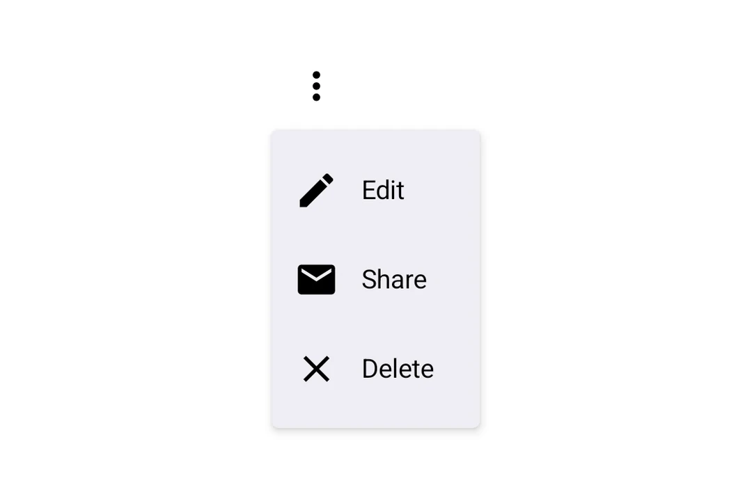
DropdownMenu
A Jetpack Compose DropdownMenu component for displaying dropdown menus.
Expo UI DropdownMenu matches the official Jetpack Compose Menu API and displays a dropdown menu when a trigger element is pressed.
Installation
- npx expo install @expo/uiIf you are installing this in an existing React Native app, make sure to install expo in your project.
Usage
Basic dropdown menu
import {
  Host,
  DropdownMenu,
  DropdownMenuItem,
  OutlinedButton,
  Text,
  Icon,
} from '@expo/ui/jetpack-compose';
import { useState } from 'react';

const homeIcon = require('./assets/home.xml');

export default function BasicDropdownMenuExample() {
  const [isExpanded, setIsExpanded] = useState(false);
  return (
    <Host matchContents>
      <DropdownMenu expanded={isExpanded} onDismissRequest={() => setIsExpanded(false)}>
        <DropdownMenu.Trigger>
          <OutlinedButton onClick={() => setIsExpanded(true)}>Show Menu</OutlinedButton>
        </DropdownMenu.Trigger>
        <DropdownMenu.Items>
          <DropdownMenuItem
            onClick={() => {
              setIsExpanded(false);
              console.log('Home pressed');
            }}>
            <DropdownMenuItem.Text>
              <Text>Home</Text>
            </DropdownMenuItem.Text>
            <DropdownMenuItem.LeadingIcon>
              <Icon source={homeIcon} size={24} />
            </DropdownMenuItem.LeadingIcon>
          </DropdownMenuItem>
        </DropdownMenu.Items>
      </DropdownMenu>
    </Host>
  );
}
React Native components as trigger
You can use a React Native view (such as Pressable) as the dropdown's trigger by wrapping it in RNHostView.
import {
  Host,
  DropdownMenu,
  DropdownMenuItem,
  Text as ComposeText,
  RNHostView,
} from '@expo/ui/jetpack-compose';
import { useState } from 'react';
import { Pressable, Text } from 'react-native';

export default function RNTriggerDropdownMenuExample() {
  const [isExpanded, setIsExpanded] = useState(false);
  return (
    <Host matchContents>
      <DropdownMenu expanded={isExpanded} onDismissRequest={() => setIsExpanded(false)}>
        <DropdownMenu.Trigger>
          <RNHostView matchContents>
            <Pressable
              onPress={() => setIsExpanded(true)}
              style={{
                alignSelf: 'flex-start',
                paddingHorizontal: 16,
                paddingVertical: 10,
                borderRadius: 8,
                backgroundColor: '#9B59B6',
              }}>
              <Text style={{ color: 'white', fontWeight: '600' }}>RN Pressable Trigger</Text>
            </Pressable>
          </RNHostView>
        </DropdownMenu.Trigger>
        <DropdownMenu.Items>
          <DropdownMenuItem onClick={() => setIsExpanded(false)}>
            <DropdownMenuItem.Text>
              <ComposeText>Item 1</ComposeText>
            </DropdownMenuItem.Text>
          </DropdownMenuItem>
          <DropdownMenuItem onClick={() => setIsExpanded(false)}>
            <DropdownMenuItem.Text>
              <ComposeText>Item 2</ComposeText>
            </DropdownMenuItem.Text>
          </DropdownMenuItem>
        </DropdownMenu.Items>
      </DropdownMenu>
    </Host>
  );
}
Long-press trigger
Jetpack Compose has no dedicated long-press menu primitive — you compose one from a combinedClickable modifier on the trigger view plus the existing controlled DropdownMenu. The menu anchors to the trigger automatically.
import { Host, DropdownMenu, DropdownMenuItem, Text } from '@expo/ui/jetpack-compose';
import { background, combinedClickable } from '@expo/ui/jetpack-compose/modifiers';
import { useState } from 'react';

export default function LongPressDropdownMenuExample() {
  const [isExpanded, setIsExpanded] = useState(false);
  return (
    <Host matchContents>
      <DropdownMenu expanded={isExpanded} onDismissRequest={() => setIsExpanded(false)}>
        <DropdownMenu.Trigger>
          <Text
            modifiers={[
              background('#e0e0e0'),
              combinedClickable({
                onClick: () => console.log('Short tap'),
                onLongClick: () => setIsExpanded(true),
              }),
            ]}>
            Long-press me
          </Text>
        </DropdownMenu.Trigger>
        <DropdownMenu.Items>
          <DropdownMenuItem onClick={() => setIsExpanded(false)}>
            <DropdownMenuItem.Text>
              <Text>Copy</Text>
            </DropdownMenuItem.Text>
          </DropdownMenuItem>
          <DropdownMenuItem
            elementColors={{ textColor: '#B3261E' }}
            onClick={() => setIsExpanded(false)}>
            <DropdownMenuItem.Text>
              <Text>Delete</Text>
            </DropdownMenuItem.Text>
          </DropdownMenuItem>
        </DropdownMenu.Items>
      </DropdownMenu>
    </Host>
  );
}
API
import { DropdownMenu } from '@expo/ui/jetpack-compose';
Components
Type: React.Element<DropdownMenuProps>
Props of the DropdownMenu component.
ReactNodeThe contents of the submenu are used as an anchor for the dropdown menu. The children will be wrapped in a pressable element, which triggers opening of the dropdown menu.
() => voidCallback fired when the menu requests to be dismissed (e.g. tapping outside).
Must be provided when expanded is true to allow the menu to close.
Type: React.Element<DropdownMenuItemProps>
A dropdown menu item component that wraps Compose's DropdownMenuItem.
Should be used inside DropdownMenu.Items or ExposedDropdownMenu.
Type: React.Element<{
children: ReactNode
}>
Container for items displayed in the dropdown menu.
Children should be DropdownMenuItem components or other native views.