This documentation is available as Markdown for AI agents and LLMs. See the full Markdown index or append .md to any documentation URL.
Toggle
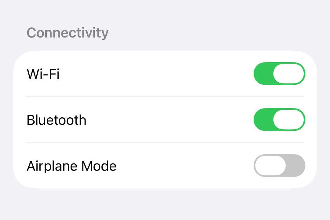
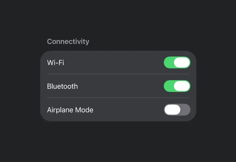
A SwiftUI Toggle component for displaying native toggles.
For cross-platform usage, see the universal
Switch— it renders the appropriate native component per platform.
Expo UI Toggle matches the official SwiftUI Toggle API and supports styling via the toggleStyle modifier.
Installation
If you are installing this in an existing React Native app, make sure to install expo in your project.
Usage
Basic toggle
Toggle with system image
Toggle styles
Use the toggleStyle modifier to change the toggle's appearance. Available styles are: automatic, switch, and button.
Note: The
buttonstyle is not available on tvOS.
Tinted toggle
Use the tint modifier to change the toggle's color.
Custom label content
You can pass custom components as children for more complex toggle labels. Use multiple Text views where the first represents the title and the second represents the subtitle.
Hidden label
Use the labelsHidden modifier to hide the label while keeping it for accessibility.
API
import { Toggle } from '@expo/ui/swift-ui';
Component
Type: React.Element<ToggleProps>
A control that toggles between on and off states.
React.ReactNodeCustom content for the toggle label. Use multiple Text views where
the first represents the title and the second represents the subtitle.
(isOn: boolean) => voidA callback that is called when the toggle's state changes.
isOn: booleanThe new state of the toggle.
SFSymbolThe name of the SF Symbol to display alongside the label.