This documentation is available as Markdown for AI agents and LLMs. See the full Markdown index or append .md to any documentation URL.
Menu A SwiftUI Menu component for displaying dropdown menus.
Recommended version:
~56.0.26
Expo UI Menu matches the official SwiftUI Menu API and supports styling via the buttonStyleContextMenu
Note: On tvOS, Menu requires tvOS 17.0 or later.
Installation
- npx expo install @expo/ui
- yarn expo install @expo/ui
- pnpm expo install @expo/ui
- bun expo install @expo/ui
If you are installing this in an existing React Native app , make sure to install expo in your project.
Usage
Simple text label
import { Host , Menu , Button } from '@expo/ui/swift-ui' ;
export default function SimpleMenuExample ( ) {
return (
< Host matchContents >
< Menu label = " Options" >
< Button label = " Option 1" onPress = { ( ) => console . log ( 'Option 1' ) } />
< Button label = " Option 2" onPress = { ( ) => console . log ( 'Option 2' ) } />
< Button label = " Option 3" onPress = { ( ) => console . log ( 'Option 3' ) } />
</ Menu >
</ Host > ) ;
}
Text label with SF Symbol
import { Host , Menu , Button , Divider } from '@expo/ui/swift-ui' ;
export default function MenuWithIconExample ( ) {
return (
< Host matchContents >
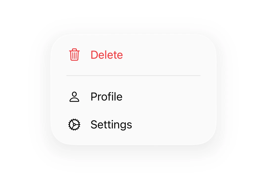
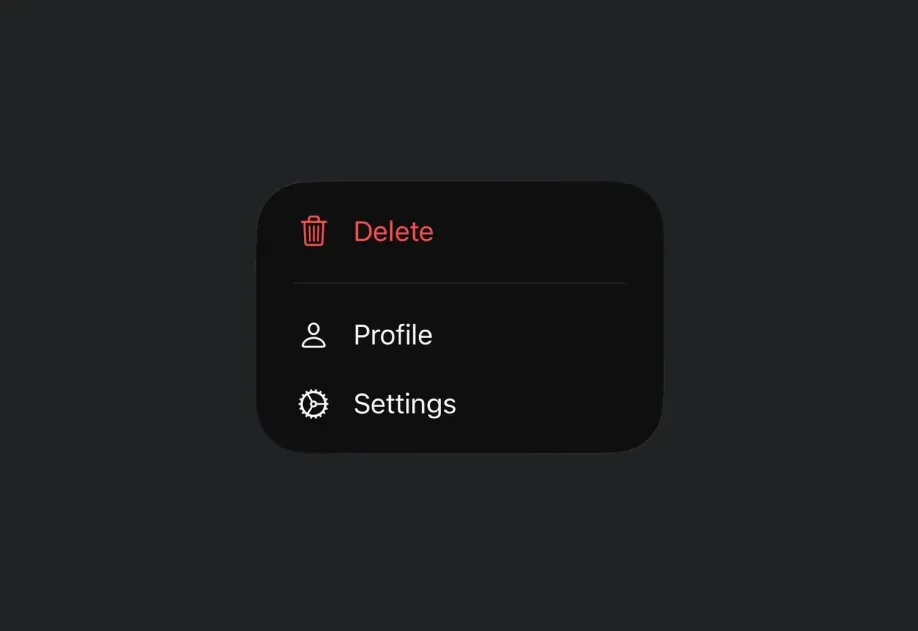
< Menu label = " More" systemImage = " ellipsis.circle" >
< Button label = " Settings" systemImage = " gear" onPress = { ( ) => console . log ( 'Settings' ) } />
< Button label = " Profile" systemImage = " person" onPress = { ( ) => console . log ( 'Profile' ) } />
< Divider />
< Button label = " Delete" role = " destructive" systemImage = " trash" onPress = { ( ) => console . log ( 'Delete' ) } />
</ Menu >
</ Host > ) ;
}
Custom label
You can pass a React node as the label for custom styling.
CustomLabelMenuExample.tsx import { Host , Menu , Button , Text } from '@expo/ui/swift-ui' ;
import { foregroundStyle } from '@expo/ui/swift-ui/modifiers' ;
export default function CustomLabelMenuExample ( ) {
return (
< Host matchContents >
< Menu label = { < Text modifiers = { [ foregroundStyle ( 'accentColor' ) ] } > Custom Label </ Text > } >
< Button label = " Action 1" onPress = { ( ) => console . log ( 'Action 1' ) } />
< Button label = " Action 2" onPress = { ( ) => console . log ( 'Action 2' ) } />
</ Menu >
</ Host > ) ;
}
React Native components as label
You can use a React Native view (such as Pressable) as the menu's label by wrapping it in RNHostView
import { Host , Menu , Button , RNHostView } from '@expo/ui/swift-ui' ;
import { Pressable , Text } from 'react-native' ;
export default function RNLabelMenuExample ( ) {
return (
< Host matchContents >
< Menu label = {
< RNHostView matchContents >
< Pressable onPress = { ( ) => console . log ( 'RN trigger pressed' ) } style = { {
alignSelf: 'flex-start' ,
paddingHorizontal: 16 ,
paddingVertical: 10 ,
borderRadius: 8 ,
backgroundColor: '#9B59B6' ,
} } >
< Text style = { { color: 'white' , fontWeight: '600' } } > RN Pressable Trigger </ Text >
</ Pressable >
</ RNHostView > } >
< Button label = " Item 1" onPress = { ( ) => console . log ( 'Item 1' ) } />
< Button label = " Item 2" onPress = { ( ) => console . log ( 'Item 2' ) } />
</ Menu >
</ Host > ) ;
}
Menus can be nested to create submenus.
import { Host , Menu , Button } from '@expo/ui/swift-ui' ;
export default function NestedMenuExample ( ) {
return (
< Host matchContents >
< Menu label = " Main Menu" >
< Button label = " Item 1" onPress = { ( ) => console . log ( 'Item 1' ) } />
< Menu label = " Submenu" >
< Button label = " Sub Item 1" onPress = { ( ) => console . log ( 'Sub Item 1' ) } />
< Button label = " Sub Item 2" onPress = { ( ) => console . log ( 'Sub Item 2' ) } />
</ Menu >
< Button label = " Item 2" onPress = { ( ) => console . log ( 'Item 2' ) } />
</ Menu >
</ Host > ) ;
}
With primary action
When onPrimaryAction is provided, a single tap triggers the primary action while a long-press shows the menu.
PrimaryActionMenuExample.tsx import { Host , Menu , Button } from '@expo/ui/swift-ui' ;
export default function PrimaryActionMenuExample ( ) {
return (
< Host matchContents >
< Menu label = " Tap or Hold" systemImage = " play.circle" onPrimaryAction = { ( ) => console . log ( 'Primary action triggered!' ) } >
< Button label = " Menu Item 1" onPress = { ( ) => console . log ( 'Menu Item 1' ) } />
< Button label = " Menu Item 2" onPress = { ( ) => console . log ( 'Menu Item 2' ) } />
< Button label = " Menu Item 3" onPress = { ( ) => console . log ( 'Menu Item 3' ) } />
</ Menu >
</ Host > ) ;
}
Styling with modifiers
You can use the buttonStyle modifier to change the appearance of the menu trigger.
import { Host , Menu , Button } from '@expo/ui/swift-ui' ;
import { buttonStyle } from '@expo/ui/swift-ui/modifiers' ;
export default function StyledMenuExample ( ) {
return (
< Host matchContents >
< Menu label = " Styled Menu" modifiers = { [ buttonStyle ( 'borderedProminent' ) ] } >
< Button label = " Styled Action 1" onPress = { ( ) => console . log ( 'Styled 1' ) } />
< Button label = " Styled Action 2" onPress = { ( ) => console . log ( 'Styled 2' ) } />
</ Menu >
</ Host > ) ;
}
To create a menu with the iOS Liquid Glass appearance, use buttonStyle('glass') or buttonStyle('glassProminent') on the Menu component.
Important: Do not apply the glassEffect() modifier to the Menu's label view to achieve a glass look. This causes a visual artifact where a rectangular halo briefly appears behind the trigger when the menu is dismissed. Always use buttonStyle instead, which correctly integrates with the Menu's dismiss animation.
import { Host , Menu , Button } from '@expo/ui/swift-ui' ;
import { buttonStyle } from '@expo/ui/swift-ui/modifiers' ;
export default function GlassMenuExample ( ) {
return (
< Host matchContents >
< Menu label = " Glass Menu" systemImage = " ellipsis.circle" modifiers = { [ buttonStyle ( 'glass' ) ] } >
< Button label = " Action 1" onPress = { ( ) => console . log ( 'Action 1' ) } />
< Button label = " Action 2" onPress = { ( ) => console . log ( 'Action 2' ) } />
</ Menu >
</ Host > ) ;
}
For a more prominent glass effect, use glassProminent:
GlassProminentMenuExample.tsx import { Host , Menu , Button } from '@expo/ui/swift-ui' ;
import { buttonStyle } from '@expo/ui/swift-ui/modifiers' ;
export default function GlassProminentMenuExample ( ) {
return (
< Host matchContents >
< Menu label = " Glass Prominent Menu" systemImage = " slider.horizontal.3" modifiers = { [ buttonStyle ( 'glassProminent' ) ] } >
< Button label = " Settings" systemImage = " gear" onPress = { ( ) => console . log ( 'Settings' ) } />
< Button label = " Filter" systemImage = " line.3.horizontal.decrease" onPress = { ( ) => console . log ( 'Filter' ) } />
</ Menu >
</ Host > ) ;
}
With control group
Use a ControlGroup
MenuWithControlGroupExample.tsx import { Host , Menu , ControlGroup , Button , Section , Divider } from '@expo/ui/swift-ui' ;
export default function MenuWithControlGroupExample ( ) {
return (
< Host matchContents >
< Menu label = " Song Options" systemImage = " ellipsis.circle" >
< ControlGroup >
< Button systemImage = " plus" label = " Add" onPress = { ( ) => console . log ( 'Add' ) } />
< Button systemImage = " star" label = " Favorite" onPress = { ( ) => console . log ( 'Favorite' ) } />
< Button systemImage = " square.and.arrow.up" label = " Share" onPress = { ( ) => console . log ( 'Share' ) } />
</ ControlGroup >
< Section >
< Button systemImage = " text.badge.plus" label = " Add to a Playlist" onPress = { ( ) => console . log ( 'Add to Playlist' ) } />
< Button systemImage = " antenna.radiowaves.left.and.right" label = " Create Station" onPress = { ( ) => console . log ( 'Create Station' ) } />
</ Section >
< Divider />
< Button systemImage = " hand.thumbsdown" label = " Suggest Less" onPress = { ( ) => console . log ( 'Suggest Less' ) } />
</ Menu >
</ Host > ) ;
}
Use the labelStyle('iconOnly') modifier to display only the icon without the label text. The label prop should still be provided for accessibility purposes.
import { Host , Menu , Button } from '@expo/ui/swift-ui' ;
import { labelStyle } from '@expo/ui/swift-ui/modifiers' ;
export default function IconOnlyMenuExample ( ) {
return (
< Host matchContents >
< Menu label = " Icon Only Button" systemImage = " gear" modifiers = { [ labelStyle ( 'iconOnly' ) ] } >
< Button label = " Menu Item 1" onPress = { ( ) => console . log ( 'Menu Item 1' ) } />
< Button label = " Menu Item 2" onPress = { ( ) => console . log ( 'Menu Item 2' ) } />
< Button label = " Menu Item 3" onPress = { ( ) => console . log ( 'Menu Item 3' ) } />
</ Menu >
</ Host > ) ;
}
API
import { Menu } from '@expo/ui/swift-ui' ;
Component Type: React.Element < MenuProps >
Displays a dropdown menu when tapped.
Props for the Menu component.
The menu's content items, which are shown when the menu is opened.
Can contain Button, Toggle, Picker, Section, Divider or nested Menu components.
Literal type: union
The label for the menu trigger. Can be a string for simple text labels,
or a ReactNode for custom label content.
Acceptable values are: string | ReactNode
Optional • Type: ( ) => void
A callback that is invoked when the user taps the menu label.
When provided, a single tap triggers this action, while a long-press shows the menu.
When not provided, a single tap shows the menu.
Optional • Type: string
An SF Symbol name to display alongside the label.
Only used when label is a string.