This documentation is available as Markdown for AI agents and LLMs. See the full Markdown index or append .md to any documentation URL.
Label
A SwiftUI Label component for displaying text with an icon.
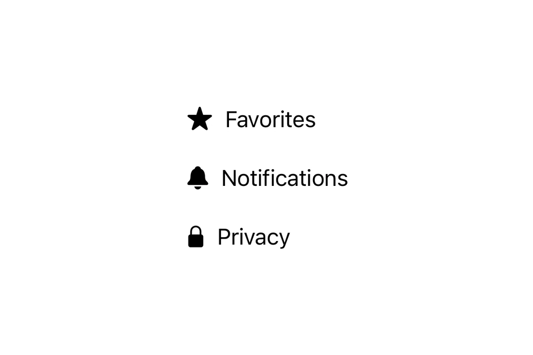
Expo UI Label matches the official SwiftUI Label API and displays a title alongside an icon.

Installation
If you are installing this in an existing React Native app, make sure to install expo in your project.
Usage
Basic label with SF Symbol
With custom icon
Use the icon prop to provide a custom React node as the icon instead of an SF Symbol.
Icon only
Use the labelStyle modifier with iconOnly to display only the icon. Always provide a title for accessibility even though it won't be visible.
API
import { Label } from '@expo/ui/swift-ui';
Component
Type: React.Element<LabelProps>
Renders a native label view, which could be used in a list or section.
React.ReactNodeCustom title view. Accepts any React node (for example, a VStack with title and subtitle).
When provided, this takes precedence over title.
Deprecated: Use
foregroundStylemodifier instead.
ColorValueThe color of the label icon.
React.ReactNodeCustom icon view to be displayed in the label.
When provided, this takes precedence over systemImage.