This documentation is available as Markdown for AI agents and LLMs. See the full Markdown index or append .md to any documentation URL.
ConfirmationDialog
A SwiftUI ConfirmationDialog component for presenting confirmation prompts.
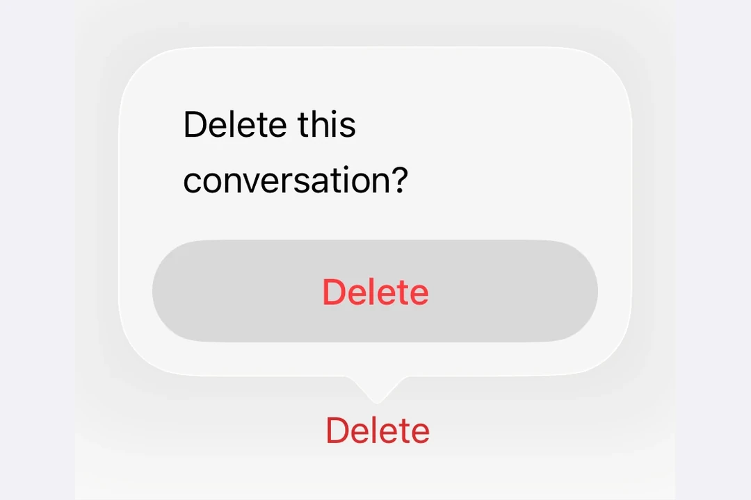
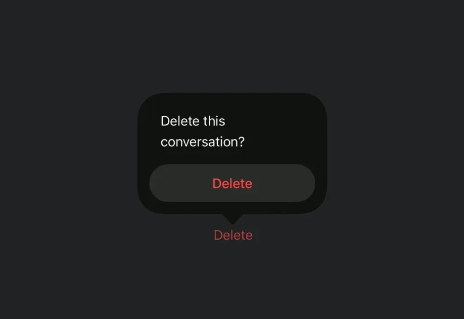
Expo UI ConfirmationDialog matches the official SwiftUI confirmationDialog API and presents an action sheet-style dialog with a title, actions, and an optional message.
Installation
If you are installing this in an existing React Native app, make sure to install expo in your project.
Usage
Basic confirmation dialog
Use ConfirmationDialog.Trigger to define the visible element and ConfirmationDialog.Actions to provide the dialog buttons.
Destructive action confirmation
Use role="destructive" on a Button inside ConfirmationDialog.Actions to style it as a destructive action.
With message and multiple actions
Use ConfirmationDialog.Message to display a descriptive message below the title, and include multiple action buttons for different choices.
Hidden title
Set titleVisibility="hidden" to hide the dialog title while still showing the actions and message. You should still provide a title for accessibility.
API
import { ConfirmationDialog } from '@expo/ui/swift-ui';
Component
Type: React.Element<ConfirmationDialogProps>
ConfirmationDialog presents a confirmation dialog with a title, optional message, and action buttons.
React.ReactNodeThe contents of the confirmation dialog.
Should include ConfirmationDialog.Trigger, ConfirmationDialog.Actions, and optionally ConfirmationDialog.Message.
(isPresented: boolean) => voidA callback that is called when the isPresented state changes.
string • Default: 'automatic'The visibility of the dialog title.
Acceptable values are: 'automatic' | 'visible' | 'hidden'