For cross-platform usage, see the universal BottomSheet — it renders the appropriate native component per platform.
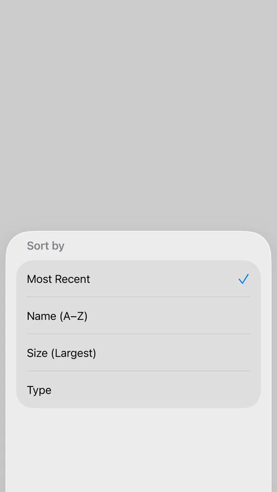
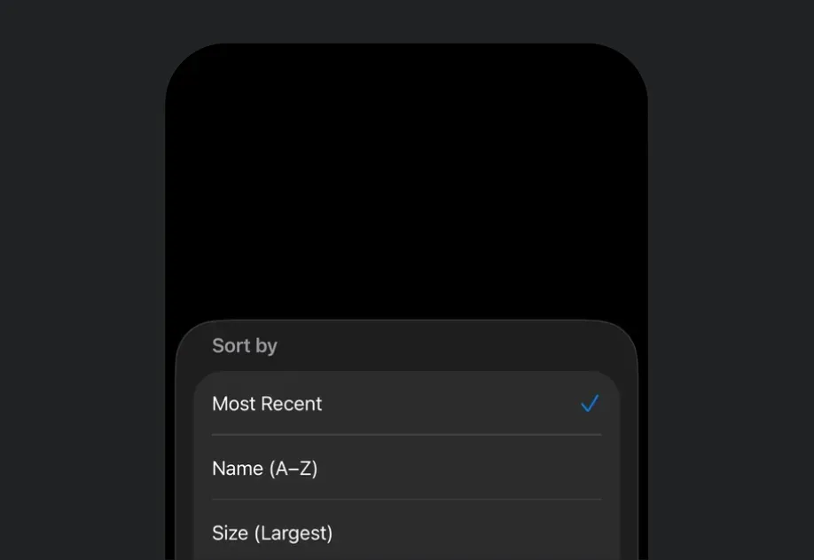
Expo UI BottomSheet matches the official SwiftUI sheet API and presents content from the bottom of the screen.
On iOS, to show a bottom sheet on top of another, nest the second BottomSheet inside the first sheet's content rather than beside it. This is a limitation of the underlying SwiftUI sheet modifier. See how to present multiple sheets for more information.
Use the fitToContents prop to automatically size the sheet to fit its content.
BottomSheetFitsContentExample.tsx
import{ useState }from'react';import{Host,BottomSheet,Button,Text,VStack}from'@expo/ui/swift-ui';exportdefaultfunctionBottomSheetFitsContentExample(){const[isPresented, setIsPresented]=useState(false);return(<Hoststyle={{ flex:1}}><VStack><Buttonlabel="Open Sheet"onPress={()=>setIsPresented(true)}/><BottomSheetisPresented={isPresented}onIsPresentedChange={setIsPresented}fitToContents><VStack><Text>This sheet automatically sizes to fit its content.</Text><Buttonlabel="Close"onPress={()=>setIsPresented(false)}/></VStack></BottomSheet></VStack></Host>);}
Custom background color
By default, a sheet uses the system's translucent material background (Liquid Glass on iOS 26). Use the presentationBackground modifier on Group to paint the sheet with a solid color instead, which also opts the sheet out of that translucent material.
Prefer presentationBackground over a background modifier on the sheet's content. A background sits behind the content's own background, so a Form or List covers it, and the color shows inconsistently as the sheet moves between detents. presentationBackground colors the sheet surface itself, so it stays consistent at every detent. When the content is a Form or List, also add scrollContentBackground('hidden') so the sheet color shows through the grouped background.
import{ useState }from'react';import{Host,BottomSheet,Button,Text,VStack}from'@expo/ui/swift-ui';import{
presentationDetents,
presentationBackgroundInteraction,}from'@expo/ui/swift-ui/modifiers';exportdefaultfunctionBottomSheetWithBackgroundInteractionExample(){const[isPresented, setIsPresented]=useState(false);return(<Hoststyle={{ flex:1}}><VStack><Buttonlabel="Open Sheet"onPress={()=>setIsPresented(true)}/><BottomSheetisPresented={isPresented}onIsPresentedChange={setIsPresented}><Groupmodifiers={[presentationDetents(['medium','large']),presentationBackgroundInteraction({ type:'enabledUpThrough', detent:'medium'}),]}><Text>Interact with content behind when at medium height.</Text></Group></BottomSheet></VStack></Host>);}
When using React Native content with flex: 1, omit the matchContents prop on RNHostView and use presentationDetents to control the sheet height.
BottomSheetWithFlexRNContentExample.tsx
import{ useState }from'react';import{TextasRNText,View}from'react-native';import{Host,BottomSheet,Button,RNHostView,VStack}from'@expo/ui/swift-ui';import{ presentationDetents, presentationDragIndicator }from'@expo/ui/swift-ui/modifiers';exportdefaultfunctionBottomSheetWithFlexRNContentExample(){const[isPresented, setIsPresented]=useState(false);return(<Hoststyle={{ flex:1}}><VStack><Buttonlabel="Open Sheet"onPress={()=>setIsPresented(true)}/><BottomSheetisPresented={isPresented}onIsPresentedChange={setIsPresented}><Groupmodifiers={[presentationDetents(['medium','large']),presentationDragIndicator('visible'),]}><RNHostView><Viewstyle={{ flex:1, backgroundColor:'#007AFF', padding:24}}><RNTextstyle={{ fontSize:18, fontWeight:'bold', color:'white'}}>
Flexible React Native Content
</RNText><RNTextstyle={{ color:'white', marginTop:8}}>
This content fills the available space in the sheet.
</RNText></View></RNHostView></Group></BottomSheet></VStack></Host>);}
Scrollable React Native content
Nest a scrollable React Native list such as FlatList, ScrollView, or a high-performance list like FlashList or Legend List inside the sheet with RNHostView. Size the sheet with presentationDetents and the list scrolls within that height.
BottomSheet presents content from the bottom of the screen.
BottomSheetProps
children
iOS
tvOS
Type: React.ReactNode
The children of the BottomSheet component.
Use Group to wrap your content and apply presentation modifiers
like presentationDetents, presentationDragIndicator,
presentationBackgroundInteraction, and interactiveDismissDisabled.
fitToContents
iOS
tvOS
Optional • Type: boolean • Default: false
When true, the sheet will automatically size itself to fit its content.
This sets the presentation detent to match the height of the children.
isPresented
iOS
tvOS
Type: boolean
Whether the BottomSheet is presented.
onDismiss
iOS
tvOS
Optional • Type: () => void
Callback function that is called after the BottomSheet has been fully dismissed.
onIsPresentedChange
iOS
tvOS
Type: (isPresented: boolean) => void
Callback function that is called when the BottomSheet presented state changes.