This documentation is available as Markdown for AI agents and LLMs. See the full Markdown index or append .md to any documentation URL.
Gauge
A SwiftUI Gauge component for displaying progress with visual indicators.
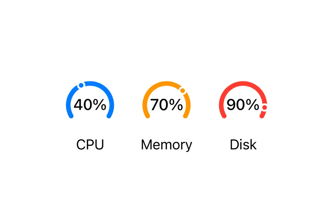
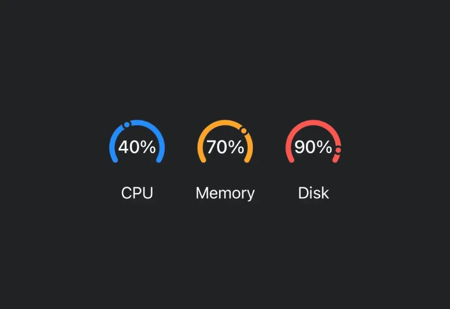
Expo UI Gauge matches the official SwiftUI Gauge API and supports styling via the gaugeStyle modifier.
Installation
If you are installing this in an existing React Native app, make sure to install expo in your project.
Usage
Basic gauge
With label
You can pass custom components as children to provide a label for the gauge.
With value labels
Use the currentValueLabel, minimumValueLabel, and maximumValueLabel props to display value information.
Gauge styles
Use the gaugeStyle modifier to change the gauge's appearance. Available styles are: automatic, circular, circularCapacity, linear, and linearCapacity.
Tinted gauge
Use the tint modifier to change the gauge's color.
API
import { Gauge } from '@expo/ui/swift-ui';
Component
Type: React.Element<GaugeProps>
Renders a SwiftUI Gauge component.
React.ReactNodeA label showing the current value. Use Text or Label to display the value.
React.ReactNodeA label showing the maximum value. Use Text or Label to display the value.
React.ReactNodeA label showing the minimum value. Use Text or Label to display the value.