This documentation is available as Markdown for AI agents and LLMs. See the full Markdown index or append .md to any documentation URL.
Section
A SwiftUI Section component for grouping content within lists and forms.
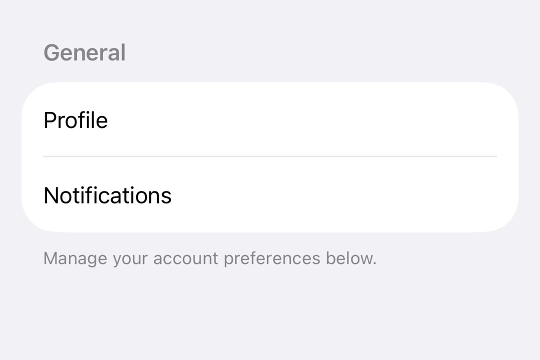
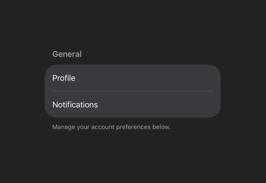
Expo UI Section matches the official SwiftUI Section API and is used to group related content within List, Form or Picker components.
Installation
If you are installing this in an existing React Native app, make sure to install expo in your project.
Usage
Basic section with title
Use the title prop for simple sections with a text header.
Section with custom header and footer
Use the header and footer props for custom views. These props are only used when title is not provided.
Collapsible section
Use the isExpanded prop to control whether the section is expanded or collapsed. When provided, the section becomes collapsible. Use onIsExpandedChange to handle state changes.
Note: Collapsible sections require iOS 17+ and tvOS 17+, and the list must use the
sidebarstyle. Footer is not supported for collapsible sections.
Multiple sections in a form
Sections work within Form components to organize form controls into logical groups.
API
import { Section } from '@expo/ui/swift-ui';
Component
Type: React.Element<SectionProps>
Section component uses the native Section component.
booleanControls whether the section is expanded or collapsed. When provided, the section becomes collapsible.
Note: Available only when the list style is set to
sidebar.
(isExpanded: boolean) => voidCallback triggered when the section's expanded state changes.