For cross-platform usage, see the universal Button — it renders the appropriate native component per platform.
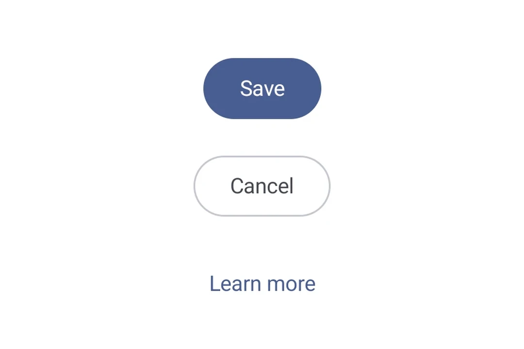
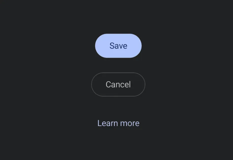
Expo UI provides five button components that match the official Jetpack Compose Button API: Button (filled), FilledTonalButton, OutlinedButton, ElevatedButton, and TextButton. All variants share the same props and accept composable children for content.
Type
Appearance
Purpose
Filled
Solid background with contrasting text.
High-emphasis buttons for primary actions such as "submit" and "save."
Filled tonal
Background color varies to match the surface.
Also for primary or significant actions. Filled tonal buttons provide more visual weight and suit functions such as "add to cart" and "Sign in."
Elevated
Stands out by having a shadow.
Serves a similar purpose to tonal buttons. Increase elevation to make the button appear even more prominently.
Outlined
Features a border with no fill.
Medium-emphasis buttons, containing actions that are important but not primary. They pair well with other buttons to indicate alternative, secondary actions like "Cancel" or "Back."
Text
Displays text with no background or border.
Low-emphasis buttons, ideal for less critical actions such as navigational links, or secondary functions like "Learn More" or "View details."
Since buttons accept composable children, you can add leading and trailing icons using the Icon component. This follows the Material 3 buttons with icon pattern (official sample), use 18dp icon size, 8dp spacing between the icon and label.
ButtonWithIconsExample.tsx
import{Host,Button,OutlinedButton,FilledTonalButton,Icon,Spacer,Text,}from'@expo/ui/jetpack-compose';import{ width }from'@expo/ui/jetpack-compose/modifiers';const addIcon =require('./assets/add.png');const sendIcon =require('./assets/send.png');exportdefaultfunctionButtonWithIconsExample(){return(<HostmatchContents>{/* Leading icon */}<ButtononClick={()=>{}}><Iconsource={addIcon}size={18}tint="#FFFFFF"/><Spacermodifiers={[width(8)]}/><Text>Add Item</Text></Button>{/* Trailing icon */}<OutlinedButtononClick={()=>{}}><Text>Send</Text><Spacermodifiers={[width(8)]}/><Iconsource={sendIcon}size={18}/></OutlinedButton>{/* Both leading and trailing icons */}<FilledTonalButtononClick={()=>{}}><Iconsource={addIcon}size={18}/><Spacermodifiers={[width(8)]}/><Text>Create & Send</Text><Spacermodifiers={[width(8)]}/><Iconsource={sendIcon}size={18}/></FilledTonalButton></Host>);}
Custom colors
Override container and content colors using the colors prop.