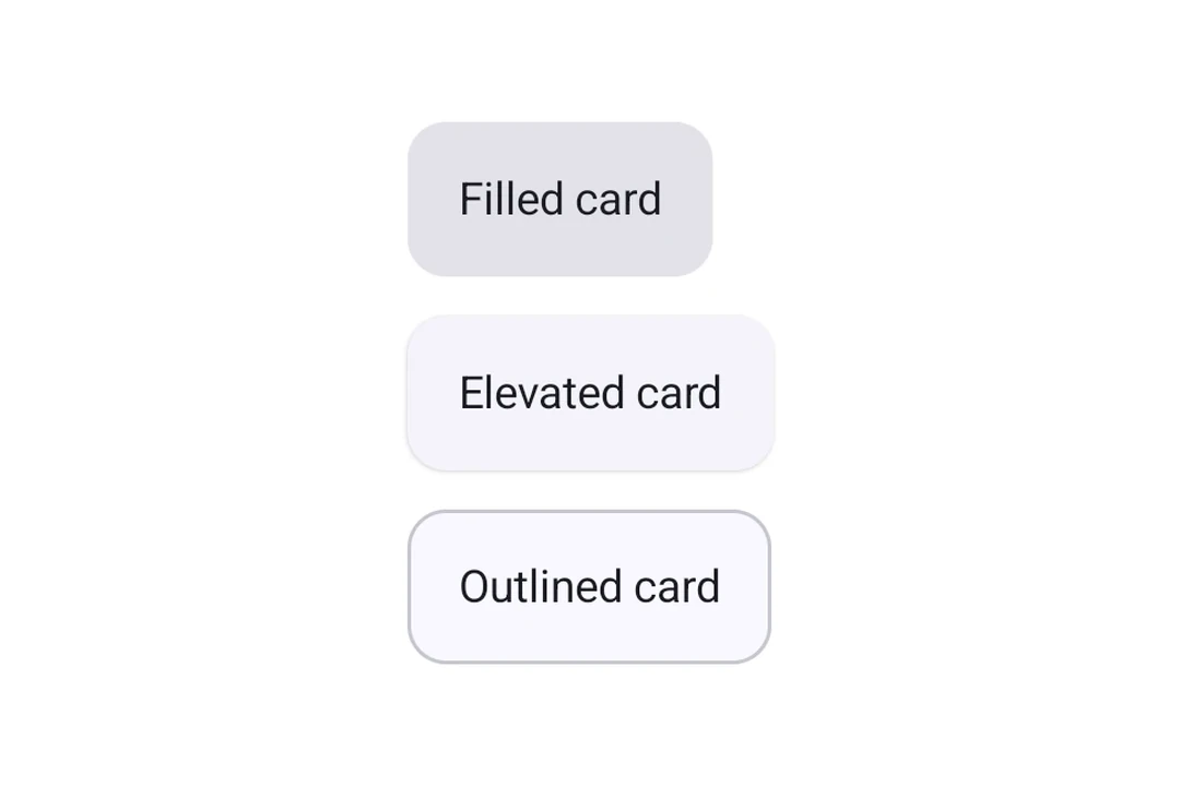
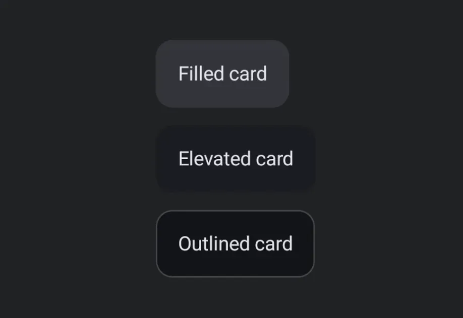
Expo UI Card matches the official Jetpack Compose Card API and displays content inside a styled surface container with optional elevation and outline. The Card component renders a filled card, while ElevatedCard and OutlinedCard provide raised and bordered variants respectively.
import{Host,Card,Text}from'@expo/ui/jetpack-compose';import{ paddingAll }from'@expo/ui/jetpack-compose/modifiers';exportdefaultfunctionBasicCardExample(){return(<HostmatchContents><Card><Textmodifiers={[paddingAll(16)]}>This is a basic card with default styling.</Text></Card></Host>);}
Card types
Use Card (filled), ElevatedCard, or OutlinedCard for different styles.
Use the elevation prop (in dp) to control shadow depth. Elevation is most meaningful on ElevatedCard, which uses shadow elevation. Filled Card uses tonal elevation by default, so changes may be subtle.
ElevatedCardExample.tsx
import{Host,ElevatedCard,Text}from'@expo/ui/jetpack-compose';import{ paddingAll }from'@expo/ui/jetpack-compose/modifiers';exportdefaultfunctionElevatedCardExample(){return(<HostmatchContents><ElevatedCardelevation={8}><Textmodifiers={[paddingAll(16)]}>Card with 8dp elevation</Text></ElevatedCard></Host>);}
Custom border
Card and OutlinedCard accept a border prop to customize stroke width and color.
OutlinedCardExample.tsx
import{Host,OutlinedCard,Text}from'@expo/ui/jetpack-compose';import{ paddingAll }from'@expo/ui/jetpack-compose/modifiers';exportdefaultfunctionOutlinedCardExample(){return(<HostmatchContents><OutlinedCardborder={{ width:2, color:'#6200EE'}}><Textmodifiers={[paddingAll(16)]}>Card with custom purple border</Text></OutlinedCard></Host>);}