This documentation is available as Markdown for AI agents and LLMs. See the full Markdown index or append .md to any documentation URL.
Switch
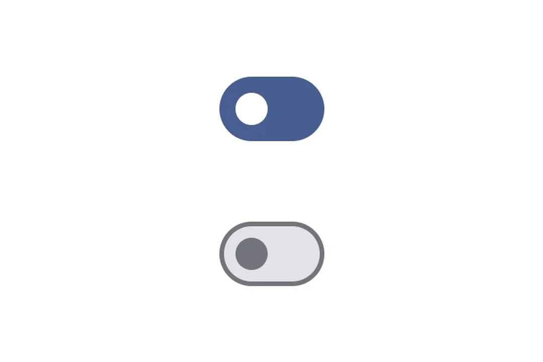
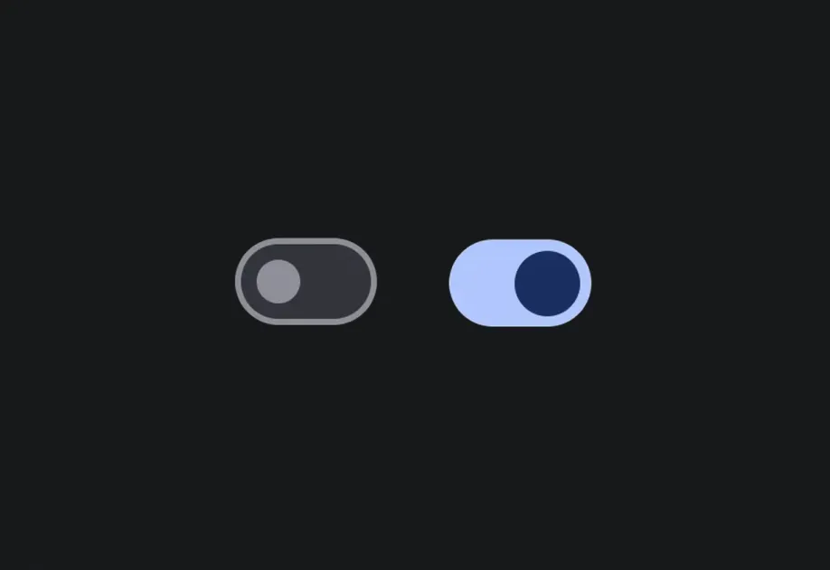
A Jetpack Compose Switch component for toggle controls.
For cross-platform usage, see the universal
Switch— it renders the appropriate native component per platform.
Expo UI Switch matches the official Jetpack Compose Switch API.
Installation
If you are installing this in an existing React Native app, make sure to install expo in your project.
Usage
Toggle switch
Custom colors
Custom thumb content
Use Switch.ThumbContent to render a custom element inside the thumb. Switch.DefaultIconSize gives you the M3 default icon size so your content fits perfectly.
API
import { Switch } from '@expo/ui/jetpack-compose';
Components
Type: React.Element<SwitchProps>
A switch component.
(value: boolean) => voidCallback function that is called when the checked state changes.
Type: React.Element<ThumbContentProps>
Custom content to be displayed inside the switch thumb.