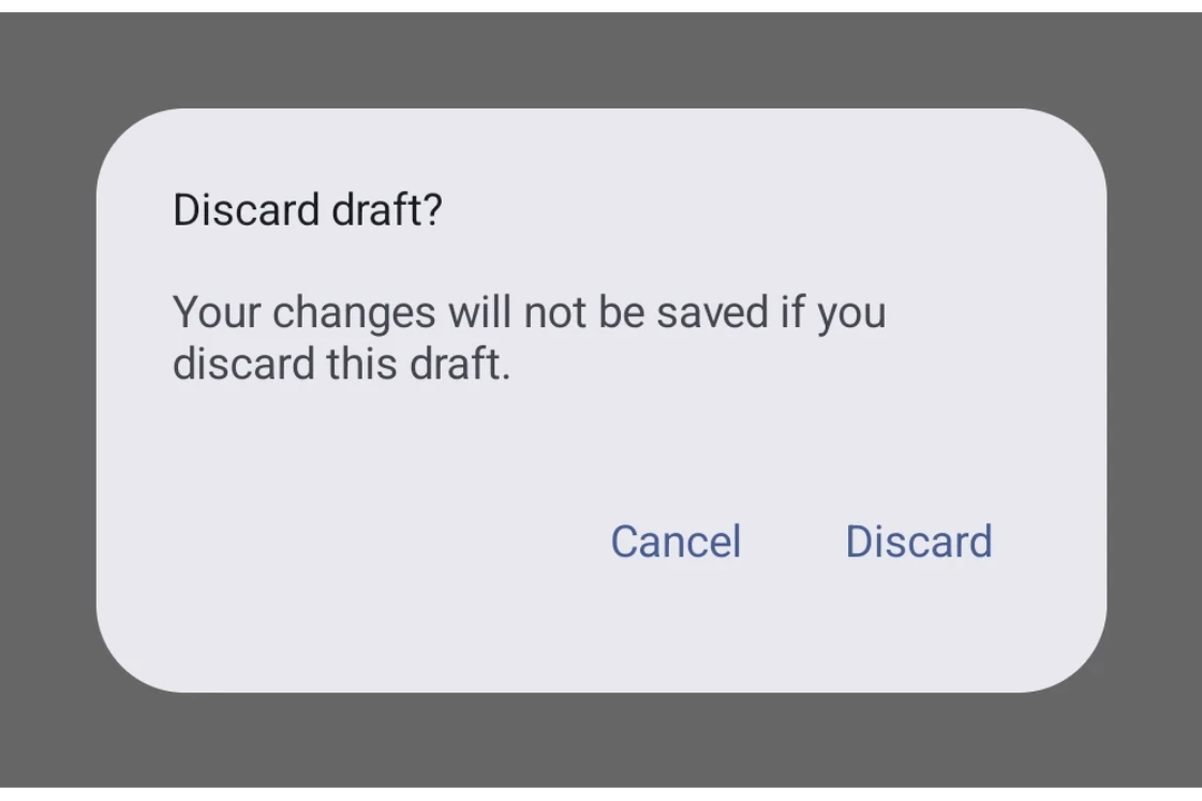
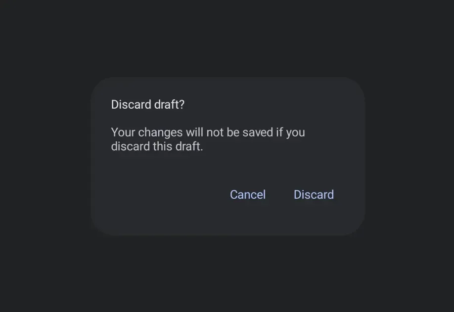
Expo UI AlertDialog matches the official Jetpack Compose AlertDialog API. Content is provided via slot sub-components (AlertDialog.Title, AlertDialog.Text, AlertDialog.ConfirmButton, AlertDialog.DismissButton, AlertDialog.Icon) that map directly to Compose's slot parameters.
import{ useState }from'react';import{Host,AlertDialog,Button,TextButton,Text}from'@expo/ui/jetpack-compose';exportdefaultfunctionBasicAlertDialogExample(){const[visible, setVisible]=useState(false);return(<HostmatchContents><ButtononClick={()=>setVisible(true)}><Text>Show Alert</Text></Button>{visible &&(<AlertDialogonDismissRequest={()=>setVisible(false)}><AlertDialog.Title><Text>Confirm Action</Text></AlertDialog.Title><AlertDialog.Text><Text>Are you sure you want to proceed?</Text></AlertDialog.Text><AlertDialog.ConfirmButton><TextButtononClick={()=>setVisible(false)}><Text>Confirm</Text></TextButton></AlertDialog.ConfirmButton><AlertDialog.DismissButton><TextButtononClick={()=>setVisible(false)}><Text>Cancel</Text></TextButton></AlertDialog.DismissButton></AlertDialog>)}</Host>);}
import{ useState }from'react';import{Host,AlertDialog,Button,TextButton,Text,Icon}from'@expo/ui/jetpack-compose';exportdefaultfunctionIconDialogExample(){const[visible, setVisible]=useState(false);return(<HostmatchContents><ButtononClick={()=>setVisible(true)}><Text>Show Alert</Text></Button>{visible &&(<AlertDialogonDismissRequest={()=>setVisible(false)}><AlertDialog.Icon>{/* Replace with your own icon asset */}<Iconsource={require('./info-icon.xml')}/></AlertDialog.Icon><AlertDialog.Title><Text>Dialog with Icon</Text></AlertDialog.Title><AlertDialog.Text><Text>This dialog has an icon above the title.</Text></AlertDialog.Text><AlertDialog.ConfirmButton><TextButtononClick={()=>setVisible(false)}><Text>OK</Text></TextButton></AlertDialog.ConfirmButton></AlertDialog>)}</Host>);}
Renders an AlertDialog component with slot-based content matching the Compose API.
Content is provided via slot sub-components: AlertDialog.Title, AlertDialog.Text,
AlertDialog.ConfirmButton, AlertDialog.DismissButton, and AlertDialog.Icon.
AlertDialogProps
children
Android
Optional • Type: React.ReactNode
Children containing slot sub-components (AlertDialog.Title, AlertDialog.Text,
AlertDialog.ConfirmButton, AlertDialog.DismissButton, AlertDialog.Icon).
Properties for the dialog window, matching DialogProperties in Compose.
Property
Type
Description
decorFitsSystemWindows(optional)
boolean
Whether the dialog's decor fits system windows (status bar, navigation bar, and more).
When true, the dialog's content will be inset to avoid overlapping with system UI.
Default:true
dismissOnBackPress(optional)
boolean
Whether the dialog can be dismissed by pressing the back button.
Default:true
dismissOnClickOutside(optional)
boolean
Whether the dialog can be dismissed by clicking outside of it.
Default:true
usePlatformDefaultWidth(optional)
boolean
Whether the dialog should use the platform default width.