This documentation is available as Markdown for AI agents and LLMs. See the full Markdown index or append .md to any documentation URL.
Divider
Jetpack Compose Divider components for creating visual separators.
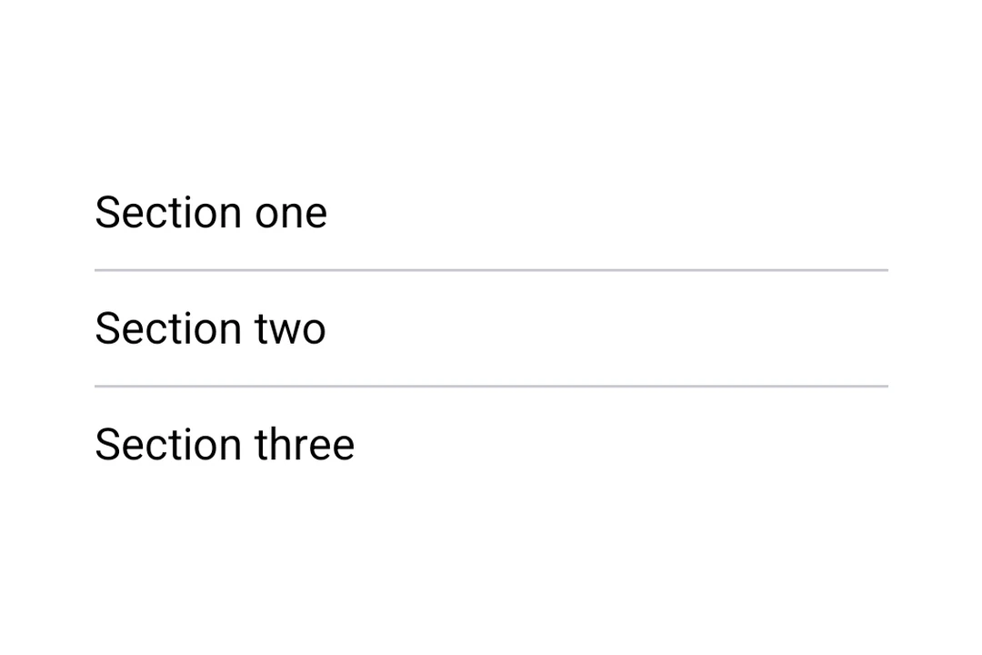
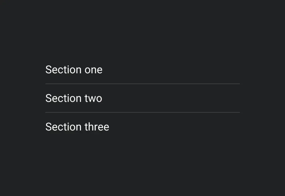
Expo UI provides HorizontalDivider and VerticalDivider matching the official Jetpack Compose Divider API.
Installation
If you are installing this in an existing React Native app, make sure to install expo in your project.
Usage
Horizontal divider
A thin horizontal line to visually separate content in lists and layouts.
Custom thickness and color
Both HorizontalDivider and VerticalDivider accept thickness and color props. Use StyleSheet.hairlineWidth for a single-pixel line, or set a custom thickness and color.
Vertical divider
A vertical line to separate items side by side in a row layout.
API
import { HorizontalDivider, VerticalDivider } from '@expo/ui/jetpack-compose';
Components
Type: React.Element<ComponentType<DividerCommonConfig>>
A horizontal divider line that groups content in lists and layouts,
matching Compose's HorizontalDivider.
Type: React.Element<ComponentType<DividerCommonConfig>>
A vertical divider line that groups content in layouts,
matching Compose's VerticalDivider.