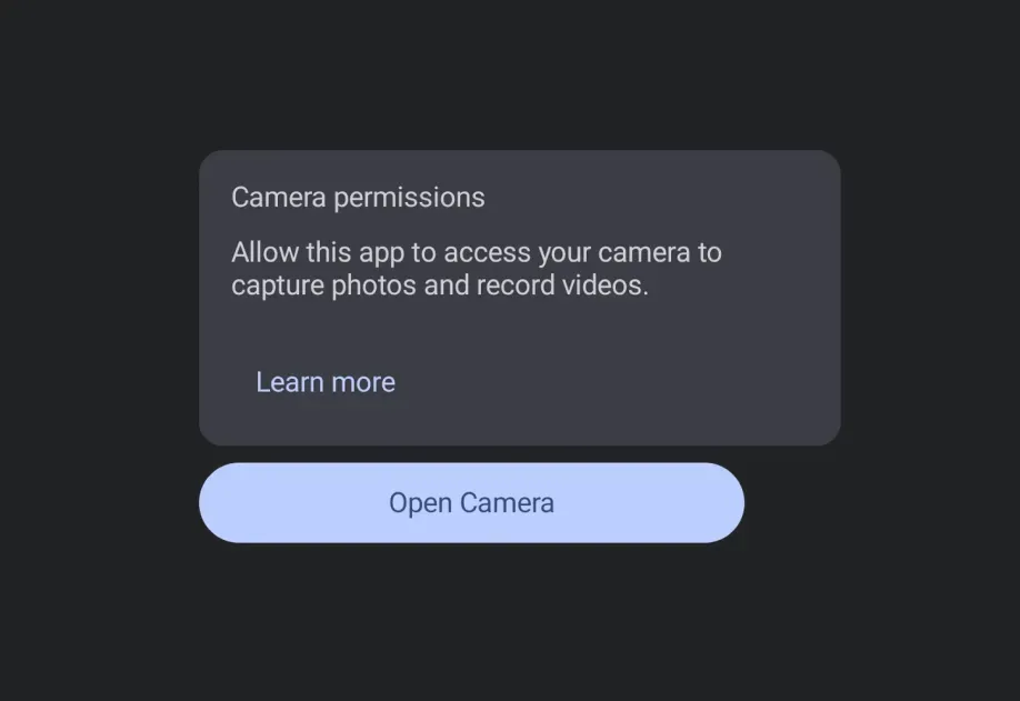
This documentation is available as Markdown for AI agents and LLMs. See the full Markdown index or append .md to any documentation URL.
Jetpack Compose
Jetpack Compose components for building native Android interfaces with @expo/ui.
Android
Included in Expo Go
The Jetpack Compose components in @expo/ui/jetpack-compose allow you to build fully native Android interfaces using Jetpack Compose from React Native.
Installation
Terminal
- npx expo install @expo/uiIf you are installing this in an existing React Native app, make sure to install expo in your project.
Usage
Using a component from @expo/ui/jetpack-compose requires wrapping it in a Host component. The Host is a container for Jetpack Compose views.
import { Host, Button } from '@expo/ui/jetpack-compose'; export function SaveButton() { return ( <Host matchContents> <Button onClick={() => alert('Saved!')}>Save changes</Button> </Host> ); }
Available components
| Component | Description |
|---|---|
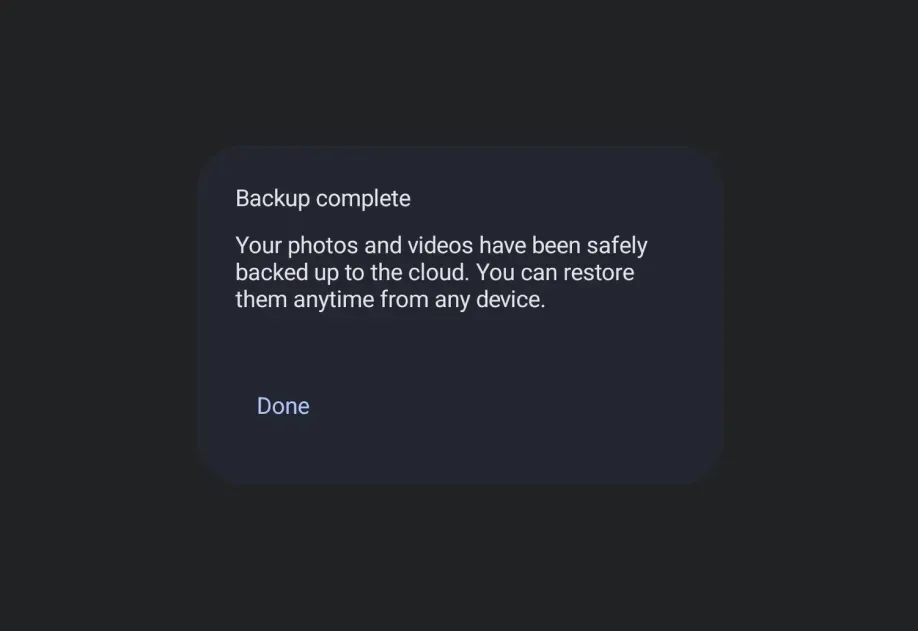
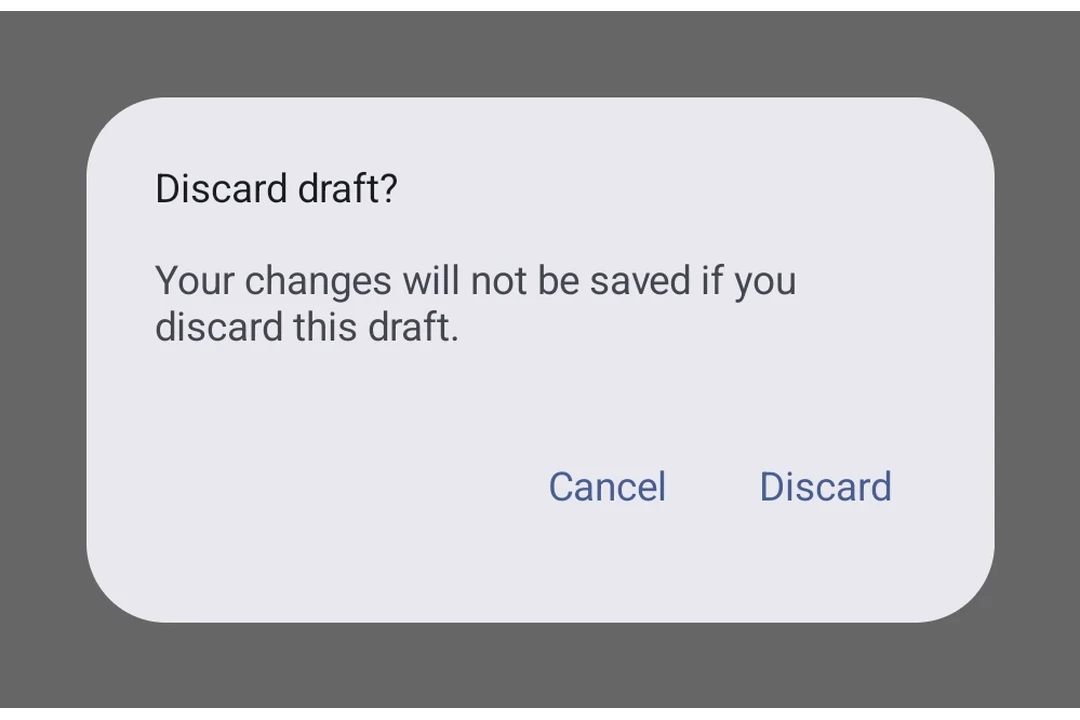
AlertDialog | AlertDialog component for displaying native alert dialogs. |
Badge | Badge component for displaying status indicators and counts. |
BadgedBox | BadgedBox component for overlaying badges on content. |
BasicAlertDialog | BasicAlertDialog component for displaying dialogs with custom content. |
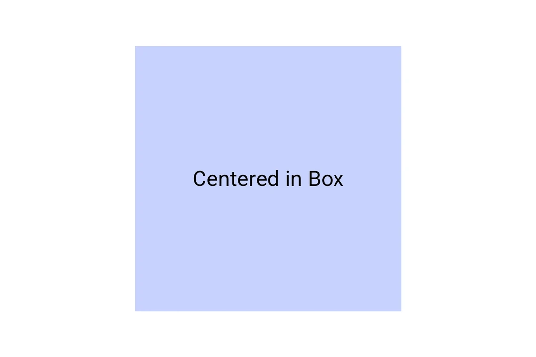
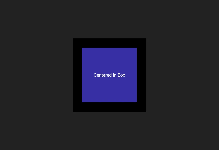
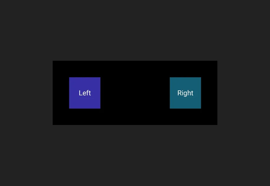
Box | Box component for stacking child elements. |
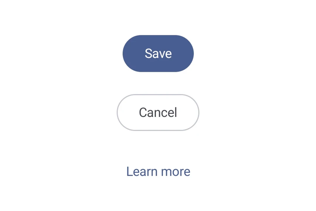
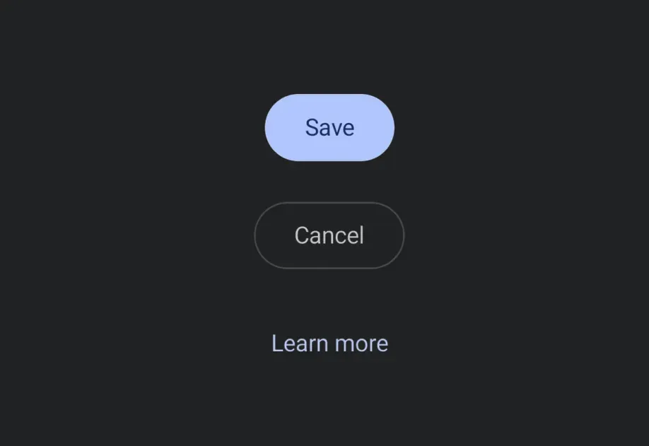
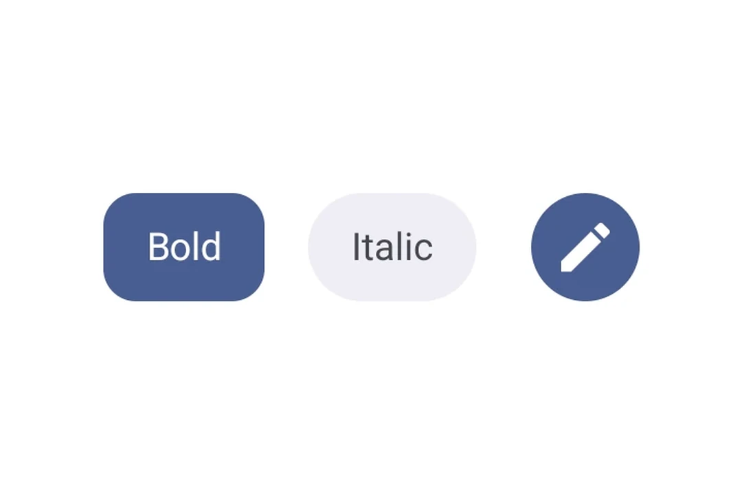
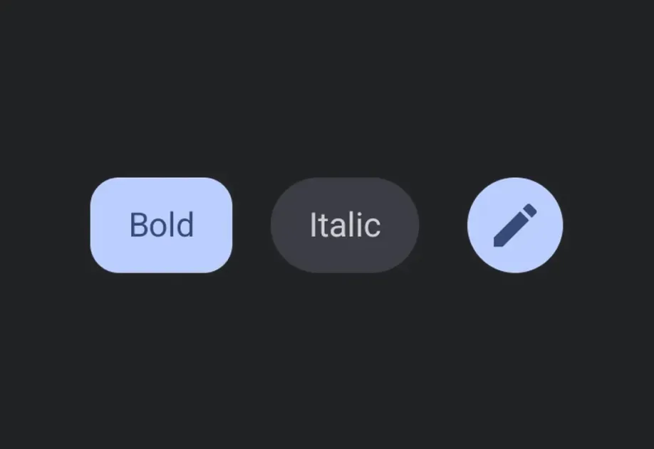
Button | Button components for displaying native Material3 buttons. |
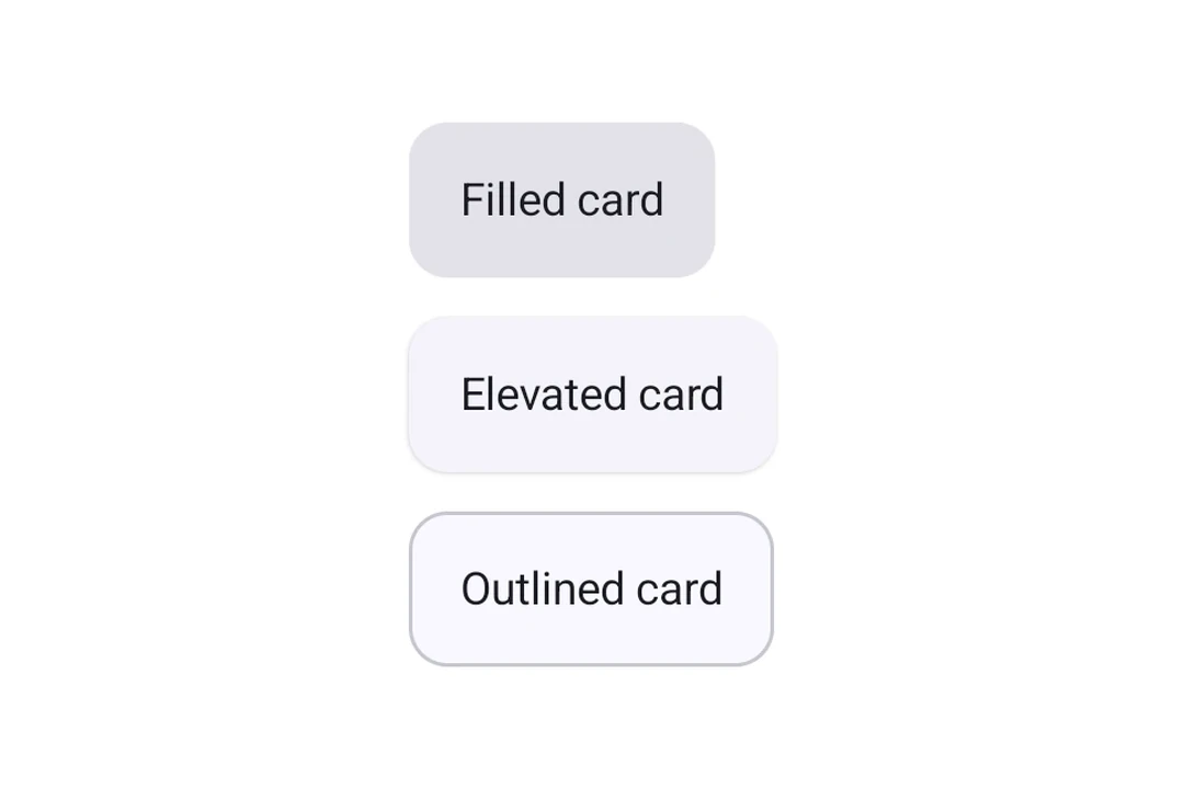
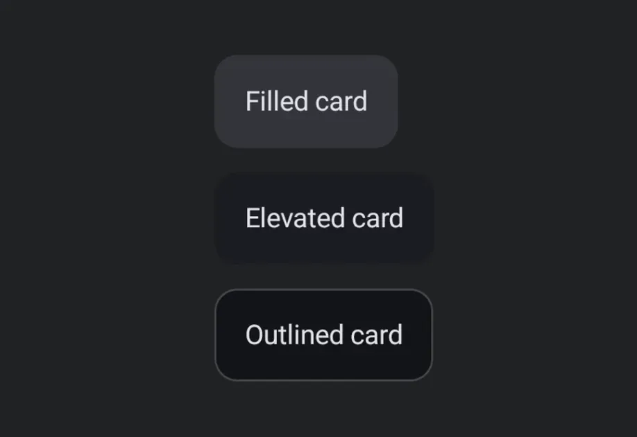
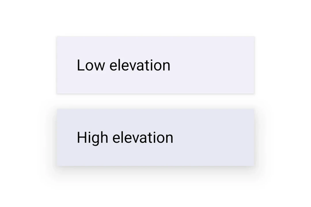
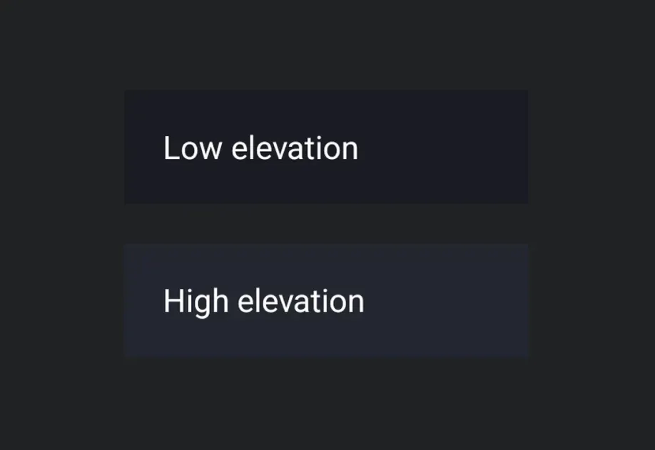
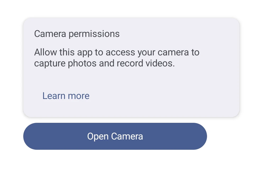
Card | Card component for displaying content in a styled container. |
Carousel | Carousel components for displaying scrollable collections of items. |
Checkbox | Checkbox component for selection controls. |
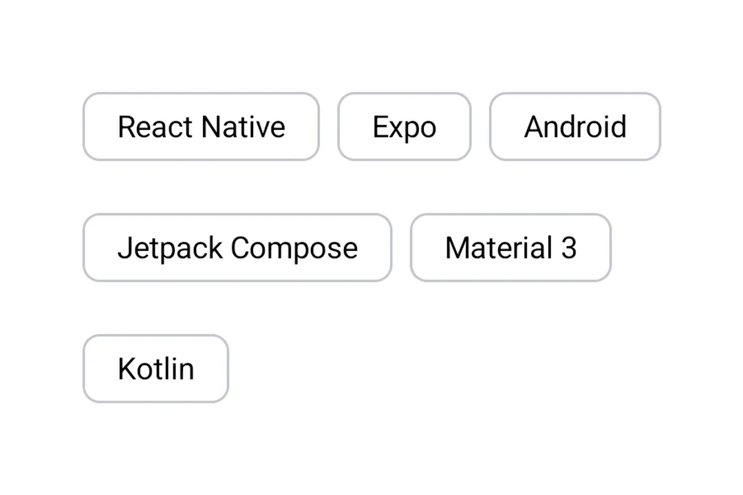
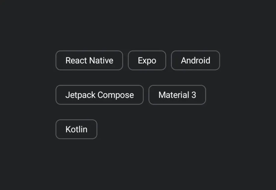
Chip | Chip components for displaying compact elements. |
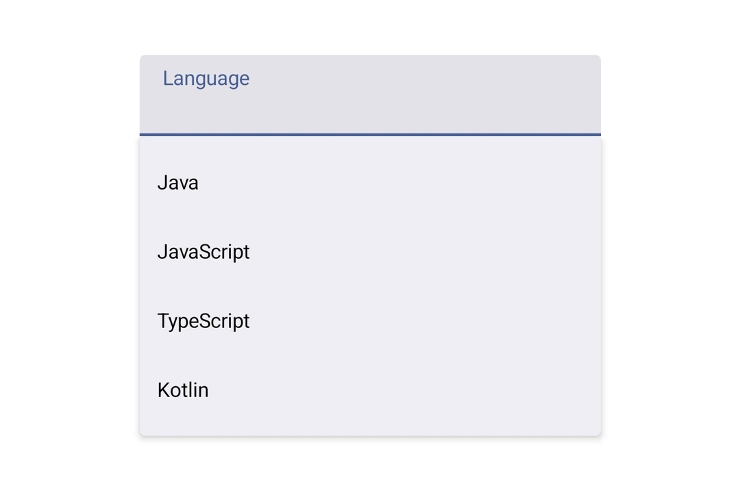
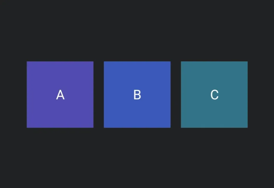
Column | Column component for placing children vertically. |
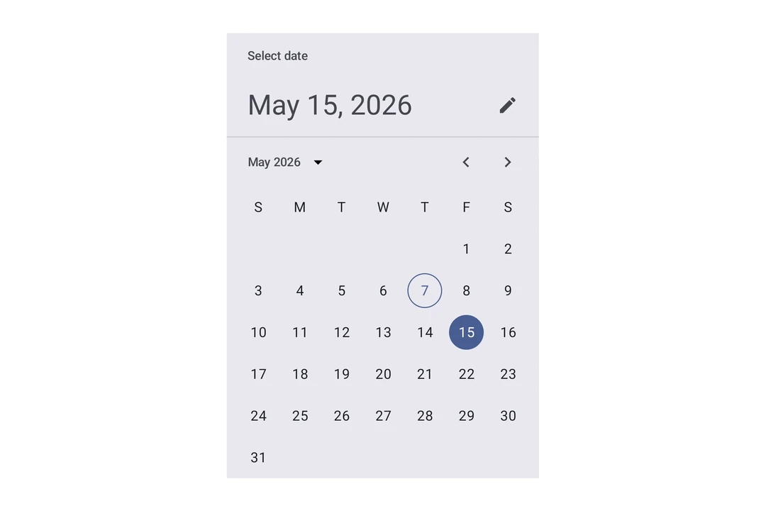
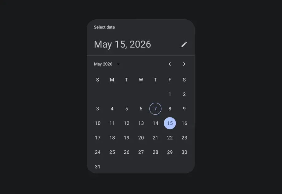
DateTimePicker | DateTimePicker component for selecting dates and times. |
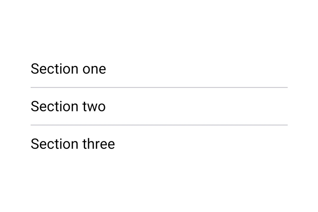
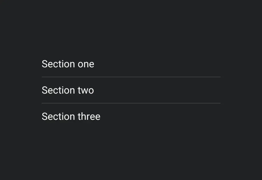
Divider | Divider components for creating visual separators. |
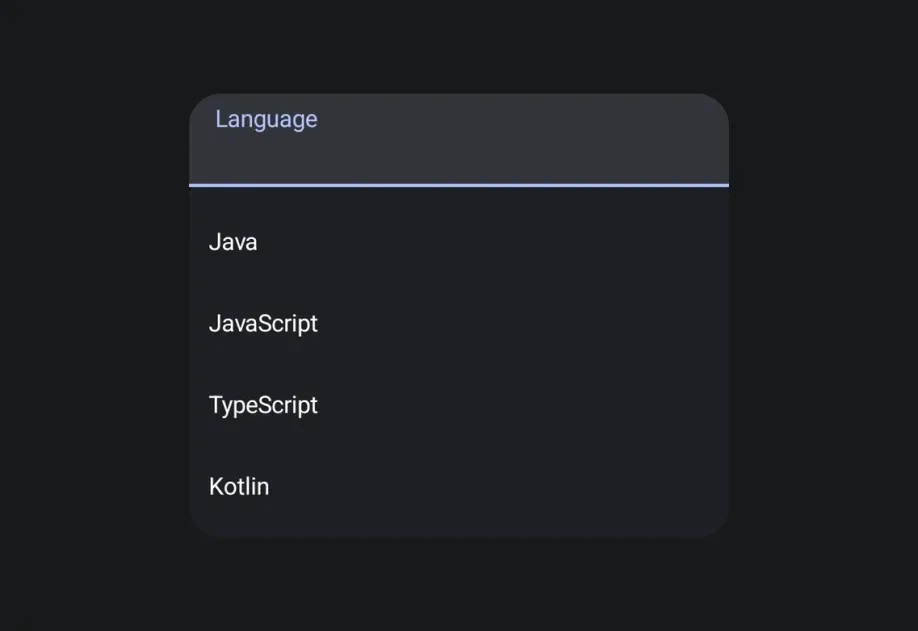
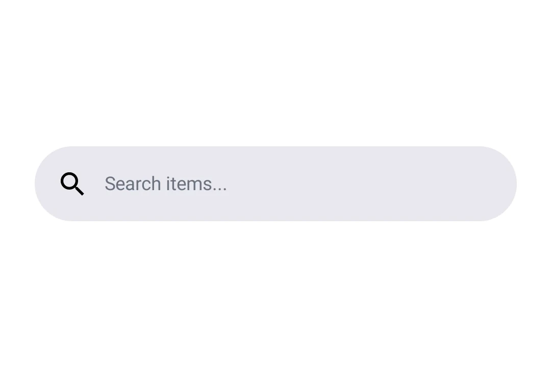
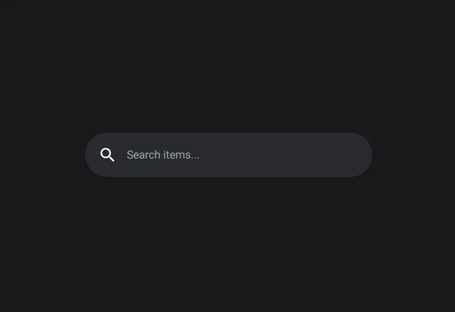
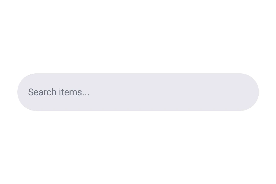
DockedSearchBar | DockedSearchBar component for displaying an inline search input. |
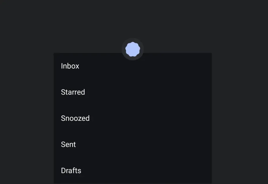
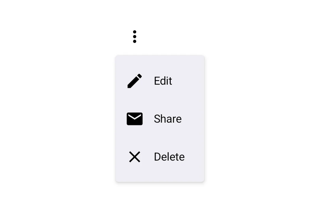
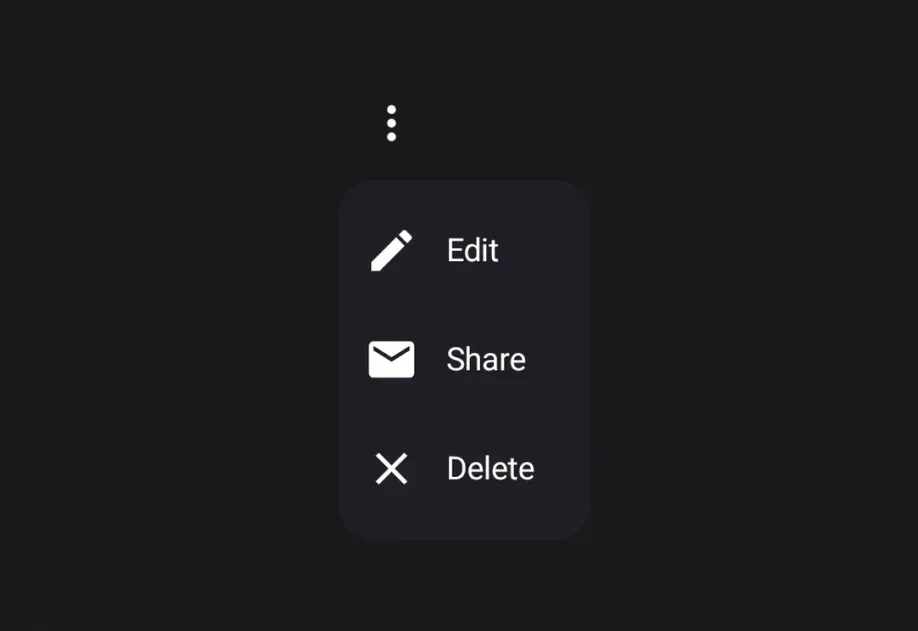
DropdownMenu | DropdownMenu component for displaying dropdown menus. |
ExposedDropdownMenuBox | ExposedDropdownMenuBox component for displaying a dropdown menu with a customizable anchor. |
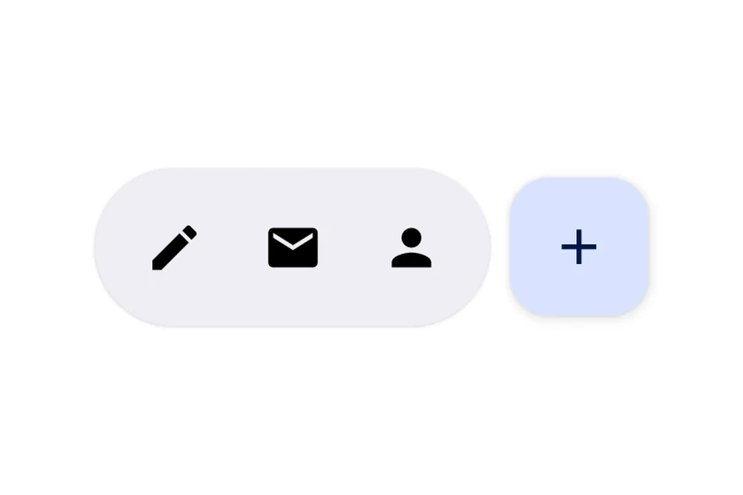
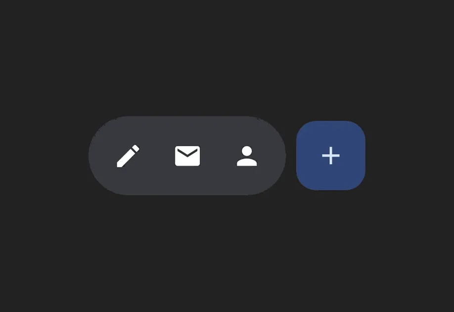
FloatingActionButton | FloatingActionButton components following Material Design 3. |
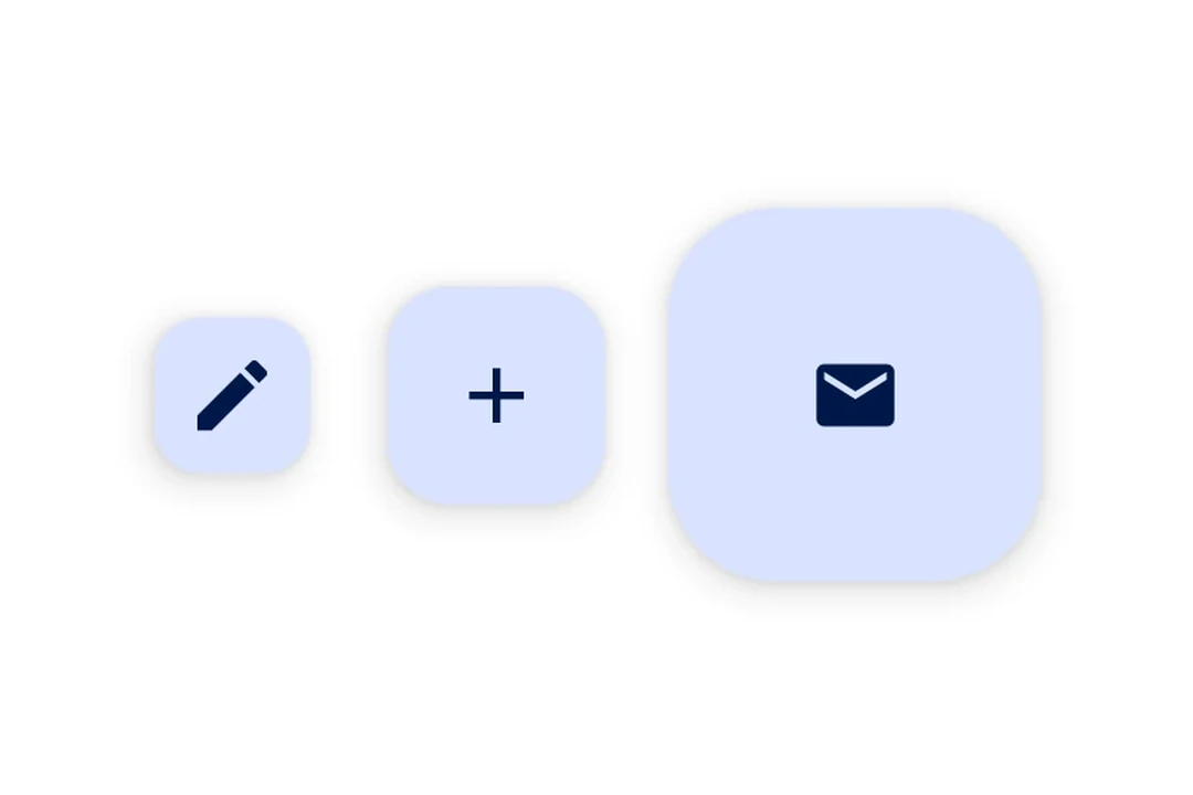
FlowRow | FlowRow component for wrapping children horizontally. |
HorizontalFloatingToolbar | HorizontalFloatingToolbar component for displaying a floating action bar. |
HorizontalPager | HorizontalPager component for swipeable pages. |
Host | Host component for bridging React Native and Jetpack Compose. |
Icon | Icon component for displaying icons. |
IconButton | IconButton components for displaying native Material3 icon buttons. |
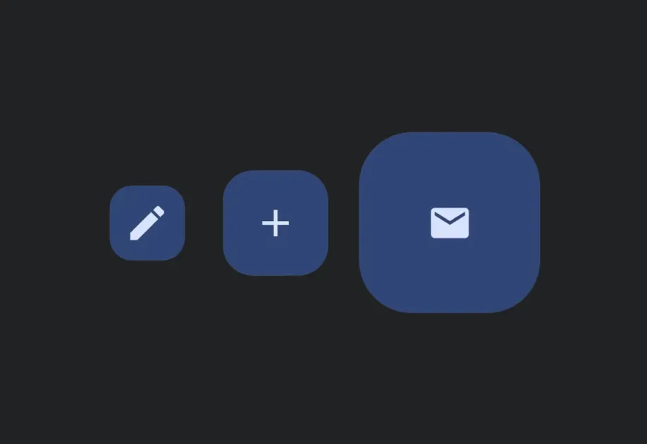
LazyColumn | LazyColumn component for displaying scrollable lists. |
LazyRow | LazyRow component for displaying horizontally scrolling lists. |
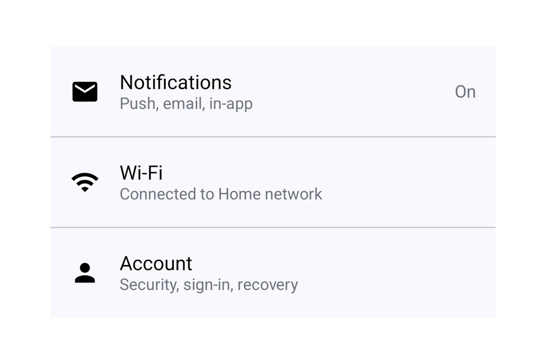
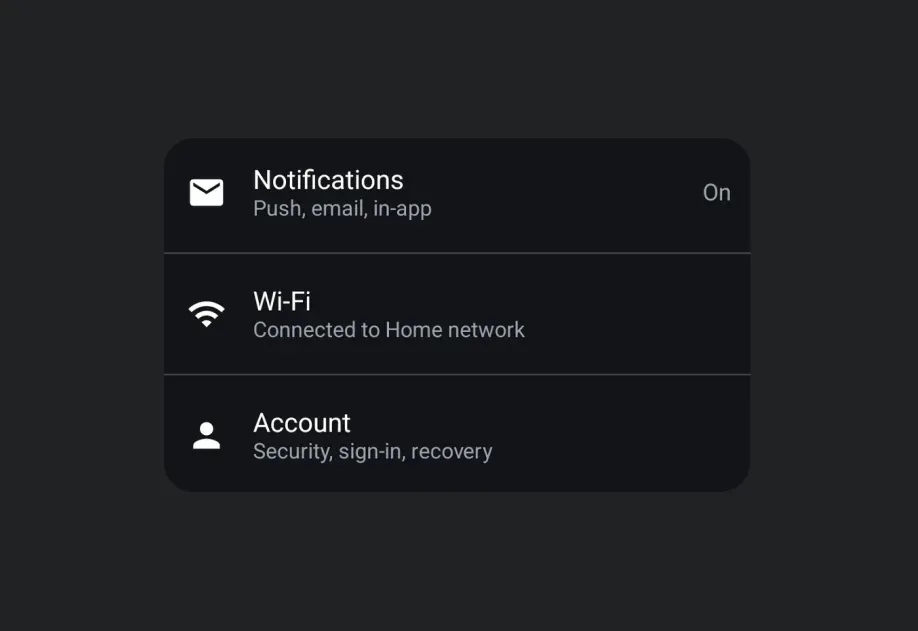
ListItem | ListItem component for displaying structured list entries. |
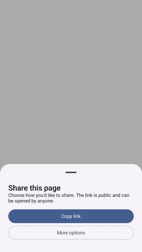
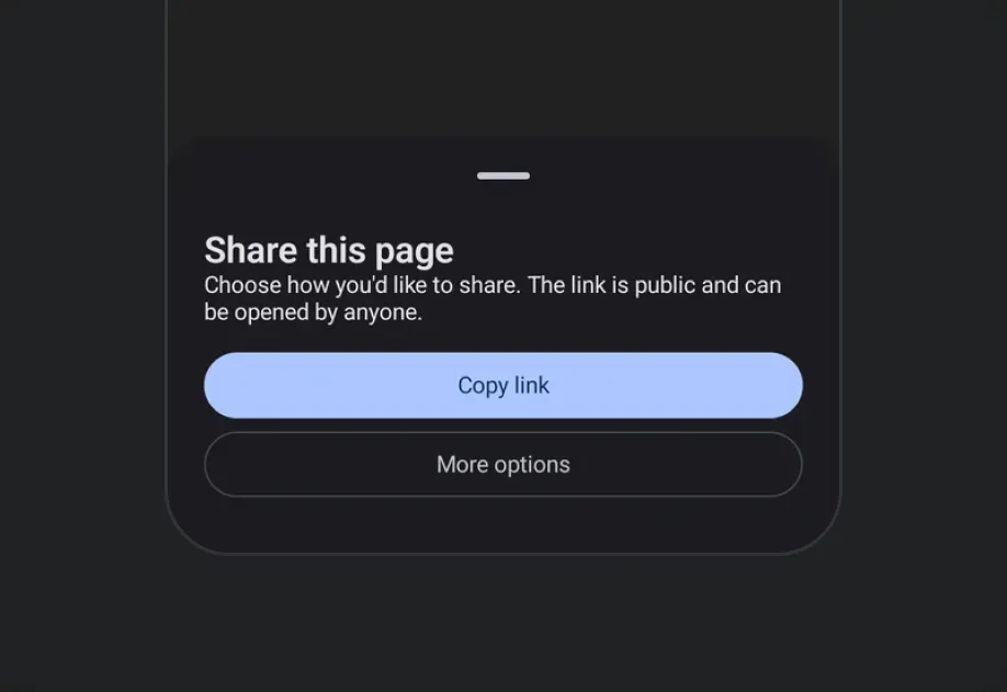
ModalBottomSheet | ModalBottomSheet component that presents content from the bottom of the screen. |
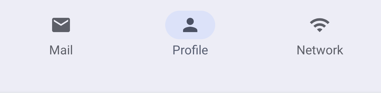
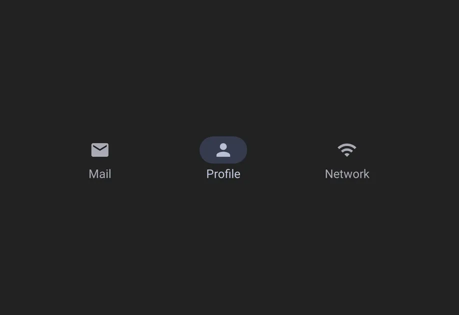
NavigationBar | NavigationBar component for Material 3 bottom navigation. |
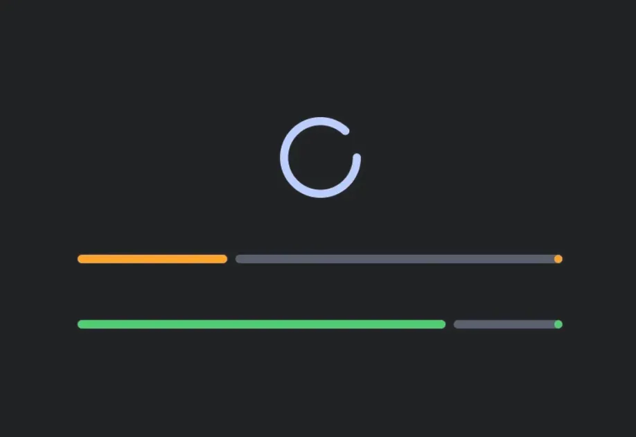
Progress Indicators | Progress indicator components for displaying operation status. |
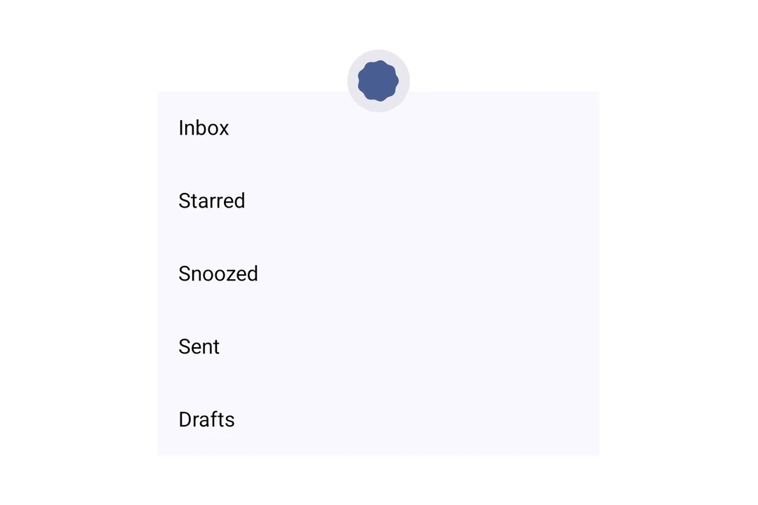
PullToRefreshBox | PullToRefreshBox component for pull-to-refresh interactions. |
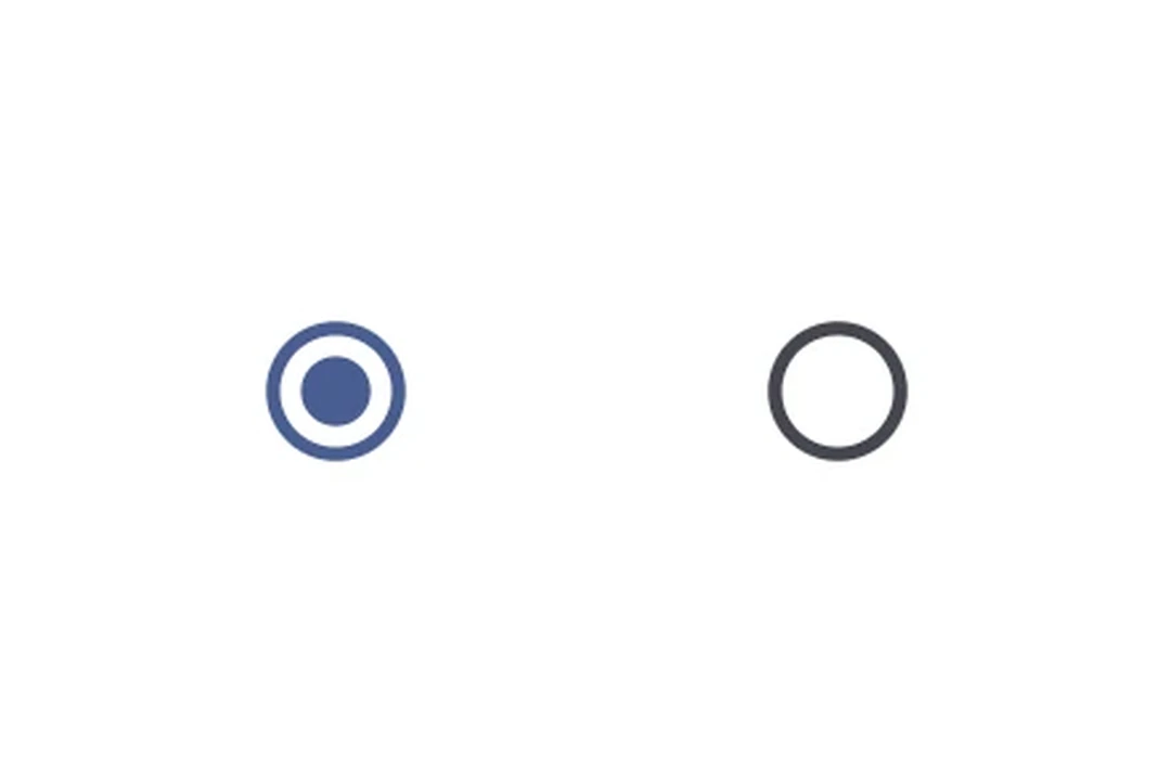
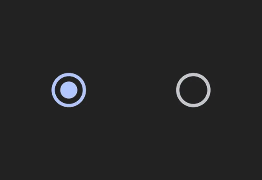
RadioButton | RadioButton component for single-selection controls. |
RNHostView | A component that enables React Native views inside Jetpack Compose. |
Row | Row component for placing children horizontally. |
SearchBar | SearchBar component for search input functionality. |
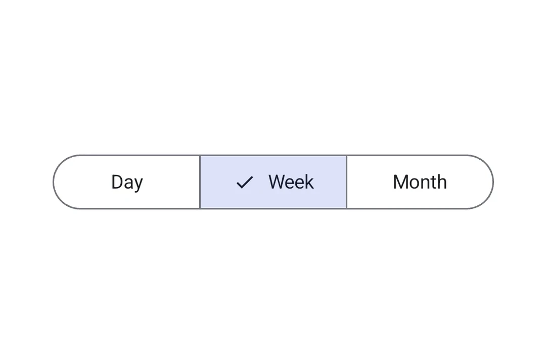
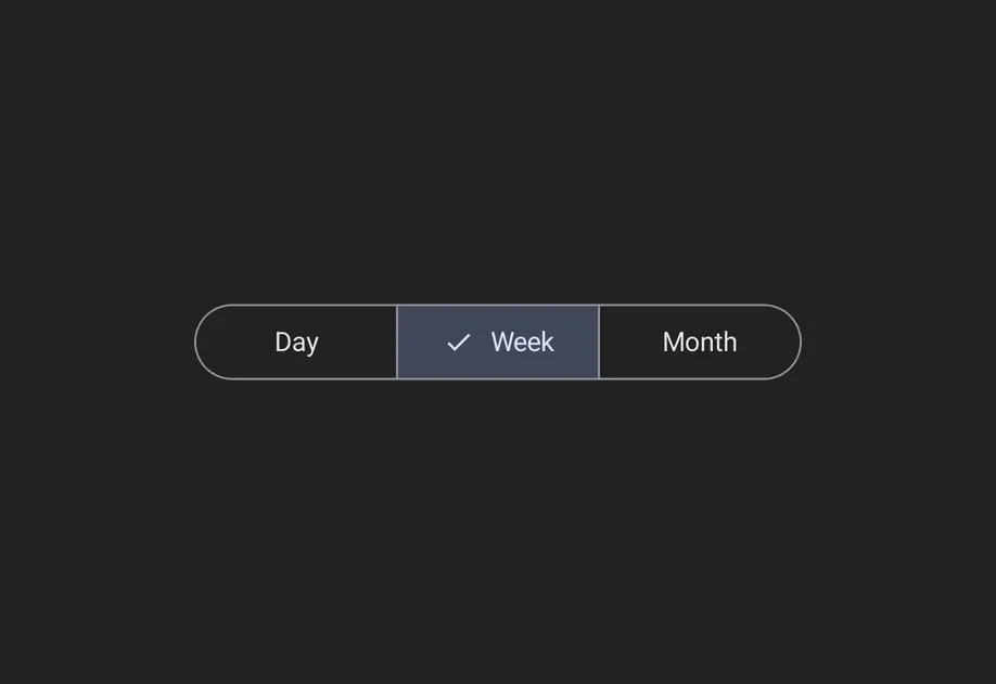
SegmentedButton | Segmented Button components for single or multi-choice selection. |
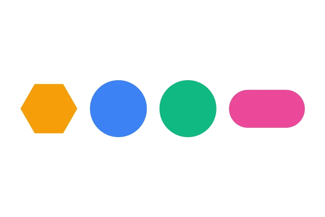
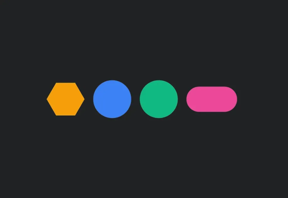
Shape | Shape component for drawing geometric shapes. |
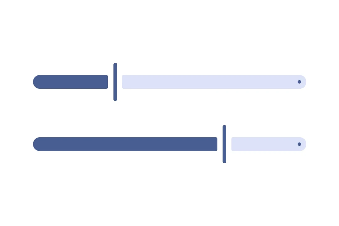
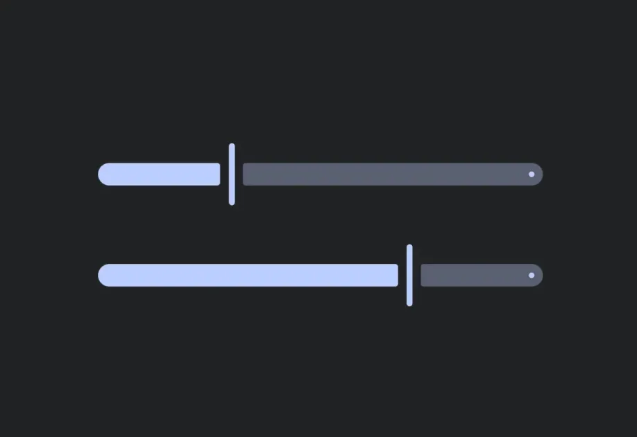
Slider | Slider component for selecting values from a range. |
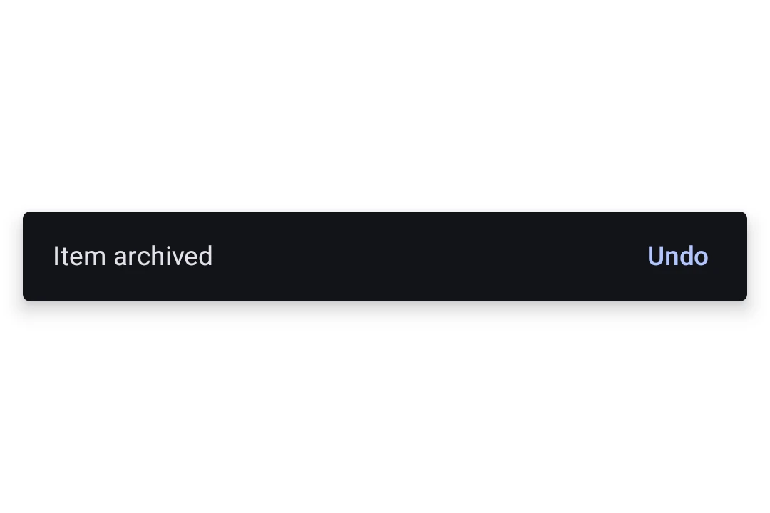
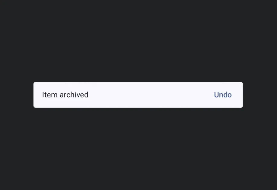
Snackbar | A brief notification that appears at the bottom of the screen to provide feedback without interrupting the user. |
Spacer | Spacer component for adding flexible space between elements. |
Surface | Surface component for styled content containers. |
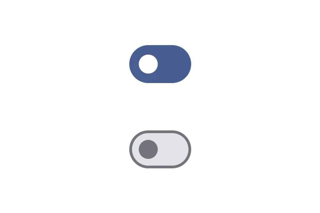
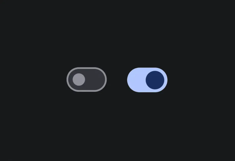
Switch | Switch component for toggle controls. |
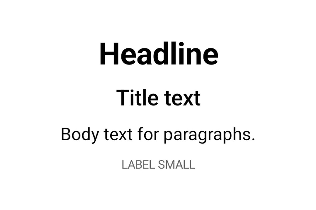
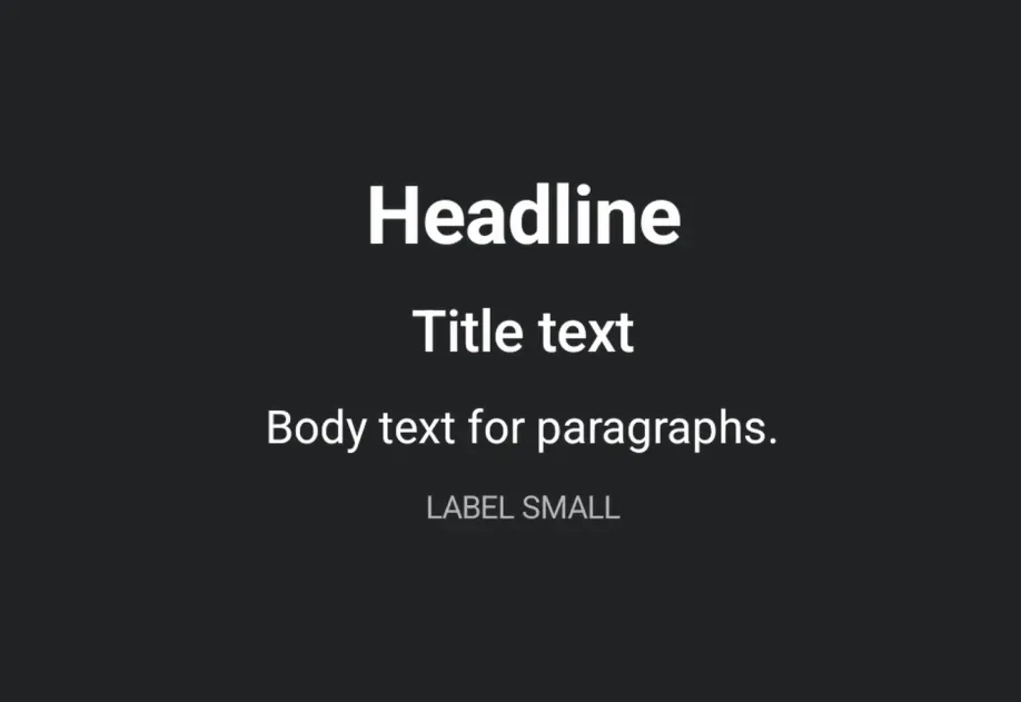
Text | Text component for displaying styled text. |
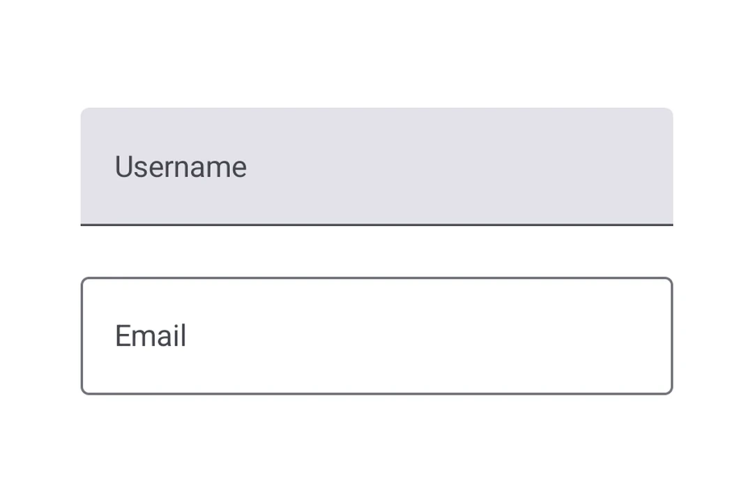
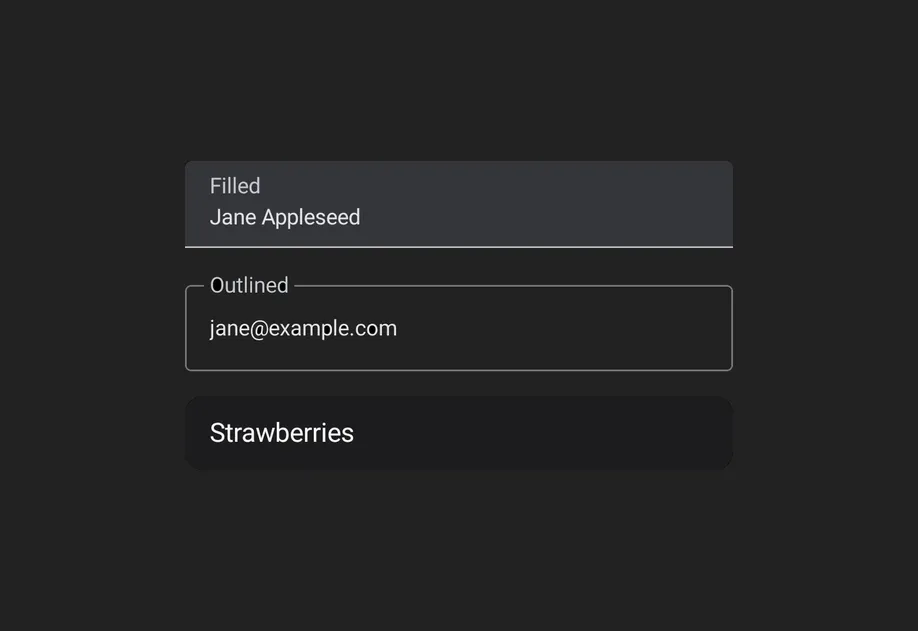
TextField | TextField components for native Material3 text input. |
ToggleButton | ToggleButton components for displaying native Material3 toggle buttons. |
Tooltip | Tooltip components for displaying contextual information on long-press. |