This documentation is available as Markdown for AI agents and LLMs. See the full Markdown index or append .md to any documentation URL.
Tooltip
Jetpack Compose Tooltip components for displaying contextual information on long-press.
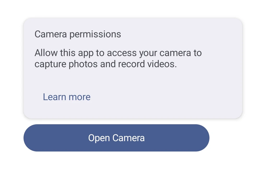
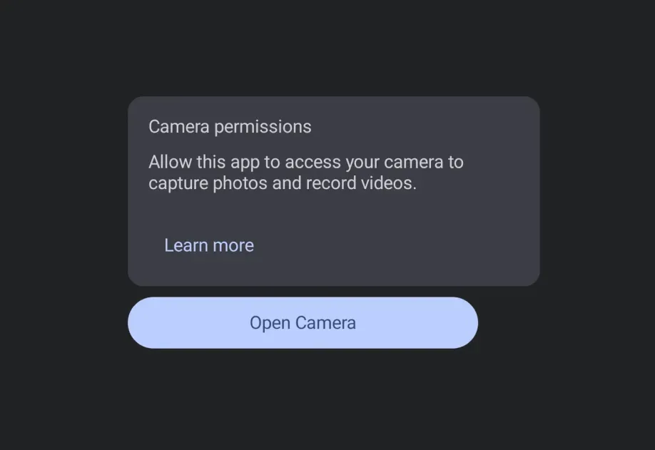
Expo UI Tooltip matches the official Jetpack Compose Tooltip API. TooltipBox wraps anchor content and displays a tooltip. The tooltip content is provided via the TooltipBox.PlainTooltip or TooltipBox.RichTooltip compound components, which match PlainTooltip and RichTooltip respectively. Tooltips can be triggered by long-press or shown programmatically via ref.
Installation
If you are installing this in an existing React Native app, make sure to install expo in your project.
Usage
Plain tooltip
Long-press the anchor content to display the tooltip.
Rich tooltip with title and body
Use TooltipBox.RichTooltip with Title and Text compound component pattern for more detailed contextual information.
Rich tooltip with action
Add an interactive action with TooltipBox.RichTooltip.Action. Use isPersistent so the tooltip stays visible for the user to tap it. hasAction is automatically derived when an action slot is present.
Programmatic show and dismiss
Use a ref to imperatively show() or dismiss() the tooltip without requiring a long-press.
API
import { TooltipBox } from '@expo/ui/jetpack-compose';
Component
Type: React.Element<TooltipBoxProps>
A container that wraps anchor content and shows a tooltip on long-press.
Provide the tooltip content via TooltipBox.PlainTooltip or TooltipBox.RichTooltip.
All other children are the anchor/trigger.
Use ref to imperatively show() or dismiss() the tooltip.
React.ReactNodeChildren containing a TooltipBox.PlainTooltip or TooltipBox.RichTooltip slot and the anchor/trigger content.
The anchor content triggers the tooltip on long-press.
boolean • Default: trueWhether user input (long-press, hover) triggers the tooltip.
booleanWhether the tooltip contains an action. Affects accessibility and dismiss behavior.
When not specified, this is automatically derived from the presence of a RichTooltip.Action slot.
boolean • Default: falseWhether the tooltip persists instead of auto-dismissing after a short timeout.