This documentation is available as Markdown for AI agents and LLMs. See the full Markdown index or append .md to any documentation URL.
Checkbox
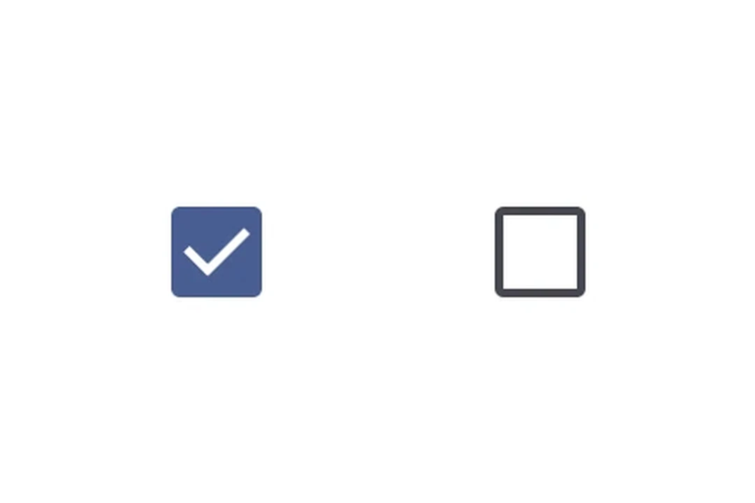
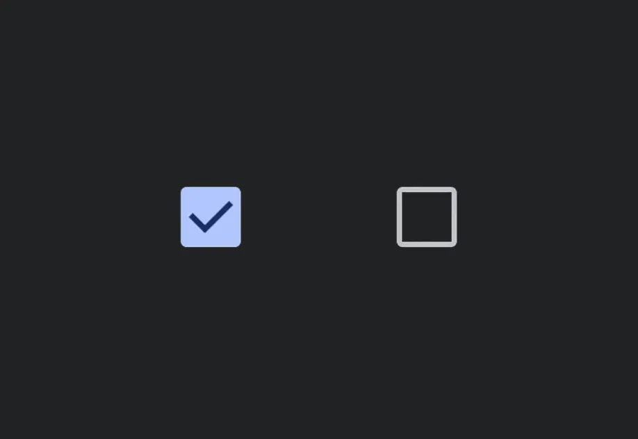
A Jetpack Compose Checkbox component for selection controls.
For cross-platform usage, see the universal
Checkbox— it renders the appropriate native component per platform.
Expo UI Checkbox matches the official Jetpack Compose Checkbox API.
Installation
If you are installing this in an existing React Native app, make sure to install expo in your project.
Usage
Basic checkbox
Custom colors
Select all (TriStateCheckbox)
Use TriStateCheckbox for a parent checkbox that reflects the state of its children. It supports three states: 'on', 'off', and 'indeterminate'.
Apply the toggleable modifier to each Row to make the entire row (checkbox + label) tappable with correct accessibility semantics. When using toggleable on the row, omit onCheckedChange/onClick from the checkbox itself to avoid double-handling.
API
import { Checkbox, TriStateCheckbox } from '@expo/ui/jetpack-compose';
Components
Type: React.Element<CheckboxProps>
A checkbox component.
(value: boolean) => voidCallback function that is called when the checked state changes.
Type: React.Element<TriStateCheckboxProps>
A tri-state checkbox component that supports 'on', 'off', and 'indeterminate' states.
Useful for "select all" patterns where the parent checkbox reflects the state of its children.
() => voidCallback function that is called when the checkbox is clicked.
ToggleableStateThe toggleable state of the checkbox: 'on', 'off', or 'indeterminate'.