This documentation is available as Markdown for AI agents and LLMs. See the full Markdown index or append .md to any documentation URL.
ListItem
A Jetpack Compose ListItem component for displaying structured list entries.
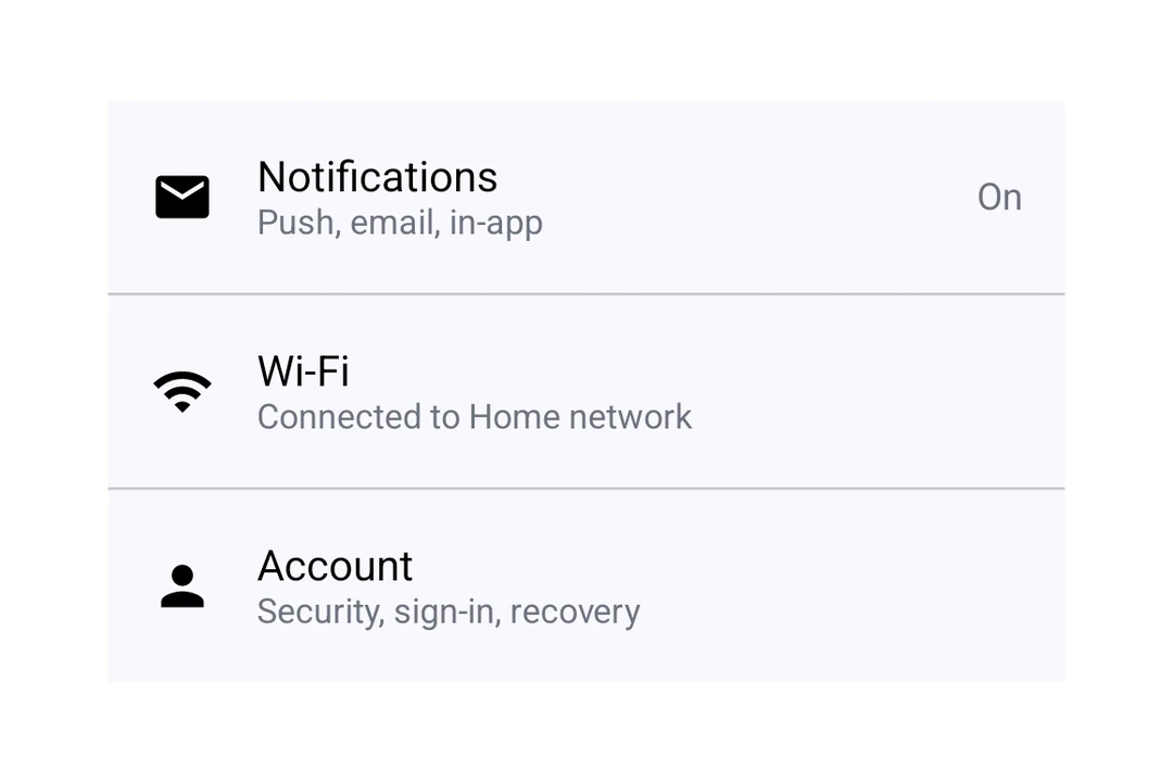
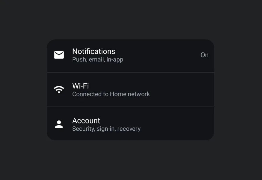
Expo UI ListItem matches the official Jetpack Compose ListItem API for structured list entries with headline, supporting, overline, leading, and trailing content slots.
Installation
- npx expo install @expo/uiIf you are installing this in an existing React Native app, make sure to install expo in your project.
Usage
Basic list item
import { Host, ListItem, Text } from '@expo/ui/jetpack-compose'; export default function BasicListItem() { return ( <Host matchContents> <ListItem> <ListItem.HeadlineContent> <Text>Settings</Text> </ListItem.HeadlineContent> </ListItem> </Host> ); }
With compound components
Use compound components for rich content in each position.
import { Host, ListItem, Icon, Text } from '@expo/ui/jetpack-compose'; export default function ListItemWithSlots() { return ( <Host matchContents> <ListItem> <ListItem.HeadlineContent> <Text>Notifications</Text> </ListItem.HeadlineContent> <ListItem.OverlineContent> <Text>ACCOUNT</Text> </ListItem.OverlineContent> <ListItem.SupportingContent> <Text>Manage notification preferences</Text> </ListItem.SupportingContent> <ListItem.LeadingContent> <Icon source={require('./assets/notifications.xml')} /> </ListItem.LeadingContent> <ListItem.TrailingContent> <Icon source={require('./assets/chevron.xml')} /> </ListItem.TrailingContent> </ListItem> </Host> ); }
Clickable list item
Use the clickable modifier to handle tap interactions.
import { Host, ListItem, Text } from '@expo/ui/jetpack-compose'; import { clickable } from '@expo/ui/jetpack-compose/modifiers'; export default function ClickableListItem() { return ( <Host matchContents> <ListItem modifiers={[clickable(() => console.log('Tapped!'))]}> <ListItem.HeadlineContent> <Text>Tap me</Text> </ListItem.HeadlineContent> </ListItem> </Host> ); }
Custom headline content
Use ListItem.HeadlineContent for composable headline content like rows with icons.
import { Host, ListItem, Text, Row, Icon } from '@expo/ui/jetpack-compose'; export default function ListItemCustomHeadline() { return ( <Host matchContents> <ListItem> <ListItem.HeadlineContent> <Row horizontalArrangement={{ spacedBy: 8 }} verticalAlignment="center"> <Text>Premium Feature</Text> <Icon source={require('./assets/star.xml')} size={16} /> </Row> </ListItem.HeadlineContent> </ListItem> </Host> ); }
API
import { ListItem } from '@expo/ui/jetpack-compose';
Component
Type: React.Element<ListItemProps>
A list item matching Compose's ListItem.
number • Default: ListItemDefaults.ElevationShadow elevation in dp.
Types
Colors for list item elements, matching ListItemDefaults.colors().
| Property | Type | Description |
|---|---|---|
| containerColor(optional) | ColorValue | - |
| contentColor(optional) | ColorValue | - |
| leadingContentColor(optional) | ColorValue | - |
| overlineContentColor(optional) | ColorValue | - |
| supportingContentColor(optional) | ColorValue | - |
| trailingContentColor(optional) | ColorValue | - |