This documentation is available as Markdown for AI agents and LLMs. See the full Markdown index or append .md to any documentation URL.
BasicAlertDialog
A Jetpack Compose BasicAlertDialog component for displaying dialogs with custom content.
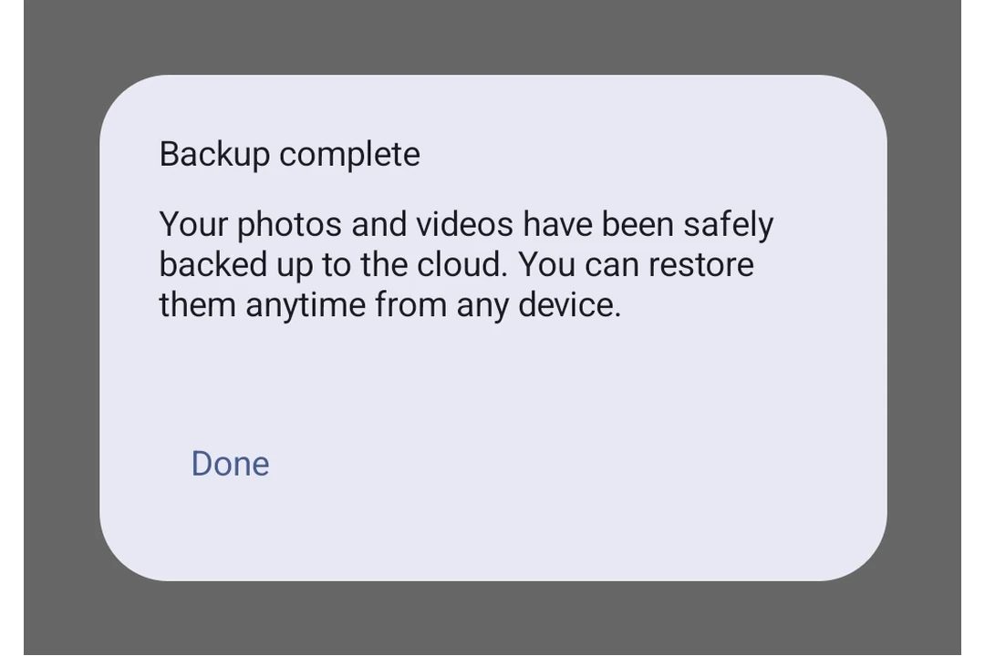
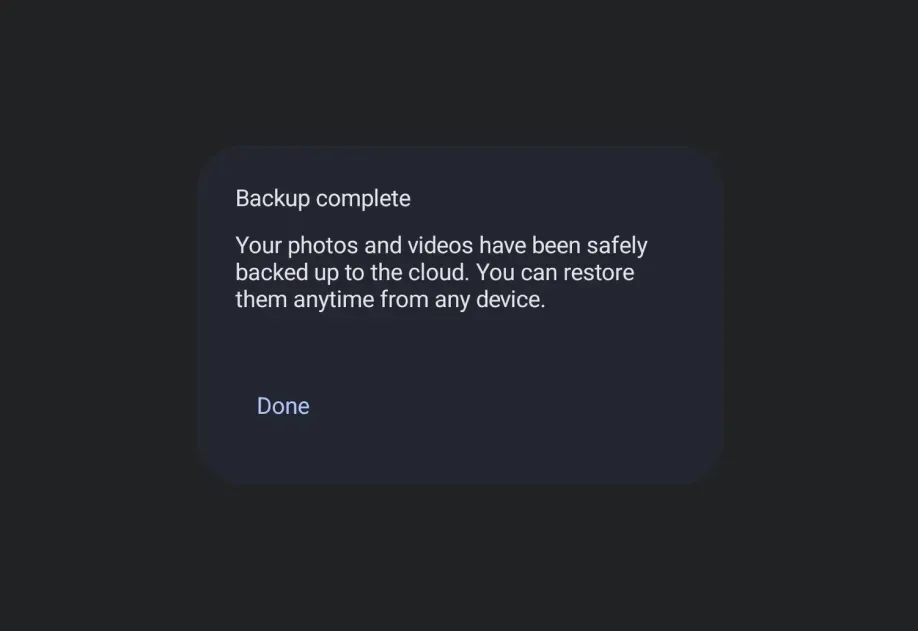
Expo UI BasicAlertDialog matches the official Jetpack Compose BasicAlertDialog API and displays a minimal dialog that accepts custom children as its content, giving you full control over the dialog layout.
Installation
If you are installing this in an existing React Native app, make sure to install expo in your project.
Usage
Basic dialog with custom content
API
import { BasicAlertDialog } from '@expo/ui/jetpack-compose';
Component
Type: React.Element<BasicAlertDialogProps>
A basic alert dialog that provides a blank container for custom content.
Unlike AlertDialog, this component does not have structured title/text/buttons slots.
() => voidCallback that is called when the user tries to dismiss the dialog (e.g. by tapping outside of it or pressing the back button).