This documentation is available as Markdown for AI agents and LLMs. See the full Markdown index or append .md to any documentation URL.
FloatingActionButton
Jetpack Compose FloatingActionButton components following Material Design 3.
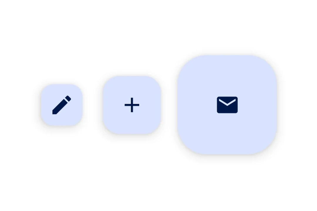
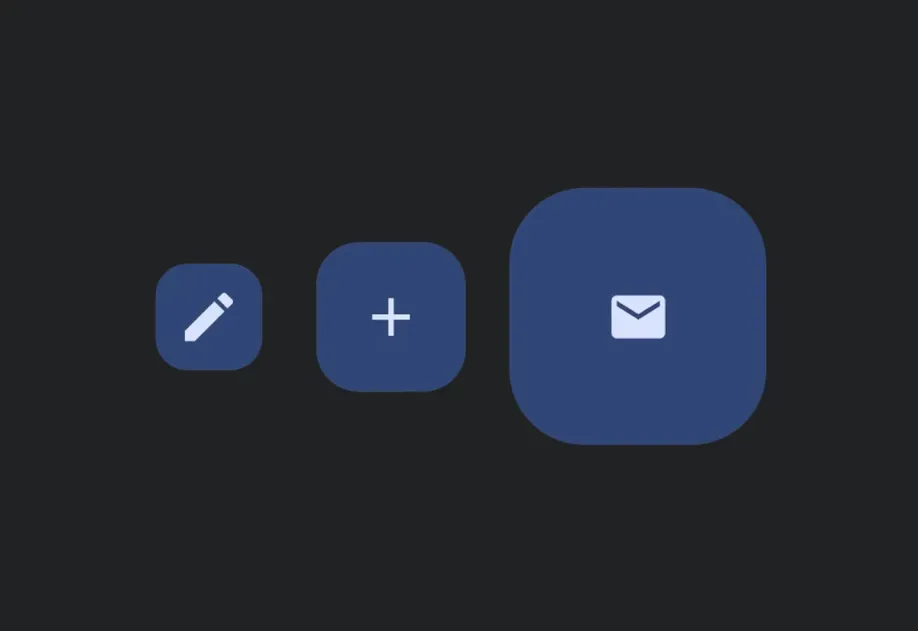
Expo UI provides four FloatingActionButton variants matching the Material Design 3 FloatingActionButton API:
SmallFloatingActionButton— a compact FABFloatingActionButton— the standard FAB (default size)LargeFloatingActionButton— a larger FABExtendedFloatingActionButton— a FAB with an icon and a text label, supporting animated expand/collapse
Each component uses slot-based children (.Icon and, for ExtendedFloatingActionButton, .Text) to compose content.
Note: If you need multiple action buttons in a floating toolbar, use
HorizontalFloatingToolbarinstead.
Installation
If you are installing this in an existing React Native app, make sure to install expo in your project.
Usage
Standard FloatingActionButton
FAB variants
ExtendedFloatingActionButton
Floating over content
Use a Compose Box with align('bottomEnd') to position the FAB over scrollable content entirely within the Compose layer.
Custom color
API
import {
  SmallFloatingActionButton,
  FloatingActionButton,
  LargeFloatingActionButton,
  ExtendedFloatingActionButton,
} from '@expo/ui/jetpack-compose';
Components
Type: React.Element<ExtendedFloatingActionButtonProps>
Renders a Material Design 3 ExtendedFloatingActionButton with animated label expansion.
Wraps ExtendedFloatingActionButton.
Example
import { ExtendedFloatingActionButton, Host, Icon, Text } from '@expo/ui/jetpack-compose';

<Host matchContents>
  <ExtendedFloatingActionButton expanded={true} onClick={() => console.log('pressed')}>
    <ExtendedFloatingActionButton.Icon>
      <Icon source={require('./assets/edit.xml')} />
    </ExtendedFloatingActionButton.Icon>
    <ExtendedFloatingActionButton.Text>
      <Text>Edit</Text>
    </ExtendedFloatingActionButton.Text>
  </ExtendedFloatingActionButton>
</Host>
Type: React.Element<FloatingActionButtonProps>
Renders a Material Design 3 standard FloatingActionButton.
Wraps FloatingActionButton.
Example
import { FloatingActionButton, Host, Icon } from '@expo/ui/jetpack-compose';

<Host matchContents>
  <FloatingActionButton onClick={() => console.log('pressed')}>
    <FloatingActionButton.Icon>
      <Icon source={require('./assets/add.xml')} />
    </FloatingActionButton.Icon>
  </FloatingActionButton>
</Host>
ColorValueThe background color of the button container.
Defaults to FloatingActionButtonDefaults.containerColor (primary container).
Type: React.Element<FloatingActionButtonProps>
Renders a Material Design 3 large FloatingActionButton.
Wraps LargeFloatingActionButton.
Example
import { LargeFloatingActionButton, Host, Icon } from '@expo/ui/jetpack-compose';

<Host matchContents>
  <LargeFloatingActionButton onClick={() => console.log('pressed')}>
    <LargeFloatingActionButton.Icon>
      <Icon source={require('./assets/add.xml')} />
    </LargeFloatingActionButton.Icon>
  </LargeFloatingActionButton>
</Host>
Type: React.Element<FloatingActionButtonProps>
Renders a Material Design 3 small FloatingActionButton.
Wraps SmallFloatingActionButton.
Example
import { SmallFloatingActionButton, Host, Icon } from '@expo/ui/jetpack-compose';

<Host matchContents>
  <SmallFloatingActionButton onClick={() => console.log('pressed')}>
    <SmallFloatingActionButton.Icon>
      <Icon source={require('./assets/add.xml')} />
    </SmallFloatingActionButton.Icon>
  </SmallFloatingActionButton>
</Host>