This documentation is available as Markdown for AI agents and LLMs. See the full Markdown index or append .md to any documentation URL.
This is documentation for the next SDK version. For up-to-date documentation, see the latest version (SDK 57).
Text
A SwiftUI Text component for displaying styled text with support for nested texts.
For cross-platform usage, see the universalText— it renders the appropriate native component per platform.
Expo UI Text matches the official SwiftUI Text API.
Installation
- npx expo install @expo/uiIf you are installing this in an existing React Native app, make sure to install expo in your project.
Usage
Basic text
import { Host, Text } from '@expo/ui/swift-ui';

export default function BasicTextExample() {
  return (
    <Host matchContents>
      <Text>Hello world</Text>
    </Host>
  );
}
Text with modifiers
Use modifiers to style the entire text.
import { Host, Text } from '@expo/ui/swift-ui';
import { font, foregroundStyle } from '@expo/ui/swift-ui/modifiers';

export default function StyledTextExample() {
  return (
    <Host matchContents>
      <Text modifiers={[font({ size: 24, weight: 'bold' }), foregroundStyle('blue')]}>
        Large Bold Blue Text
      </Text>
    </Host>
  );
}
Nested text (per-segment styling)
Nest Text components to style individual segments differently. This is useful for inline formatting, such as bold or colored words within a sentence.
Note: Nested text uses SwiftUI's Text concatenation, so only modifiers that return
Text(such asbold,italic,font,foregroundColor, andforegroundStylewith color) will apply to nested segments.
import { Host, Text } from '@expo/ui/swift-ui';
import { bold, italic, foregroundStyle } from '@expo/ui/swift-ui/modifiers';

export default function NestedTextExample() {
  return (
    <Host matchContents>
      <Text>
        Hello <Text modifiers={[bold(), foregroundStyle('red')]}>world</Text>!
      </Text>
    </Host>
  );
}
Mixed inline styles
Combine multiple styled segments for rich text formatting.
import { Host, Text } from '@expo/ui/swift-ui';
import { bold, italic, foregroundStyle, font } from '@expo/ui/swift-ui/modifiers';

export default function MixedStylesExample() {
  return (
    <Host matchContents>
      <Text>
        This is <Text modifiers={[bold()]}>bold</Text>, <Text modifiers={[italic()]}>italic</Text>,
        and <Text modifiers={[foregroundStyle('orange')]}>colored</Text> text.
      </Text>
    </Host>
  );
}
Font weights
Use the font modifier to apply different font weights.
import { Host, Text, VStack } from '@expo/ui/swift-ui';
import { font } from '@expo/ui/swift-ui/modifiers';

export default function FontWeightsExample() {
  return (
    <Host matchContents>
      <VStack spacing={4}>
        <Text modifiers={[font({ weight: 'ultraLight' })]}>Ultra Light</Text>
        <Text modifiers={[font({ weight: 'light' })]}>Light</Text>
        <Text modifiers={[font({ weight: 'regular' })]}>Regular</Text>
        <Text modifiers={[font({ weight: 'medium' })]}>Medium</Text>
        <Text modifiers={[font({ weight: 'semibold' })]}>Semibold</Text>
        <Text modifiers={[font({ weight: 'bold' })]}>Bold</Text>
        <Text modifiers={[font({ weight: 'heavy' })]}>Heavy</Text>
        <Text modifiers={[font({ weight: 'black' })]}>Black</Text>
      </VStack>
    </Host>
  );
}
Font designs
Use the font modifier to apply different font designs.
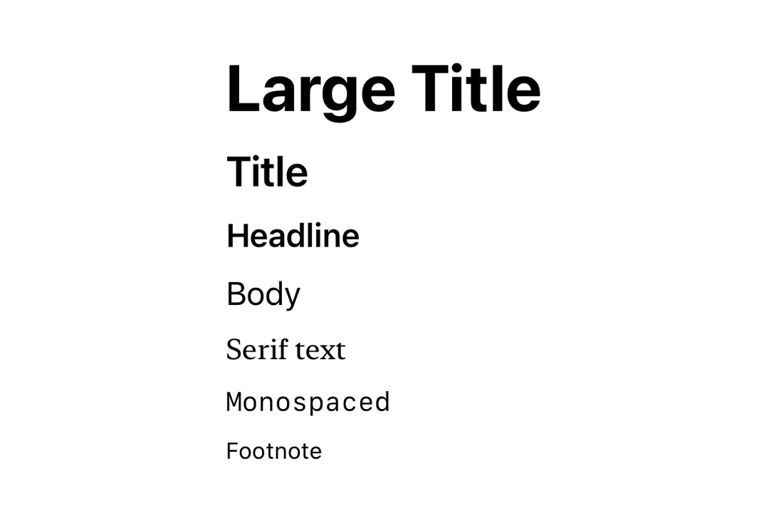
import { Host, Text, VStack } from '@expo/ui/swift-ui';
import { font } from '@expo/ui/swift-ui/modifiers';

export default function FontDesignsExample() {
  return (
    <Host matchContents>
      <VStack spacing={4}>
        <Text modifiers={[font({ design: 'default', size: 18 })]}>Default Design</Text>
        <Text modifiers={[font({ design: 'rounded', size: 18 })]}>Rounded Design</Text>
        <Text modifiers={[font({ design: 'serif', size: 18 })]}>Serif Design</Text>
        <Text modifiers={[font({ design: 'monospaced', size: 18 })]}>Monospaced Design</Text>
      </VStack>
    </Host>
  );
}
Custom fonts
Use the font modifier with a family parameter to use custom fonts. You can load custom fonts using expo-font library.
import { Host, Text, VStack } from '@expo/ui/swift-ui';
import { font } from '@expo/ui/swift-ui/modifiers';

export default function CustomFontExample() {
  return (
    <Host matchContents>
      <VStack spacing={4}>
        <Text modifiers={[font({ family: 'Inter-Bold', size: 18 })]}>Inter Bold</Text>
        <Text modifiers={[font({ family: 'Inter-Regular', size: 18 })]}>Inter Regular</Text>
      </VStack>
    </Host>
  );
}
Text with line limit
Use the lineLimit modifier to truncate text after a certain number of lines.
import { Host, Text } from '@expo/ui/swift-ui';
import { lineLimit } from '@expo/ui/swift-ui/modifiers';

export default function LineLimitExample() {
  const longText = 'This is a very long text that will be truncated after two lines. '.repeat(5);

  return (
    <Host matchContents>
      <Text modifiers={[lineLimit(2)]}>{longText}</Text>
    </Host>
  );
}
Markdown
Use the markdownEnabled property to enable Markdown formatting for the text content.
import { Host, Text, VStack } from '@expo/ui/swift-ui';

export default function MarkdownTextExample() {
  return (
    <Host matchContents>
      <VStack spacing={4}>
        <Text markdownEnabled>Regular text.</Text>
        <Text markdownEnabled>
          This is **bold text**, *italic text* and ***text in both bold and italic***.
        </Text>
        <Text markdownEnabled>~~Strikethrough text~~</Text>
        <Text markdownEnabled>`This is monospaced text`</Text>
        <Text markdownEnabled>
          Visit the [Expo Docs](https://docs.expo.dev/versions/latest/sdk/ui/) to learn more about
          Expo UI
        </Text>
      </VStack>
    </Host>
  );
}
Auto-updating date
Use the date and dateStyle props to display a date that automatically updates as time passes. This is especially useful in widgets and Live Activities.
import { Host, Text } from '@expo/ui/swift-ui';

export default function DateTextExample() {
  return (
    <Host matchContents>
      <Text date={new Date(Date.now() + 300000)} dateStyle="timer" />
    </Host>
  );
}
Timer interval
Use timerInterval to display a live countdown or count-up timer. This requires iOS/tvOS 16+.
import { Host, Text } from '@expo/ui/swift-ui';

export default function TimerIntervalExample() {
  return (
    <Host matchContents>
      <Text
        timerInterval={{ lower: new Date(), upper: new Date(Date.now() + 600000) }}
        countsDown
      />
    </Host>
  );
}
Note:
timerInterval,countsDown, andpauseTimerequire iOS 16.0+ / tvOS 16.0+. On older versions, the timer interval will not render.
API
import { Text } from '@expo/ui/swift-ui';
Component
Type: React.Element<TextProps>
boolean • Default: trueWhether the timer counts down (true) or up (false).
DateA date to display using the specified dateStyle. The text auto-updates as time passes.
TextDateStyle • Default: 'date'The style used to format the date prop.
booleanEnables Markdown formatting for the text content using SwiftUI LocalizedStringKey.
ClosedRangeDateA time interval to display as a live-updating timer.