This documentation is available as Markdown for AI agents and LLMs. See the full Markdown index or append .md to any documentation URL.
This is documentation for the next SDK version. For up-to-date documentation, see the latest version (SDK 57).
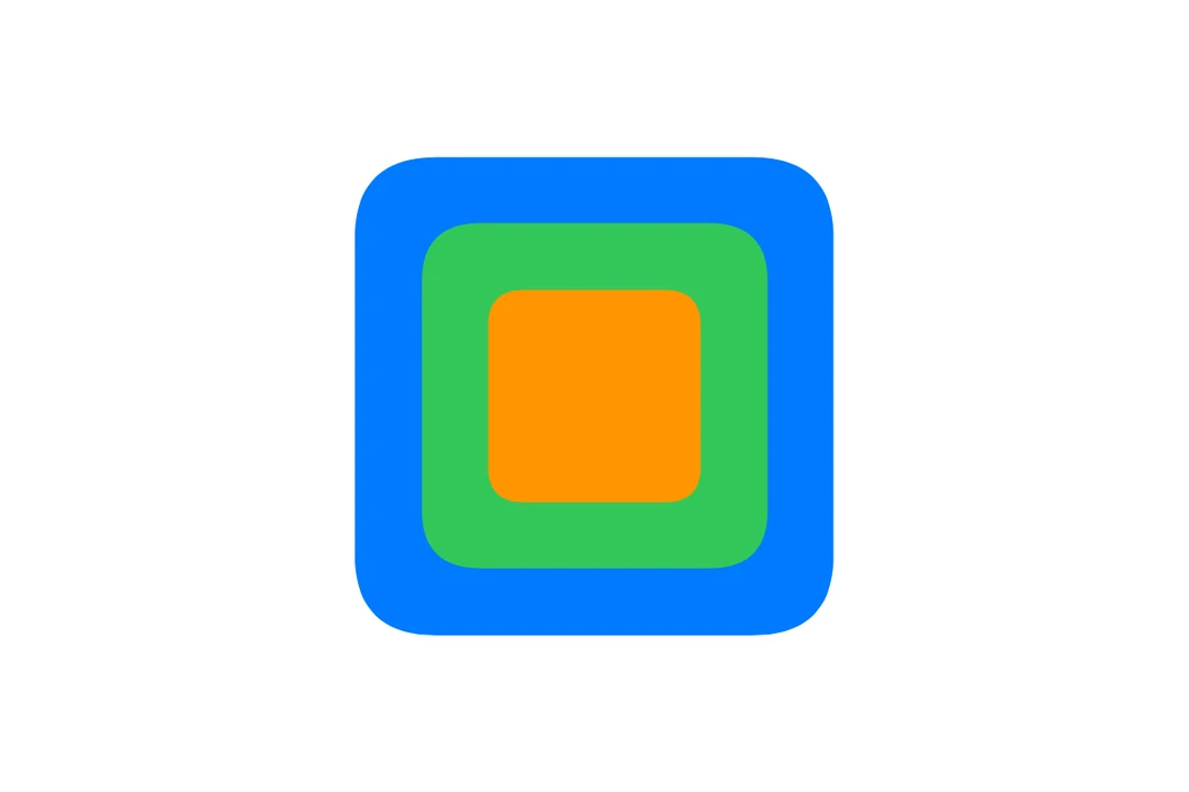
ZStack
A SwiftUI ZStack component for overlapping layouts.
iOS
tvOS
Included in Expo Go
Expo UI ZStack matches the official SwiftUI ZStack API and overlays its children on top of each other.
Installation
Terminal
- npx expo install @expo/uiIf you are installing this in an existing React Native app, make sure to install expo in your project.
Usage
Basic overlapping stack
BasicZStackExample.tsx
import { Host, ZStack, Rectangle, Text } from '@expo/ui/swift-ui';
import { frame, foregroundStyle } from '@expo/ui/swift-ui/modifiers';

export default function BasicZStackExample() {
  return (
    <Host matchContents>
      <ZStack>
        <Rectangle modifiers={[frame({ width: 100, height: 100 })]} />
        <Text modifiers={[foregroundStyle('white')]}>Overlay</Text>
      </ZStack>
    </Host>
  );
}
With alignment
The alignment prop controls how children are positioned within the stack. Available options include: center, leading, trailing, top, bottom, topLeading, topTrailing, bottomLeading, and bottomTrailing.
ZStackAlignmentExample.tsx
import { Host, ZStack, Rectangle, Circle } from '@expo/ui/swift-ui';
import { frame, foregroundStyle } from '@expo/ui/swift-ui/modifiers';

export default function ZStackAlignmentExample() {
  return (
    <Host matchContents>
      <ZStack alignment="bottomTrailing">
        <Rectangle modifiers={[frame({ width: 100, height: 100 }), foregroundStyle('blue')]} />
        <Circle modifiers={[frame({ width: 30, height: 30 }), foregroundStyle('red')]} />
      </ZStack>
    </Host>
  );
}
Creating a badge overlay
ZStackBadgeExample.tsx
import { Host, ZStack, Circle, Text, Image } from '@expo/ui/swift-ui';
import { frame, foregroundStyle } from '@expo/ui/swift-ui/modifiers';

export default function ZStackBadgeExample() {
  return (
    <Host matchContents>
      <ZStack alignment="topTrailing">
        <Image systemName="bell.fill" size={32} color="blue" />
        <Circle modifiers={[frame({ width: 16, height: 16 }), foregroundStyle('red')]} />
      </ZStack>
    </Host>
  );
}
API
import { ZStack } from '@expo/ui/swift-ui';
Component
Type: React.Element<ZStackProps>
Type:
ReactNode