This documentation is available as Markdown for AI agents and LLMs. See the full Markdown index or append .md to any documentation URL.
This is documentation for the next SDK version. For up-to-date documentation, see the latest version (SDK 57).
ControlGroup
A SwiftUI ControlGroup component for grouping interactive controls.
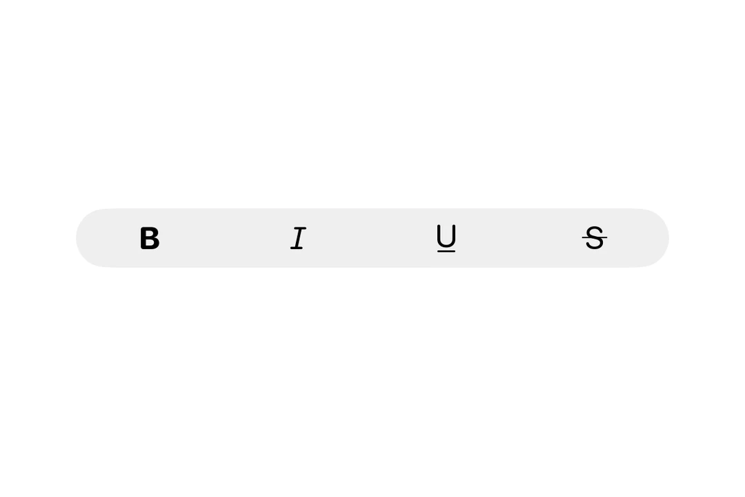
Expo UI ControlGroup matches the official SwiftUI ControlGroup API. When placed inside a Menu, the children are rendered as a compact horizontal row of buttons.
Note: On tvOS,
ControlGrouprequires tvOS 17.0 or later.
Installation
- npx expo install @expo/uiIf you are installing this in an existing React Native app, make sure to install expo in your project.
Usage
Basic control group
A control group inside a menu, these render as a horizontal row of icon buttons.
import { Host, Menu, ControlGroup, Button } from '@expo/ui/swift-ui';

export default function BasicControlGroupExample() {
  return (
    <Host matchContents>
      <Menu label="Options" systemImage="ellipsis.circle">
        <ControlGroup>
          <Button systemImage="plus" label="Add" onPress={() => console.log('Add')} />
          <Button systemImage="star" label="Favorite" onPress={() => console.log('Favorite')} />
          <Button
            systemImage="square.and.arrow.up"
            label="Share"
            onPress={() => console.log('Share')}
          />
        </ControlGroup>
        <Button label="Other Action" onPress={() => console.log('Other')} />
      </Menu>
    </Host>
  );
}
API
import { ControlGroup } from '@expo/ui/swift-ui';
Component
Type: React.Element<ControlGroupProps>
ReactNodeThe control group's content.
Can contain Button, Toggle, Picker, or other interactive controls.
ReactNodeThe label for the control group. Can be a string for simple text labels,
or a Label component for custom label content. When omitted, the control group
has no label.
SFSymbols7_0An SF Symbol name to display alongside the label.
Only used when label is a string.