This documentation is available as Markdown for AI agents and LLMs. See the full Markdown index or append .md to any documentation URL.
This is documentation for the next SDK version. For up-to-date documentation, see the latest version (SDK 57).
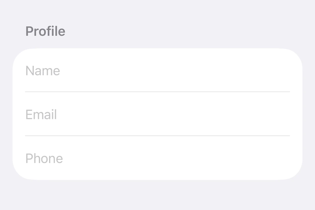
TextField
A SwiftUI TextField component for text input.
For cross-platform usage, see the universalTextInput— it renders the appropriate native component per platform.
Expo UI TextField matches the official SwiftUI TextField API and supports single-line and multiline input, keyboard configuration, submit handling, and an imperative ref for programmatic control.
Installation
- npx expo install @expo/uiIf you are installing this in an existing React Native app, make sure to install expo in your project.
Usage
Uncontrolled text field
Bind a useNativeState observable to text. The field tracks the user's input on its own, and you read the current value from textState.value.
import { Host, TextField, useNativeState } from '@expo/ui/swift-ui';

export default function BasicTextFieldExample() {
  const textState = useNativeState('');

  return (
    <Host matchContents>
      <TextField placeholder="Username" text={textState} />
    </Host>
  );
}
Controlled text field
Pass an onTextChange worklet to transform or validate input and write the result back to the useNativeState observable state. The example below uppercases the text as it is typed.
Note: Worklets require installing
react-native-worklets.
import { Host, TextField, useNativeState } from '@expo/ui/swift-ui';
import { useCallback } from 'react';

export default function ControlledTextFieldExample() {
  const text = useNativeState('');

  const handleTextChange = useCallback(
    (value: string) => {
      'worklet';
      text.value = value.toUpperCase();
    },
    [text]
  );

  return (
    <Host matchContents>
      <TextField placeholder="Name" text={text} onTextChange={handleTextChange} />
    </Host>
  );
}
Multiline text field
Set axis="vertical" to allow the text field to expand vertically. Use the lineLimit modifier to control the visible line count. When using Host matchContents, add fixedSize({ horizontal: false, vertical: true }) so the text field accepts the parent's width while using its ideal height.
import { Host, TextField, useNativeState } from '@expo/ui/swift-ui';
import { lineLimit, fixedSize } from '@expo/ui/swift-ui/modifiers';

export default function MultilineTextFieldExample() {
  const textState = useNativeState('');

  return (
    <Host matchContents>
      <TextField
        axis="vertical"
        text={textState}
        placeholder="Tell us about yourself..."
        modifiers={[lineLimit(5), fixedSize({ horizontal: false, vertical: true })]}
      />
    </Host>
  );
}
Keyboard type
Use the keyboardType modifier to display a specific keyboard layout.
import { Host, TextField, useNativeState } from '@expo/ui/swift-ui';
import { keyboardType, autocorrectionDisabled } from '@expo/ui/swift-ui/modifiers';

export default function KeyboardTypeExample() {
  const textState = useNativeState('');

  return (
    <Host matchContents>
      <TextField
        placeholder="Email"
        text={textState}
        modifiers={[keyboardType('email-address'), autocorrectionDisabled()]}
      />
    </Host>
  );
}
Submit handling
Use the submitLabel modifier to customize the return key and onSubmit to handle the submit action.
import { Host, TextField, useNativeState } from '@expo/ui/swift-ui';
import { submitLabel, onSubmit } from '@expo/ui/swift-ui/modifiers';

export default function SubmitHandlingExample() {
  const textState = useNativeState('');

  return (
    <Host matchContents>
      <TextField
        placeholder="Search..."
        text={textState}
        modifiers={[
          submitLabel('search'),
          onSubmit(() => console.log('Submitted:', textState.value)),
        ]}
      />
    </Host>
  );
}
Imperative ref
Use a ref to imperatively set text, focus, blur, or select text.
Note:
setSelectionrequires iOS 18.0+ / tvOS 18.0+. The other ref methods work on all supported versions.
import { useRef } from 'react';
import {
  Host,
  TextField,
  TextFieldRef,
  Button,
  HStack,
  VStack,
  useNativeState,
} from '@expo/ui/swift-ui';
import { buttonStyle } from '@expo/ui/swift-ui/modifiers';

export default function ImperativeRefExample() {
  const ref = useRef<TextFieldRef>(null);
  const textState = useNativeState('Select me!');

  return (
    <Host matchContents>
      <VStack>
        <TextField ref={ref} text={textState} placeholder="Imperative field" />
        <HStack spacing={12}>
          <Button
            modifiers={[buttonStyle('bordered')]}
            onPress={() => ref.current?.focus()}
            label="Focus"
          />
          <Button
            modifiers={[buttonStyle('bordered')]}
            onPress={() => ref.current?.blur()}
            label="Blur"
          />
          <Button
            modifiers={[buttonStyle('bordered')]}
            onPress={() => ref.current?.setText('SwiftUI rocks!')}
            label="Set Text"
          />
          <Button
            modifiers={[buttonStyle('bordered')]}
            onPress={() => ref.current?.clear()}
            label="Clear"
          />
          <Button
            modifiers={[buttonStyle('bordered')]}
            onPress={() => ref.current?.setSelection(0, 7)}
            label="Select"
          />
        </HStack>
      </VStack>
    </Host>
  );
}
Worklet text masking
When onTextChange is marked with the 'worklet' directive, it runs synchronously on the UI thread, so writes to useNativeState observables inside the callback take effect before the next frame. There is no flicker between the typed text and the masked text. The example below masks a phone number as the user types and writes both text and selection from the worklet to keep the cursor at the end of the formatted value.
Note: Worklets require installing
react-native-worklets. Theselectionprop requires iOS 18.0+ / tvOS 18.0+. On older versions the worklet can still update the text but cursor positioning is unavailable.
import { Host, TextField, useNativeState } from '@expo/ui/swift-ui';
import { keyboardType } from '@expo/ui/swift-ui/modifiers';
import { useCallback } from 'react';

export default function WorkletPhoneMaskExample() {
  const phone = useNativeState('');
  const selection = useNativeState({ start: 0, end: 0 });

  const handleTextChange = useCallback(
    (v: string) => {
      'worklet';
      const digits = v.replace(/\D/g, '').slice(0, 10);
      let formatted = digits;
      if (digits.length > 6) {
        formatted = `(${digits.slice(0, 3)}) ${digits.slice(3, 6)}-${digits.slice(6)}`;
      } else if (digits.length > 3) {
        formatted = `(${digits.slice(0, 3)}) ${digits.slice(3)}`;
      }
      if (formatted !== v) {
        phone.value = formatted;
        // Snaps to end for demo. Real masks need smarter cursor handling.
        selection.value = { start: formatted.length, end: formatted.length };
      }
    },
    [phone, selection]
  );

  return (
    <Host matchContents>
      <TextField
        text={phone}
        selection={selection}
        placeholder="(555) 123-4567"
        modifiers={[keyboardType('phone-pad')]}
        onTextChange={handleTextChange}
      />
    </Host>
  );
}
API
import { TextField } from '@expo/ui/swift-ui';
Component
Type: React.Element<TextFieldProps>
Renders a SwiftUI TextField.
boolean • Default: falseIf true, the text field will be focused automatically when mounted.
string • Default: 'horizontal'The axis along which the text field grows when content exceeds a single line.
'horizontal'— single line (default).'vertical'— expands vertically for multiline content. UselineLimitmodifier to cap visible lines.
Acceptable values are: 'vertical' | 'horizontal'
ReactNodeSlot children — supports <TextField.Placeholder> with a <Text> child
(any text-styling modifiers on that Text are preserved as the
placeholder's styling).
numberMaximum number of characters allowed. Truncates natively as the user types.
(focused: boolean) => voidA callback triggered when the field gains or loses focus.
(selection: {
  end: number,
  start: number
}) => void
A callback triggered when the text selection range changes.
(text: string) => voidA callback triggered when the text value changes.
If the callback is marked with the 'worklet' directive, it runs synchronously
on the UI thread; otherwise it is delivered asynchronously as a regular JS event.
Ref<TextFieldRef>ObservableState<TextFieldSelection>Observable state the field writes the current selection to.
Create with useNativeState<TextFieldSelection>({ start: 0, end: 0 }).
Use ref.setSelection(start, end) to set programmatically.
ObservableState<string>An observable state that holds the current text.
Create one with useNativeState('') or useNativeState('initial value').
If omitted, the field manages its own internal state.
Types
Observable state shared between JavaScript and native views (Jetpack Compose on Android and SwiftUI on iOS).
Type: SharedObject extended by:
| Property | Type | Description |
|---|---|---|
| onChange | [listener] | null | A single listener invoked on the native UI runtime whenever the value changes
(after iOS The callback must be a worklet so it can run synchronously on the UI thread.
Attach it inside Example
|
| value | T | The current value. Writes from a UI worklet are synchronous and immediately readable. Writes from the JS thread are scheduled to the UI thread asynchronously, the new value is not readable until the update has been applied. Prefer writing from a worklet when you need synchronous updates |
| get | () => T | Reads the current value. A React Compiler compliant alternative to reading |
| set | (value: T) => void | Writes a new value. A React Compiler-compliant alternative to assigning |
Can be used for imperatively focusing and setting text/selection on the TextField component.