This documentation is available as Markdown for AI agents and LLMs. See the full Markdown index or append .md to any documentation URL.
This is documentation for the next SDK version. For up-to-date documentation, see the latest version (SDK 57).
Button
A SwiftUI Button component for displaying native buttons.
For cross-platform usage, see the universalButton— it renders the appropriate native component per platform.
Expo UI Button matches the official SwiftUI Button API and supports styling via the buttonStyle, controlSize, and other modifiers.
Installation
- npx expo install @expo/uiIf you are installing this in an existing React Native app, make sure to install expo in your project.
Usage
Basic button
import { Host, Button } from '@expo/ui/swift-ui';

export default function BasicButtonExample() {
  return (
    <Host matchContents>
      <Button label="Press me" onPress={() => alert('Pressed!')} />
    </Host>
  );
}
Button with system image
import { Host, Button } from '@expo/ui/swift-ui';

export default function ButtonWithImageExample() {
  return (
    <Host matchContents>
      <Button
        label="Download"
        systemImage="arrow.down.circle"
        onPress={() => alert('Downloading...')}
      />
    </Host>
  );
}
Icon-only button
Use the labelStyle modifier to show only the icon while keeping the label for accessibility.
import { Host, Button } from '@expo/ui/swift-ui';
import { labelStyle } from '@expo/ui/swift-ui/modifiers';

export default function IconOnlyButtonExample() {
  return (
    <Host matchContents>
      <Button
        label="Settings"
        systemImage="gear"
        modifiers={[labelStyle('iconOnly')]}
        onPress={() => alert('Settings')}
      />
    </Host>
  );
}
Button styles
Use the buttonStyle modifier to change the button's appearance. Available styles are: bordered, borderedProminent, borderless, plain, glass, and glassProminent.
Note: The
glassandglassProminentstyles are only available on iOS 26+ when built with Xcode 26.
import { Host, Button, VStack } from '@expo/ui/swift-ui';
import { buttonStyle } from '@expo/ui/swift-ui/modifiers';

export default function ButtonStylesExample() {
  return (
    <Host matchContents>
      <VStack spacing={8}>
        <Button label="Bordered" modifiers={[buttonStyle('bordered')]} />
        <Button label="Bordered Prominent" modifiers={[buttonStyle('borderedProminent')]} />
        <Button label="Borderless" modifiers={[buttonStyle('borderless')]} />
        <Button label="Plain" modifiers={[buttonStyle('plain')]} />
      </VStack>
    </Host>
  );
}
Button border shape
Use the buttonBorderShape modifier to change the shape of a styled button. Available shapes are: automatic, capsule, roundedRectangle, and circle (iOS 17+).
import { Host, Button } from '@expo/ui/swift-ui';
import {
  buttonStyle,
  controlSize,
  buttonBorderShape,
  labelStyle,
} from '@expo/ui/swift-ui/modifiers';

export default function ButtonBorderShapeExample() {
  return (
    <Host matchContents>
      <Button
        label="Favorite"
        systemImage="heart.fill"
        modifiers={[
          buttonStyle('glass'),
          controlSize('extraLarge'),
          labelStyle('iconOnly'),
          buttonBorderShape('circle'),
        ]}
        onPress={() => alert('Favorited')}
      />
    </Host>
  );
}
Control sizes
Use the controlSize modifier to adjust the button size. Available sizes are: mini, small, regular, large, and extraLarge.
Note: The
extraLargesize is only available on iOS 17+.
import { Host, Button, VStack } from '@expo/ui/swift-ui';
import { buttonStyle, controlSize } from '@expo/ui/swift-ui/modifiers';

export default function ControlSizeExample() {
  return (
    <Host matchContents>
      <VStack spacing={8}>
        <Button label="Mini" modifiers={[controlSize('mini'), buttonStyle('bordered')]} />
        <Button label="Small" modifiers={[controlSize('small'), buttonStyle('bordered')]} />
        <Button label="Regular" modifiers={[controlSize('regular'), buttonStyle('bordered')]} />
        <Button label="Large" modifiers={[controlSize('large'), buttonStyle('bordered')]} />
      </VStack>
    </Host>
  );
}
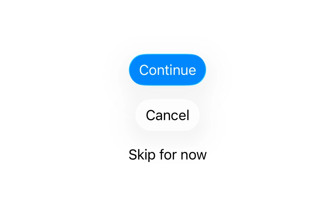
Button roles
Use the role prop to indicate the semantic role of the button. Available roles are: default, cancel, and destructive.
import { Host, Button, VStack } from '@expo/ui/swift-ui';

export default function ButtonRolesExample() {
  return (
    <Host matchContents>
      <VStack spacing={8}>
        <Button label="Default" role="default" />
        <Button label="Cancel" role="cancel" />
        <Button label="Delete" role="destructive" />
      </VStack>
    </Host>
  );
}
Tinted button
Use the tint modifier to change the button's color.
import { Host, Button } from '@expo/ui/swift-ui';
import { tint } from '@expo/ui/swift-ui/modifiers';

export default function TintedButtonExample() {
  return (
    <Host matchContents>
      <Button label="Custom Color" modifiers={[tint('#FF6347')]} />
    </Host>
  );
}
Disabled button
Use the disabled modifier to disable the button.
import { Host, Button } from '@expo/ui/swift-ui';
import { disabled } from '@expo/ui/swift-ui/modifiers';

export default function DisabledButtonExample() {
  return (
    <Host matchContents>
      <Button label="Disabled" modifiers={[disabled()]} />
    </Host>
  );
}
Custom label content
You can pass custom components as children for more complex button label content.
import { Host, Button, VStack, Image, Text } from '@expo/ui/swift-ui';

export default function CustomContentExample() {
  return (
    <Host matchContents>
      <Button onPress={() => console.log('Pressed!')}>
        <VStack spacing={4}>
          <Image systemName="folder" />
          <Text>Folder</Text>
        </VStack>
      </Button>
    </Host>
  );
}
API
import { Button } from '@expo/ui/swift-ui';
Component
Type: React.Element<ButtonProps>
Displays a native button component.
Example
import { Button } from '@expo/ui/swift-ui';
import { buttonStyle, controlSize, tint, disabled } from '@expo/ui/swift-ui/modifiers';

<Button
  role="destructive"
  onPress={handlePress}
  label="Delete"
  modifiers={[
    buttonStyle('bordered'),
    controlSize('large'),
    tint('#FF0000'),
    disabled(true)
  ]}
/>
unionCustom content for the button label. Use this for custom label views. Only nested elements are supported, not plain strings.
Acceptable values are: ReactElement<unknown, string | JSXElementConstructor<any>> | ReactElement[]
SFSymbols7_0A string describing the system image to display in the button.
Only used when label is provided.
stringTarget identifier for the button, used for identifying which button was pressed in widgets and live activities.