This documentation is available as Markdown for AI agents and LLMs. See the full Markdown index or append .md to any documentation URL.
This is documentation for the next SDK version. For up-to-date documentation, see the latest version (SDK 57).
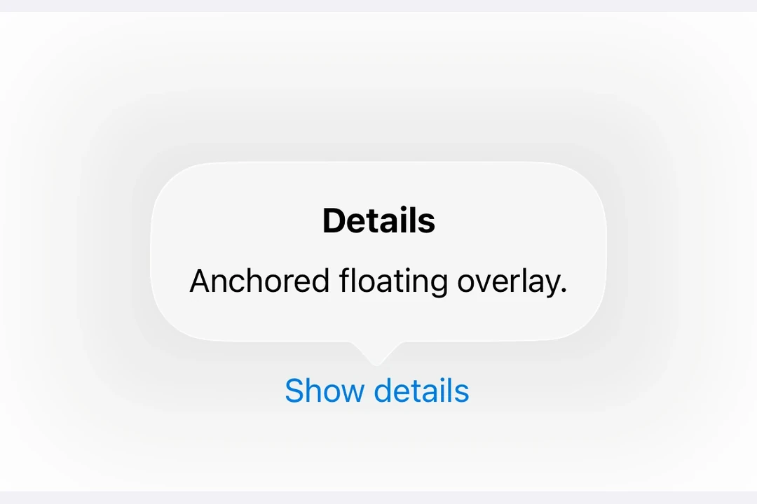
Popover
A SwiftUI Popover component for displaying content in a floating overlay.
Expo UI Popover matches the official SwiftUI Popover API and provides a way to present content in a floating overlay anchored to a trigger element.
Installation
- npx expo install @expo/uiIf you are installing this in an existing React Native app, make sure to install expo in your project.
Usage
Basic popover
import { useState } from 'react';
import { Host, Button, Popover, Text, VStack } from '@expo/ui/swift-ui';
import { padding } from '@expo/ui/swift-ui/modifiers';

export default function BasicPopoverExample() {
  const [isPresented, setIsPresented] = useState(false);

  return (
    <Host matchContents>
      <Popover
        isPresented={isPresented}
        onIsPresentedChange={isPresented => setIsPresented(isPresented)}>
        <Popover.Trigger>
          <Button label="Show Popover" onPress={() => setIsPresented(true)} />
        </Popover.Trigger>
        <Popover.Content>
          <VStack modifiers={[padding({ all: 16 })]}>
            <Text>Hello from Popover!</Text>
          </VStack>
        </Popover.Content>
      </Popover>
    </Host>
  );
}
With attachment anchor
The attachmentAnchor prop controls where the popover attaches to the trigger element. Available options are: center, leading, trailing, top, and bottom.
import { useState } from 'react';
import { Host, Button, Popover, Text, VStack } from '@expo/ui/swift-ui';
import { padding } from '@expo/ui/swift-ui/modifiers';

export default function AttachmentAnchorExample() {
  const [isPresented, setIsPresented] = useState(false);

  return (
    <Host matchContents>
      <Popover
        isPresented={isPresented}
        onIsPresentedChange={isPresented => setIsPresented(isPresented)}
        attachmentAnchor="trailing">
        <Popover.Trigger>
          <Button label="Show Popover" onPress={() => setIsPresented(true)} />
        </Popover.Trigger>
        <Popover.Content>
          <VStack modifiers={[padding({ all: 16 })]}>
            <Text>Attached to trailing edge</Text>
          </VStack>
        </Popover.Content>
      </Popover>
    </Host>
  );
}
With arrow edge
The arrowEdge prop controls which edge of the popover displays the arrow. Available options are: none, leading, trailing, top, and bottom.
import { useState } from 'react';
import { Host, Button, Popover, Text, VStack } from '@expo/ui/swift-ui';
import { padding } from '@expo/ui/swift-ui/modifiers';

export default function ArrowEdgeExample() {
  const [isPresented, setIsPresented] = useState(false);

  return (
    <Host matchContents>
      <Popover
        isPresented={isPresented}
        onIsPresentedChange={isPresented => setIsPresented(isPresented)}
        arrowEdge="top">
        <Popover.Trigger>
          <Button label="Show Popover" onPress={() => setIsPresented(true)} />
        </Popover.Trigger>
        <Popover.Content>
          <VStack modifiers={[padding({ all: 16 })]}>
            <Text>Arrow on top edge</Text>
          </VStack>
        </Popover.Content>
      </Popover>
    </Host>
  );
}
With React Native content
You can use RNHostView to embed React Native components inside the popover content.
import { useState } from 'react';
import { Pressable, Text as RNText, View } from 'react-native';
import { Host, Button, Popover, RNHostView } from '@expo/ui/swift-ui';

export default function RNContentPopoverExample() {
  const [isPresented, setIsPresented] = useState(false);
  const [counter, setCounter] = useState(0);

  return (
    <Host matchContents>
      <Popover
        isPresented={isPresented}
        onIsPresentedChange={isPresented => setIsPresented(isPresented)}>
        <Popover.Trigger>
          <Button label="Show RN Popover" onPress={() => setIsPresented(true)} />
        </Popover.Trigger>
        <Popover.Content>
          <RNHostView matchContents>
            <View style={{ padding: 16 }}>
              <RNText style={{ fontSize: 16, fontWeight: 'bold' }}>React Native Content</RNText>
              <RNText style={{ color: '#666', marginVertical: 8 }}>Counter: {counter}</RNText>
              <Pressable
                style={{
                  backgroundColor: '#007AFF',
                  padding: 12,
                  borderRadius: 8,
                  alignItems: 'center',
                }}
                onPress={() => setCounter(counter + 1)}>
                <RNText style={{ color: 'white' }}>Increment</RNText>
              </Pressable>
            </View>
          </RNHostView>
        </Popover.Content>
      </Popover>
    </Host>
  );
}
API
import { Popover } from '@expo/ui/swift-ui';
Component
Type: React.Element<PopoverViewProps>
Props
string • Default: 'none'The edge of the attachmentAnchor that defines the location of the popover's arrow. The default is none, which results in the system allowing any arrow edge.
Acceptable values are: 'top' | 'none' | 'bottom' | 'leading' | 'trailing'
stringThe positioning anchor that defines the attachment point of the popover.
Acceptable values are: 'center' | 'top' | 'bottom' | 'leading' | 'trailing'
ReactNode(isPresented: boolean) => voidA callback that is called when the isPresented state changes.