This documentation is available as Markdown for AI agents and LLMs. See the full Markdown index or append .md to any documentation URL.
This is documentation for the next SDK version. For up-to-date documentation, see the latest version (SDK 57).
Divider
A SwiftUI Divider component for creating visual separators.
iOS
tvOS
Included in Expo Go
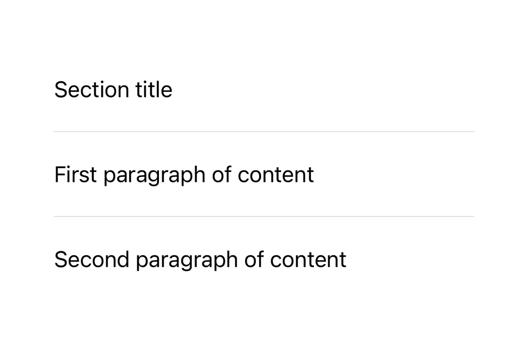
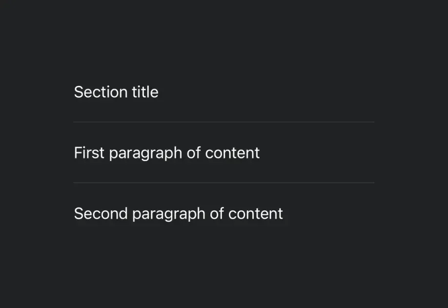
Expo UI Divider matches the official SwiftUI Divider API and creates a visual separator between content.
Installation
Terminal
- npx expo install @expo/uiIf you are installing this in an existing React Native app, make sure to install expo in your project.
Usage
Basic divider
BasicDividerExample.tsx
import { Host, Divider, VStack, Text } from '@expo/ui/swift-ui'; export default function BasicDividerExample() { return ( <Host matchContents> <VStack> <Text>First section</Text> <Divider /> <Text>Second section</Text> </VStack> </Host> ); }
Divider in a list
DividerInListExample.tsx
import { Host, Divider, VStack, Text } from '@expo/ui/swift-ui'; export default function DividerInListExample() { return ( <Host matchContents> <VStack spacing={8}> <Text>Item 1</Text> <Divider /> <Text>Item 2</Text> <Divider /> <Text>Item 3</Text> <Divider /> <Text>Item 4</Text> </VStack> </Host> ); }
Divider in a context menu
Dividers are commonly used to separate groups of actions in context menus.
DividerInContextMenuExample.tsx
import { Host, ContextMenu, Button, Text, Divider } from '@expo/ui/swift-ui'; export default function DividerInContextMenuExample() { return ( <Host matchContents> <ContextMenu> <ContextMenu.Items> <Button label="Edit" onPress={() => console.log('Edit')} /> <Button label="Duplicate" onPress={() => console.log('Duplicate')} /> <Divider /> <Button label="Delete" role="destructive" onPress={() => console.log('Delete')} /> </ContextMenu.Items> <ContextMenu.Trigger> <Text>Long press me</Text> </ContextMenu.Trigger> </ContextMenu> </Host> ); }
API
import { Divider } from '@expo/ui/swift-ui';
Component
Type: React.Element<DividerProps>
Divider component uses the native Divider component. A visual element that can be used to separate other content.