This documentation is available as Markdown for AI agents and LLMs. See the full Markdown index or append .md to any documentation URL.
This is documentation for the next SDK version. For up-to-date documentation, see the latest version (SDK 57).
DisclosureGroup
A SwiftUI DisclosureGroup component for displaying expandable content.
Expo UI DisclosureGroup matches the official SwiftUI DisclosureGroup API and displays a disclosure indicator that reveals or hides content.
Installation
- npx expo install @expo/uiIf you are installing this in an existing React Native app, make sure to install expo in your project.
Usage
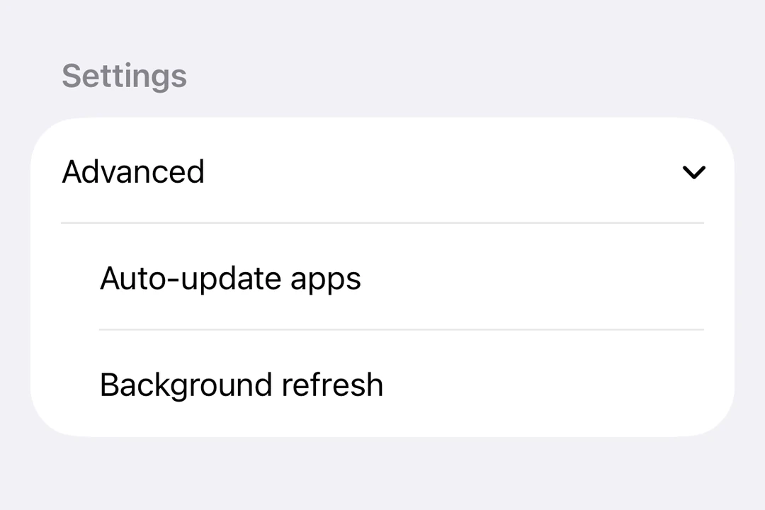
Basic disclosure group
DisclosureGroup is most commonly used inside a Form so it picks up the standard iOS list styling with a chevron indicator.
import { useState } from 'react';
import { DisclosureGroup, Form, Host, Section, Text } from '@expo/ui/swift-ui';

export default function BasicDisclosureGroupExample() {
  const [isExpanded, setIsExpanded] = useState(true);
  return (
    <Host style={{ flex: 1 }}>
      <Form>
        <Section>
          <DisclosureGroup
            label="Advanced settings"
            isExpanded={isExpanded}
            onIsExpandedChange={setIsExpanded}>
            <Text>Auto-update apps</Text>
            <Text>App downloads</Text>
            <Text>Offload unused apps</Text>
          </DisclosureGroup>
        </Section>
      </Form>
    </Host>
  );
}
Initially expanded
Set isExpanded to true initially to show the content by default.
import { useState } from 'react';
import { Host, DisclosureGroup, Text } from '@expo/ui/swift-ui';

export default function InitiallyExpandedExample() {
  const [isExpanded, setIsExpanded] = useState(true);

  return (
    <Host matchContents>
      <DisclosureGroup label="Details" isExpanded={isExpanded} onIsExpandedChange={setIsExpanded}>
        <Text>This content is visible by default.</Text>
      </DisclosureGroup>
    </Host>
  );
}
Custom label
Use DisclosureGroup.Label when the label needs custom SwiftUI content or modifiers instead of the label string prop.
import { useState } from 'react';
import { DisclosureGroup, Form, Host, Section, Text } from '@expo/ui/swift-ui';
import { font, foregroundStyle } from '@expo/ui/swift-ui/modifiers';

export default function CustomLabelDisclosureGroupExample() {
  const [isExpanded, setIsExpanded] = useState(false);

  return (
    <Host style={{ flex: 1 }}>
      <Form>
        <Section>
          <DisclosureGroup isExpanded={isExpanded} onIsExpandedChange={setIsExpanded}>
            <DisclosureGroup.Label>
              <Text modifiers={[font({ weight: 'semibold' }), foregroundStyle('#0a7ea4')]}>
                Network options
              </Text>
            </DisclosureGroup.Label>
            <Text>Wi-Fi</Text>
            <Text>Bluetooth</Text>
            <Text>Cellular data</Text>
          </DisclosureGroup>
        </Section>
      </Form>
    </Host>
  );
}
API
import { DisclosureGroup } from '@expo/ui/swift-ui';
Component
Type: React.Element<DisclosureGroupProps>
ReactNodestringText label for the disclosure group. Use DisclosureGroup.Label for custom label content.
(isExpanded: boolean) => voidA callback that is called when the expansion state changes.