This documentation is available as Markdown for AI agents and LLMs. See the full Markdown index or append .md to any documentation URL.
This is documentation for the next SDK version. For up-to-date documentation, see the latest version (SDK 57).
DatePicker
A SwiftUI DatePicker component for selecting dates and times.
Expo UI DatePicker matches the official SwiftUI DatePicker API and supports styling via the datePickerStyle modifier.
Installation
- npx expo install @expo/uiIf you are installing this in an existing React Native app, make sure to install expo in your project.
Date picker
import { useState } from 'react';
import { Host, DatePicker } from '@expo/ui/swift-ui';

export default function DatePickerExample() {
  const [selectedDate, setSelectedDate] = useState(new Date());

  return (
    <Host matchContents>
      <DatePicker
        title="Select a date"
        selection={selectedDate}
        displayedComponents={['date']}
        onDateChange={date => {
          setSelectedDate(date);
        }}
      />
    </Host>
  );
}
Time picker
import { useState } from 'react';
import { Host, DatePicker } from '@expo/ui/swift-ui';

export default function TimePickerExample() {
  const [selectedDate, setSelectedDate] = useState(new Date());

  return (
    <Host matchContents>
      <DatePicker
        title="Select a time"
        selection={selectedDate}
        displayedComponents={['hourAndMinute']}
        onDateChange={date => {
          setSelectedDate(date);
        }}
      />
    </Host>
  );
}
Date and time picker
import { useState } from 'react';
import { Host, DatePicker } from '@expo/ui/swift-ui';

export default function DateTimePickerExample() {
  const [selectedDate, setSelectedDate] = useState(new Date());

  return (
    <Host matchContents>
      <DatePicker
        title="Select date and time"
        selection={selectedDate}
        displayedComponents={['date', 'hourAndMinute']}
        onDateChange={date => {
          setSelectedDate(date);
        }}
      />
    </Host>
  );
}
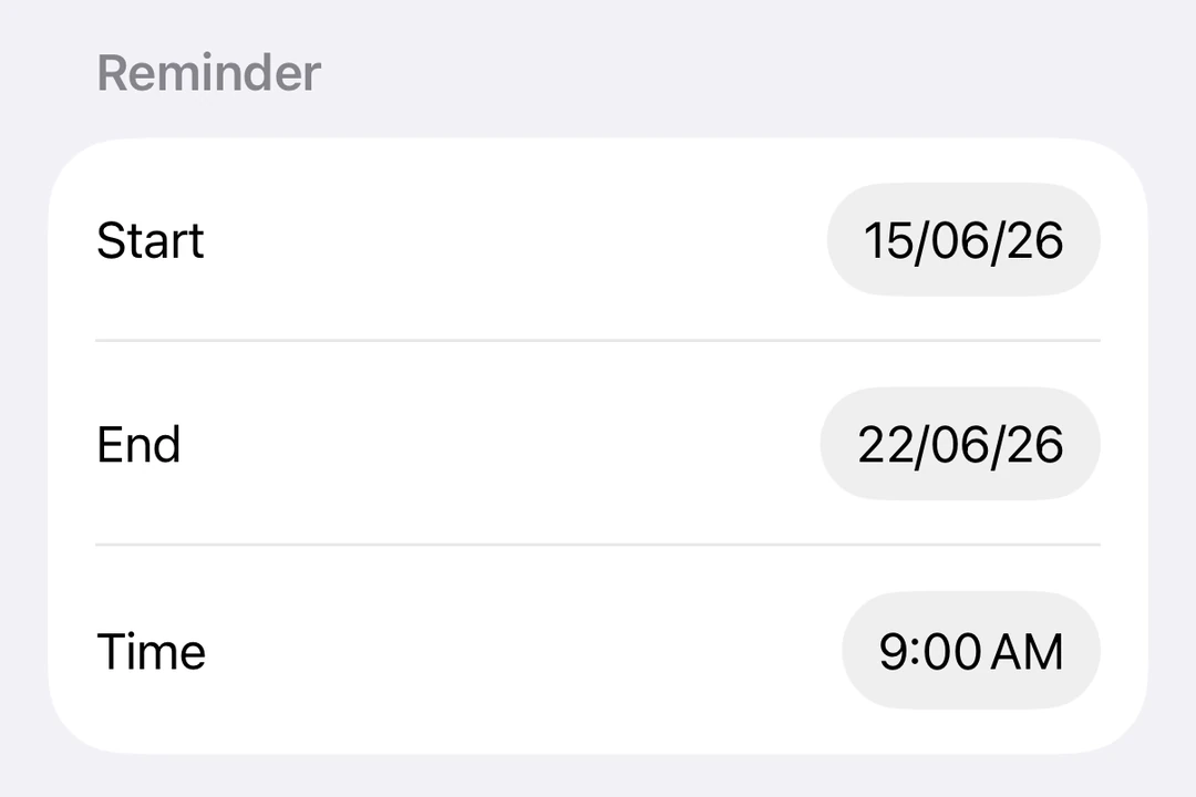
With date range
import { useState } from 'react';
import { Host, DatePicker } from '@expo/ui/swift-ui';

export default function DateRangePickerExample() {
  const [selectedDate, setSelectedDate] = useState(new Date());

  return (
    <Host matchContents>
      <DatePicker
        title="Select a date"
        selection={selectedDate}
        displayedComponents={['date']}
        range={{
          start: new Date(2024, 0, 1),
          end: new Date(2024, 11, 31),
        }}
        onDateChange={date => {
          setSelectedDate(date);
        }}
      />
    </Host>
  );
}
Styling with modifiers
You can use the datePickerStyle modifier to change the appearance of the picker. Available styles are: automatic, compact, graphical, and wheel.
import { useState } from 'react';
import { Host, DatePicker } from '@expo/ui/swift-ui';
import { datePickerStyle } from '@expo/ui/swift-ui/modifiers';

export default function WheelDatePickerExample() {
  const [selectedDate, setSelectedDate] = useState(new Date());

  return (
    <Host matchContents>
      <DatePicker
        modifiers={[datePickerStyle('wheel')]}
        title="Select a date"
        selection={selectedDate}
        displayedComponents={['date']}
        onDateChange={date => {
          setSelectedDate(date);
        }}
      />
    </Host>
  );
}
import { useState } from 'react';
import { Host, DatePicker } from '@expo/ui/swift-ui';
import { datePickerStyle } from '@expo/ui/swift-ui/modifiers';

export default function GraphicalDatePickerExample() {
  const [selectedDate, setSelectedDate] = useState(new Date());

  return (
    <Host matchContents>
      <DatePicker
        modifiers={[datePickerStyle('graphical')]}
        title="Select a date"
        selection={selectedDate}
        displayedComponents={['date']}
        onDateChange={date => {
          setSelectedDate(date);
        }}
      />
    </Host>
  );
}
Disabled picker
You can make the picker non-interactive using the disabled modifier.
import { useState } from 'react';
import { Host, DatePicker } from '@expo/ui/swift-ui';
import { disabled } from '@expo/ui/swift-ui/modifiers';

export default function DisabledDatePickerExample() {
  const [selectedDate, setSelectedDate] = useState(new Date());

  return (
    <Host matchContents>
      <DatePicker
        title="Select a date"
        selection={selectedDate}
        displayedComponents={['date']}
        onDateChange={date => {
          setSelectedDate(date);
        }}
        modifiers={[disabled()]}
      />
    </Host>
  );
}
Custom locale
Apply the environment modifier with the locale key to display the picker in a specific locale.
import { useState } from 'react';
import { Host, DatePicker } from '@expo/ui/swift-ui';
import { environment } from '@expo/ui/swift-ui/modifiers';

export default function LocaleDatePickerExample() {
  const [selectedDate, setSelectedDate] = useState(new Date());

  return (
    <Host matchContents>
      <DatePicker
        title="Sélectionner la date"
        selection={selectedDate}
        displayedComponents={['date']}
        onDateChange={date => {
          setSelectedDate(date);
        }}
        modifiers={[environment('locale', 'fr_FR')]}
      />
    </Host>
  );
}
Custom time zone
Apply the environment modifier with the timeZone key to display the picker in a specific IANA time zone.
import { useState } from 'react';
import { Host, DatePicker } from '@expo/ui/swift-ui';
import { environment } from '@expo/ui/swift-ui/modifiers';

export default function TimeZoneDatePickerExample() {
  const [selectedDate, setSelectedDate] = useState(new Date());

  return (
    <Host matchContents>
      <DatePicker
        title="Tokyo time"
        selection={selectedDate}
        displayedComponents={['date', 'hourAndMinute']}
        onDateChange={date => {
          setSelectedDate(date);
        }}
        modifiers={[environment('timeZone', 'Asia/Tokyo')]}
      />
    </Host>
  );
}
API
import { DatePicker } from '@expo/ui/swift-ui';
Component
Type: React.Element<DatePickerProps>
Renders a SwiftUI DatePicker component.
DatePickerComponent[] • Default: ['date']The components to display: 'date' and/or 'hourAndMinute'.