This documentation is available as Markdown for AI agents and LLMs. See the full Markdown index or append .md to any documentation URL.
This is documentation for the next SDK version. For up-to-date documentation, see the latest version (SDK 57).
Form
A SwiftUI Form component for collecting user input in a structured layout.
Expo UI Form matches the official SwiftUI Form API. It provides a container for grouping controls used for data entry, such as in settings or inspection panes.
Installation
- npx expo install @expo/uiIf you are installing this in an existing React Native app, make sure to install expo in your project.
Usage
Basic form
import { useState } from 'react';
import { Host, Form, TextField } from '@expo/ui/swift-ui';

export default function BasicFormExample() {
  return (
    <Host style={{ flex: 1 }}>
      <Form>
        <TextField placeholder="Enter your name" />
      </Form>
    </Host>
  );
}
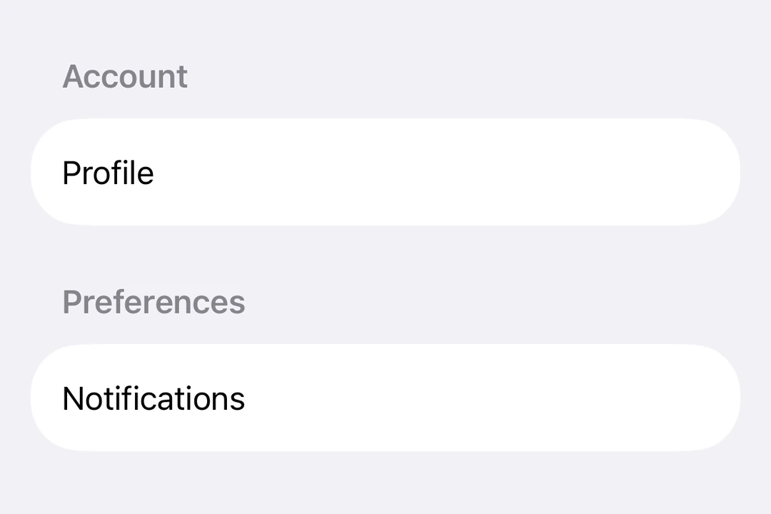
Form with sections
Use the Section component to group related controls within a form.
import { useState } from 'react';
import { Host, Form, Section, TextField, Toggle, Button } from '@expo/ui/swift-ui';

export default function FormWithSectionsExample() {
  const [notifications, setNotifications] = useState(false);
  const [darkMode, setDarkMode] = useState(false);

  return (
    <Host style={{ flex: 1 }}>
      <Form>
        <Section title="Profile">
          <TextField placeholder="Name" />
          <TextField placeholder="Email" />
        </Section>

        <Section title="Preferences">
          <Toggle
            label="Enable notifications"
            isOn={notifications}
            onIsOnChange={setNotifications}
          />
          <Toggle label="Dark mode" isOn={darkMode} onIsOnChange={setDarkMode} />
        </Section>

        <Section>
          <Button label="Save Changes" onPress={() => console.log('Saved!')} />
        </Section>
      </Form>
    </Host>
  );
}
Form with custom background
Use the scrollContentBackground modifier to customize or hide the form's background.
import { useState } from 'react';
import { Host, Form, Section, TextField } from '@expo/ui/swift-ui';
import { scrollContentBackground, background } from '@expo/ui/swift-ui/modifiers';

export default function FormBackgroundExample() {
  return (
    <Host style={{ flex: 1 }}>
      <Form modifiers={[scrollContentBackground('hidden'), background('#F0F0F0')]}>
        <Section title="Custom Background">
          <TextField placeholder="Enter text" />
        </Section>
      </Form>
    </Host>
  );
}
Non-scrollable form
Use the scrollDisabled modifier to prevent the form from scrolling.
Note: The
scrollDisabledmodifier is only available on iOS 16+ and tvOS 16+.
import { useState } from 'react';
import { Host, Form, Section, TextField, Toggle } from '@expo/ui/swift-ui';
import { scrollDisabled } from '@expo/ui/swift-ui/modifiers';

export default function NonScrollableFormExample() {
  const [isOn, setIsOn] = useState(false);

  return (
    <Host style={{ flex: 1 }}>
      <Form modifiers={[scrollDisabled()]}>
        <Section title="Settings">
          <Toggle label="Enable feature" isOn={isOn} onIsOnChange={setIsOn} />
        </Section>
      </Form>
    </Host>
  );
}
Pull-to-refresh form
Use the refreshable modifier to add pull-to-refresh functionality.
import { useState, useCallback } from 'react';
import { Host, Form, Section, Text } from '@expo/ui/swift-ui';
import { refreshable } from '@expo/ui/swift-ui/modifiers';

export default function RefreshableFormExample() {
  const [lastRefresh, setLastRefresh] = useState(new Date());

  const handleRefresh = useCallback(async () => {
    // Simulate network request
    await new Promise(resolve => setTimeout(resolve, 1500));
    setLastRefresh(new Date());
  }, []);

  return (
    <Host style={{ flex: 1 }}>
      <Form modifiers={[refreshable(handleRefresh)]}>
        <Section title="Pull to Refresh">
          <Text>Last refreshed: {lastRefresh.toLocaleTimeString()}</Text>
        </Section>
      </Form>
    </Host>
  );
}
API
import { Form } from '@expo/ui/swift-ui';